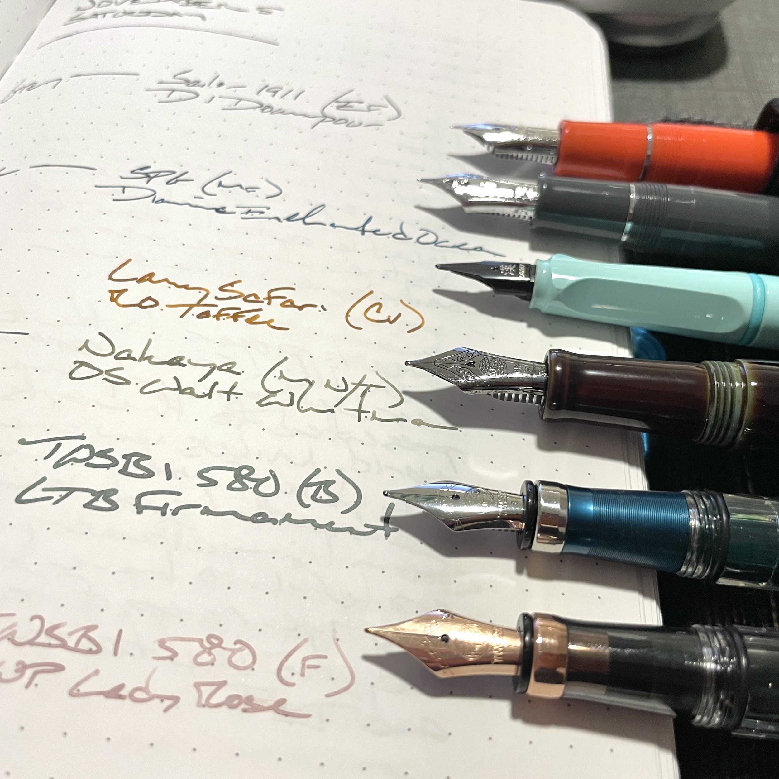
A somber fall-themed color palette
Somber, muted hues dominate my currently inked this week. The palette, as a whole, feels like fall to me. The combination of which brings a smile to my face. And that, I suspect, is the measure of a successful currently inked.

What makes a stationery purchase “good?”
What is a successful stationery purchase? On what metric does one measure a successful purchase? My mind rests this week on the philosophical challenge of deciding which stationery purchases are good and which are mistakes.
Because I’ve made stationery purchases throughout the last two weeks. And asked for stationery purchases as birthday gifts. Nerdy armchair philosophizing incoming. All shared in fun.
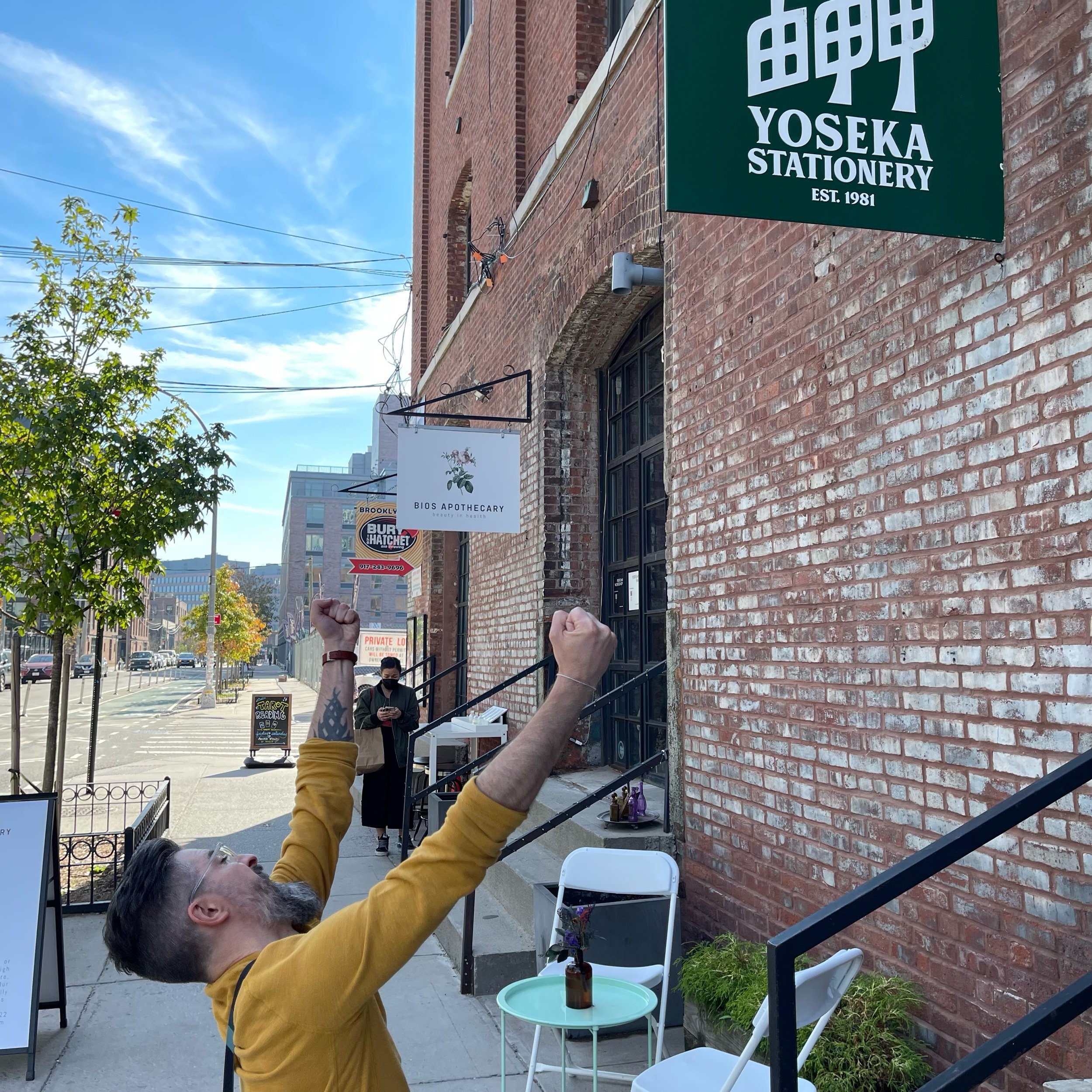
A pilgrimage to NYC’s fabled Yoseka Stationery
I did it. At long last, I transported my physical person into the hallowed Yoseka Stationery shop. Where friendly staff were eager to join me in touching, swabbing and sampling basically every item in the shop. I apologize for the excited-toddler personality I brought into their lovingly curated shop.
A little of this and a little of that, a mnml digest
Five links. Ten sentences or fewer. On the power of difference. The transformative potential of trying novel combinations that “shouldn’t work together.” The fabulous lessons to be found in the heterogeneous.