Grinding away the same set of pens

The urge to customize one of my pens hits me every now and again. Customizing a nib takes many forms: smoothing on fine-mesh, tuning and aligning mis-aligned tines, and even reshaping the tipping at the end of the nib (or: grinding a nib).
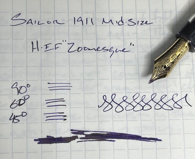
My Sailor 1911 was traded to me last summer for a Namisu Nova. It wrote terribly out of the box. A loupe exposed the problem: one tine was longer than the other. The 1911 is my first Sailor nib to arrive with any sort of problem.
I was inspired to try my hand at grinding the nibs down to the same length during virtual café with a couple of friends this past weekend. Then, I ground down the sides to narrow the stock F nib into an EF. Lastly, I shaped the tipping into a rounded triangle, making a Zoom-esque EF. I’m quite happy with the result!
This week’s collection remains the same as last week’s with two exceptions. I am sticking to only one blue ink this week. I tend to favor blues and teals over earth tones. This will encourage me to reach for more earth tones this week.
And the newly ground Sailor 1911, but with the same Purple Rain as last week. I dig the aesthetics of a purple ink that sheens gold in a pen with gold trim.
Grey/Black

Mythic Aeschylus Black & Red Swirl (EF). Diamine Earl Grey. Earl Grey writes so well in an EF. The shading stands out clearly on Tomoe River paper. And it dries quickly. A short dry time makes Earl Grey well-suited to being a daily driver. Continued task management.

Nakaya Neostandard Heki-tamenuri (B). Birmingham Midnight Twinkle. A great accent combination. I’ve come to like the silver shimmer as headings during reading notes and in my weekly. Journaling, reading notes, task management.
Blue/Teal

TWSBI 580-ALR Prussian Blue (EF/M Predator Hybrid, by Nibgrinder). Rohrer & Klingner Verdigris. This week is the third in a row with this pen and ink combination inked. Verdigris looks fantastic in the narrow EF; and shows off a bit of sheen in the M reverse grind. Lesson plans, journaling, marking student work.
Earth Tones

Monteverde Giant Sequoia Brown (M-SIG). Sailor Rikyu-Cha. I can’t get enough of this combination. The wet feed brings out the green side of Rikyu-cha, which dries to a mellow brown. This pen lays down so much ink that coated paper is simply a requirement. Lesson plans, journaling.

Lamy Safari Petrol (EF). Diamine November Rain. The wet “EF”nib writes more like a M. NR works surprisingly well on absorbent paper. I’ll continue using this combo to take quick notes on post-its and on copy paper at work. Scratch notes, lesson plans, manuscript annotations.
Wild Cards

Visconti Homo Sapiens Silver Age (F). Birmingham Andy Warhol Pop Art Purple. This pairing is firehose-level of wetness. The result offers beautiful shading along the outside of written lines, provided I can wait 30 seconds for my writing to dry. This combo has been relegated to slower writing tasks like journaling and lesson planning notes

Sailor 1911 Mid-Size Gold Demonstrator (EF Zoomesque, by mnmlscholar). Diamine Purple Rain. The nib now has a wet feed and a wonderful EF line. Combined, these traits bring out the most Prince-ly of this purple-gold ink. Pocket notes, accent notes, letters, journaling.
