A quick survey on how we experience wet inks and dry inks

Dr. Nicole Sharp (aka. @aerognome) recently extended an invitation for folks to participate in their new study on how we experience inks as wet and as dry.
I’m including an excerpt of their call to action here because it looks like a fun investigation. It’s a short, direct, and anonymous Google Form.
I filled the survey out, myself. It took me two minutes, all in. Well worth the contribution if I can learn about how folks who live outside of my head experience their inks.
“TL;DR - Fill out my survey here: https://forms.gle/a4EnhKZcjfBWA39CA
As many of you know, I study the physics of fluids, and I've teamed up with a rheologist to look at the characteristics of different fountain pen inks. We'd like to correlate our scientific findings with how people perceive different inks, and, to that end, we've created this survey. We're asking you to rank the listed inks on a scale of 1 (extremely dry) to 10 (extremely wet) based on your own experience. If you've only used one of the inks, that's fine, just rank that one. Used a bunch of them? Awesome, rank them all!
The more FP users we can get info from, the better we can correlate our rheological results with the subjective ones, so please share the link and encourage your pen friends to participate.” — @aerognome
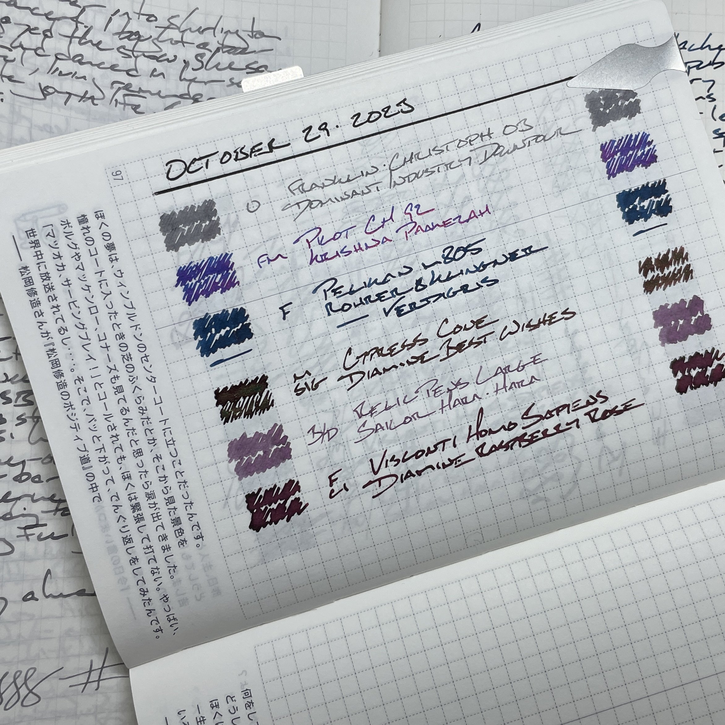
Oh, and my currently inked for the week is split in twain, with three wet inks and three moderately dry inks. Equal opportunity inker.
The Visconti, Cypress and Pelikan all pool their respective inks in rivulets of F and M widths. Such wet writing works best with a patient hand willing to wait a few heartbeats before turning the page.
On the other side, the Franklin-Christoph, Pilot and Relic each offer more moderate ink flow. A drier writer is welcome for writing quickly and for managing tasks without ink smearing. Blink and these lines are safe for page turning.
Grey/Black

Franklin-Christoph 03 Ghost (Utility EF/B, by Monty Winnfield). Dominant Industry Downpour. The Utility nib gives me two favorite line widths: an EF with a B on reverse. Downpour’s mid-tone grey is wet enough to round out the edges of the B side’s italic-ish grind. Business at the regular, play on reverse. The Ghost colorway is fun without flash — excellent for even somber meetings. Task management, meeting notes, lesson plans, reading notes, and journaling.
Blue/Teal
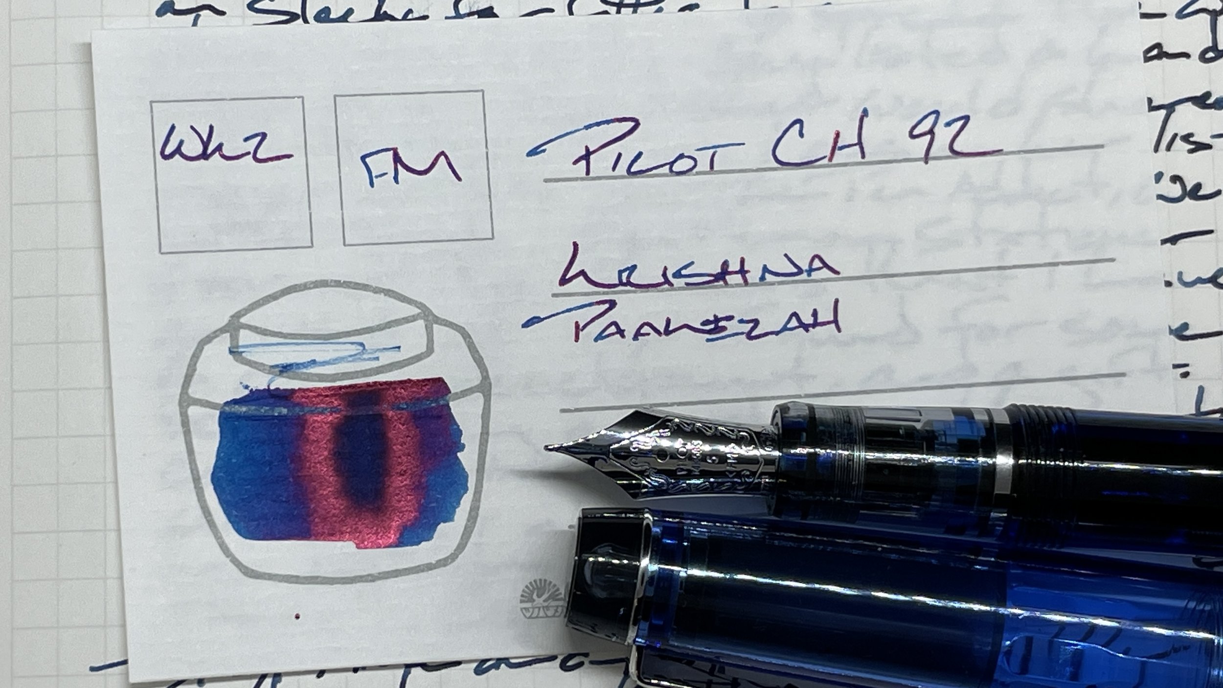
Pilot Custom Heritage 92 Transparent Blue (FM). Krishna Paakezah. Paakezah provides a shock of blue (and red sheen) within an otherwise murky color palette. The FM nib is bouncy and so accommodate odd writing angles, excellent for a pocket carry undertaking scratch notes. Also: journaling, lecture notes, lesson plans, and marking papers.

Pelikan Souverän m805 Demonstrator (F). Rohrer & Klingner Verdigris. It’s rare that I stick with a pen and ink combo for four weeks, like I have with this pair. Consistent low-key shading with infrequent splashes of subtle sheen. Genteel with a farmer’s liver. Teaching reflections, meeting notes, reading notes, lesson plans, and journaling.
Earth Tones

Cypress Cone Micarta (M SIG, by Franklin-Christoph). Diamine Best Wishes. The circular bands of earthy micarta layers leave the Cypress looking elvish. The whimsy combines with the generous M SIG nib to offer an excellent longform writer, especially during creative writing sessions. Journaling, manuscript drafting, and writing story for my D&D campaign. Best Wishes is a dark black-green with brief punches of lighter green shades — all of which dry to show off shimmer. Whimsy-of-the-wisp.
Wild Cards

Relic Pens Large “Fire, Earth & Ocean” (M Bu-di, by Nib Tailor). Sailor Shikiori Hara-hara. Broad swatches of dim-rimmed purple make for excellent highlights over black text, both printed and written. The large pen and #8 nib bring giggles to otherwise staid meeting prep. And the Bu-di’s disciplined EF works great for detailed reading notes and marking papers.

Visconti Homo Sapiens Silver Age (F CI, by Nibsmith). Diamine Raspberry Rose. Ah. The Silver age returns. Rose has grown a smoldering red since first inking. Red is a no-go for marking papers. However, Rose’s infrequent pops of shading and strong haloing lend personality to longform writing of both quick and deliberate paces: journaling, teaching reflections, lesson plans, and reading notes.