A mnml giveaway of Diamine’s Inkvent Calendar

Huzzah, hooray, and happy holiday season. To celebrate, I’m giving away a 2022 Diamine Inkvent Calendar. The so-called Green Edition.
More like a mxml giveaway. Yep. I can hear your eyes roll.
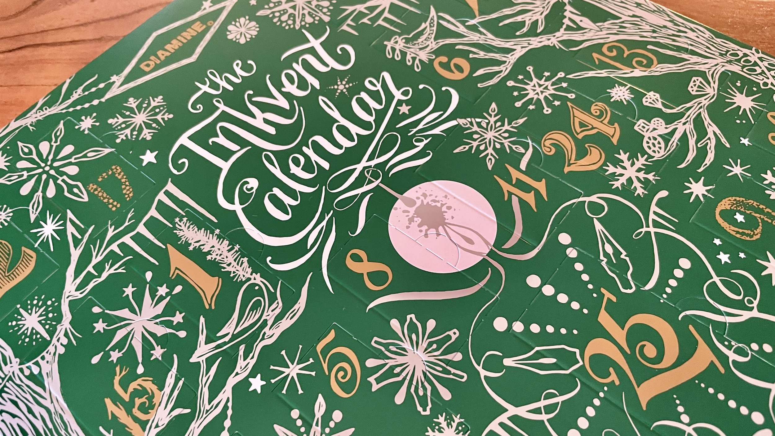
Diamine’s Inkvent calendar is too much, too little, and just right — simultaneously. The inky holiday collection is great all three reasons.
The inkvent is a lot. The packaging is large, fun and involved. There are 25 bottles of ink — 24 small and one full-sized 30 ml bottle. That’s a lot of colorful liquid. Exploring new colors that I might otherwise skip over helps me to both confirm and challenge my preferences. New horizons can arrive in the form of an inkvent.
However, the bottles are quite small. The bottles are too small. Small enough that large pens simply cannot fit inside the bottles for filling. Further, ink levels in the rectangular 12ml bottles become too low for filling through a pen’s nib after half the ink has been drawn out. Both are clear justification for playing with alternative inking methods.
Lastly, the calendar provided a full month of challenges last December. I challenged myself to use only the first six inks in the second week of December. Then only the second six inks during the third week of December. And so on.
The challenge helped me to discover new uses for ink colors I typically shy away from. And reinforced my appreciation for fun ink qualities like sheen.
Too much. Too little. Too right. I can’t wait to start my own calendar.
To enter the giveaway for your own Inkvent calendar, review and follow the details below.
Giveaway details. How. Simply share a comment on this post about one stationery item that brings you joy. Everything from your favorite sticker to your favorite journaling method counts. It simply needs to bring you joy and relate to stationery. Freedom.
Be sure to leave a valid email when prompted by Squarespace’s comment form. The email you provide is my point-of-contact for the winner.
When. Anytime before 11:59 pm (ET) on Friday, November 25, 2022.
Giveaway terms. All entries must be submitted before 11:59 pm EST on Friday, November 25, 2022. Every valid entry must be submitted as a comment on this post, here at mnmlscholar.com.
I’ll announce the winner in a post on this website on Saturday, November 26, 2022.
I use a random number generator to select the winning comment from all valid entries. And I use the email address provided in your comment’s email field to collect your preferred shipping address. I will draw a new giveaway winner if the winner is unable to respond within five days of my initial message.
This giveaway is open to everyone. I’m happy to cover first class shipping via USPS to US addresses. Costs associated with additional shipping options, parcel insurance and international shipping are paid by the winner.
Until then, the rest of this week’s Inked Tines update includes last week’s currently inked writing tools.
Toolset
Pens. This week’s standout pen-and-ink combo is the Parker Vacumatic (F). Compact size led this combo to become my pocket carry. Subtle colorway worked well for long meetings. Blind cap even served as a fidget spinner. And Akkerman’s shading suited meeting notes, reading notes, lesson plan outlines, and even some brainstorming. Oh, and journaling. 3/4 filled.

Nakaya Neostandard (M Naginata-togi) — Feed. Pen of all trades. Ink of fun but fewer trades. The combination proved great for long journaling sessions, lesson plan outlines, teaching reflections, and meeting notes. A handful of scratch notes, too.
Sailor Pro Gear (Z Architect) — Feed. Wide lines with sloshy edges. A fun, edgy writing companion for medium-length journaling sessions, lesson plan outlines, and sheen-heavy lecture notes that need to be viewed from odd angles.
TWSBI 580 (F) — 1/5. Lady Rose is a true accent ink. She works best for personal uses. Scratch notes, reading accents, some paper marking, and one lesson plan outline. All as accent markers.
TWSBI Vac700R (F CSI) — 1/3. Used for targeted, specific tasks: internal meeting notes, lesson plan outlines, and reading notes. Accent pairing extraordinaire.
Lamy Safari (Cv) — 1/3. The ever-fun cursive nib strikes yet again. Toffee grows dry over time in this Lamy feed. As such, this pair requires periodic flooding after two weeks in the pen. Worth it. Lesson plan outlines, lecture notes, accent meeting notes, and journaling.
Jinhao x159 (EF) — 1/2. Clean, disciplined, reliable EF lines. The large soft nib gives subtle control over line thickness and 223’s darkness. Perfect detailed notetaker. Daily driver for task management, meeting notes, reading notes, lesson plan outlines, and some scratch notes.

Notebooks. Work bujo. Odyssey Neptune 400 TR (A5). Sixteen. Sixteen newly added pages to the work bullet journal. Pages 192 to 207 now house scribbles, jottings, logs, and weekly task lists. I have officially journeyed across half of this great notebook’s pages.
The two-page weekly begin my week’s writing. The calendar along the top sports sprightly pink Mildliner to highlight classes set aside for students’ asynchronous workshops. A touch I will repeat in future weeks.
The remainder of my weekly was maintained by the Jinhao’s neat EF nib.

Progress made in the key of Jinhao’s fun #8 nib
Six pages of lesson plan outlines follow. The Z Architect nib in my Sailor Pro Gear proved an excellent choice for the outline that involved a lot of moving around within my classroom. The broad, wet lines brought out the most generous sheen I’ve seen yet from Enchanted Ocean. Readable from a distance.

A little red, a little teal and lot of easy skimming
The TWSBI Vac’s dry Hisoku pairing proved a second standout. Hisoku is well-prepared to serve as an accent color against 223’s mid-to-dark hue.

A lesson on data collection and sampling … using The Missing Piece
Seven more pages are home to meeting notes. Four separate meetings. I relied on a pair of pens for each meeting. I use ink colors and line widths to visually separate one topic from another. And to clearly distinguish detailed notes from my own thoughts or commentary.
The longer I process in analog spaces, the more I’m convinced that combinations matter. And the less convinced I am that there is one perfect combination.

Saturation as separation, for example, worked quite well
Journal. Endless Recorder Regalia in Mountain Snow (A5). I added eight more pages to my personal journal last week. Seven pages of longform reflections. One page of notes from a family call with a doctor.
I tapped the Nakaya for my early-week reflections. It was a free-wheeling brainstorm and organizations of my thoughts and goals for the coming holiday season. An exercise in ensuring my head is facing forward before my calendar explodes with fun gatherings.
CY’s excellent mini Naginata-togi grind offers wide, generous lines at low angles. More disciplined lines arise as my writing angle rises over the course of my writing. Two pages in, I have EF lines on my page. Intention achieved.
My newest pen arrival found its way into three separate entries. Two for longform reflections and a third for a transcription of Nikita Gill’s excellent poem, Gentle Reminder.
The Parker Vacumatic lent the gravity of its long history to my phone call notes. And Akkerman’s blue-black balances well moderate shading (which keeps me focused) and muted cobalt hues (which also prevent distraction). Double-win.
Written dry. All seven pens survived the week intact and writing-ready. Seven inked pens provide me with enough writing options that a second week will be needed to begin writing pens dry.
Newly inked. I misbehaved last week. I misbehaved and I am unapologetic.
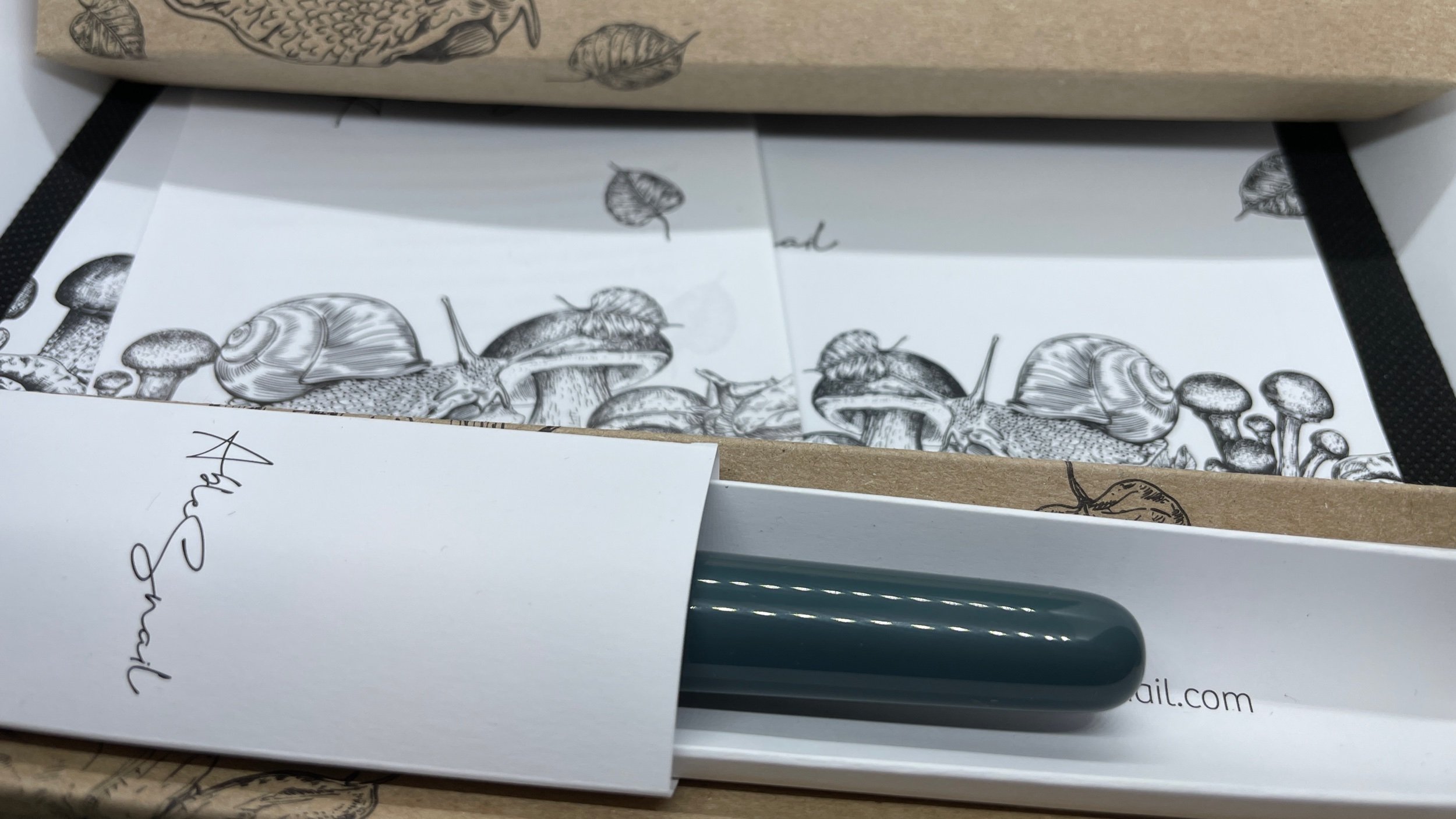
My new pen from Able Snail needed to be inked right away. It was an emergency. A Monday evening demand for inky fingers.

Details on the pen and Able Snail below
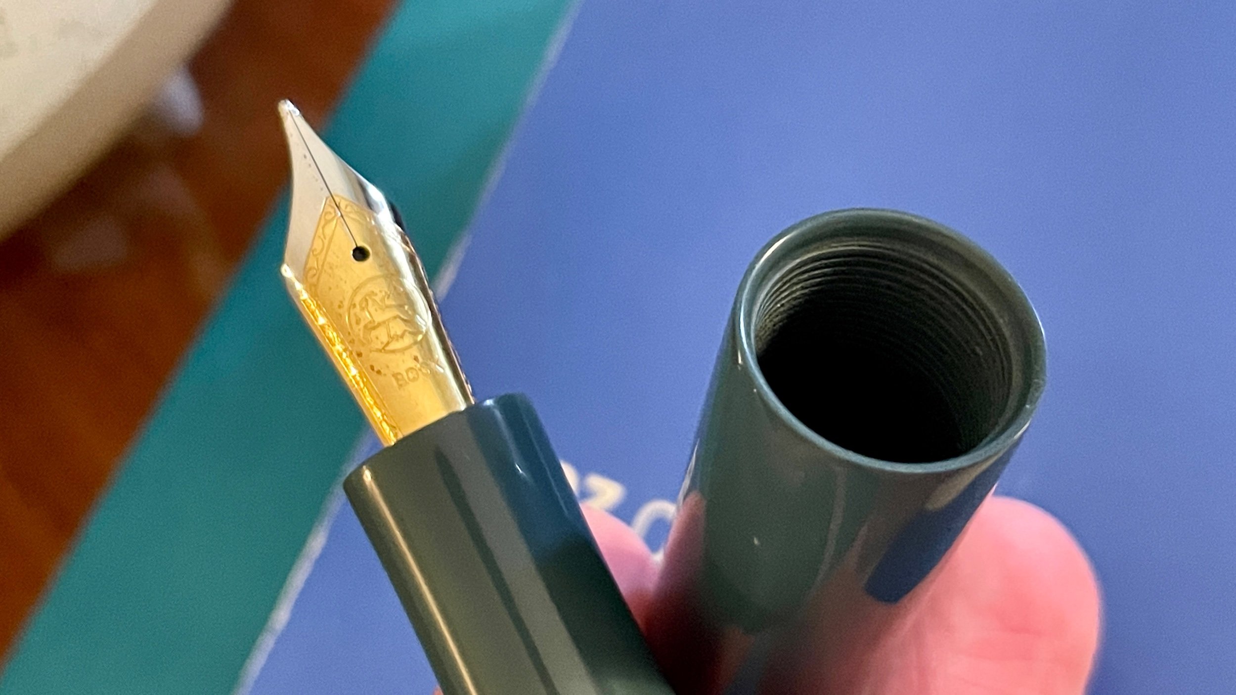
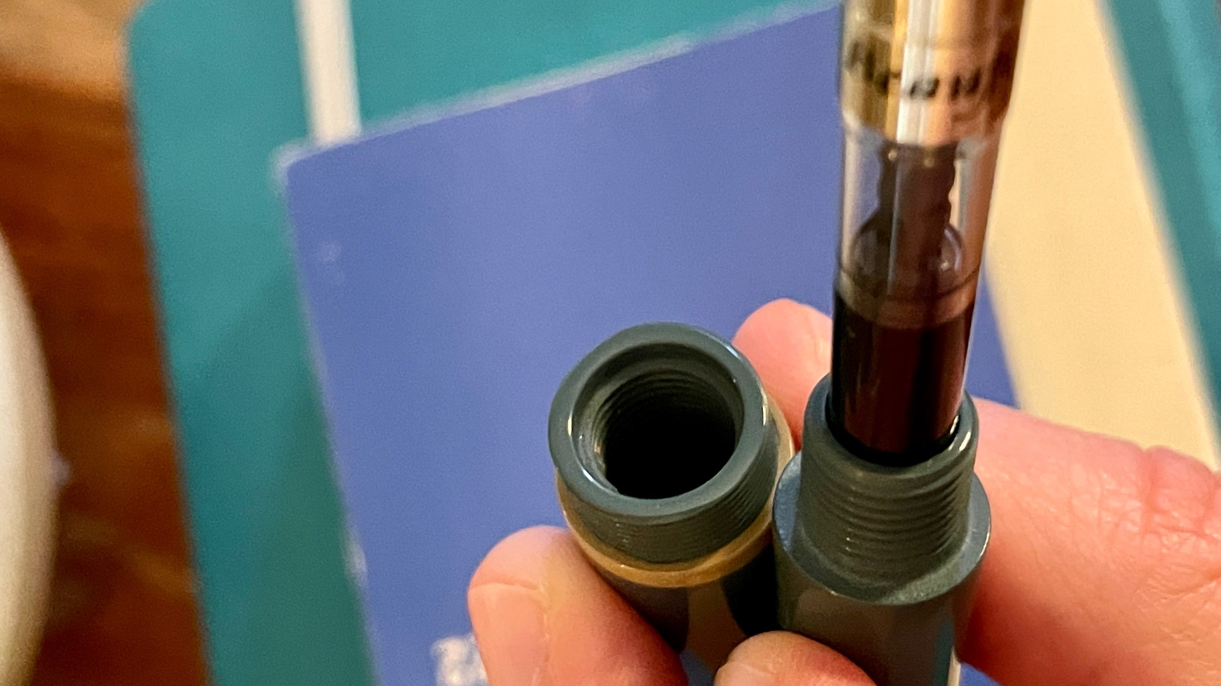
A review of my color palette for last week highlighted an absence of a red or pink accent color. The Able Snail arrived to me with a true-to-size B nib. Wide writing lines opens up my options to murky pinks and purples. Wide, dark lines will still stand out easily against 223’s narrow purple-grey lines.
So: I had options. I opted for a deep wine color that accents both my currently inked palette and the unsaturated pastel blue and sand colorway of the Able Snail.
Robert Oster Napa for a win.
The collection
Incoming / new orders. More words on my Able Snail arrival. Overall, it’s a large, well-executed pen that stands out within my current pen collection.
The excellent branding and packaging drew out a gasp from both my partner and me. A surprise given my usual ambivalence towards packaging. The whole unpacking process was rendered exciting. Like a kid who plays turns the box into a spaceship instead of using the expensive and hard-to-get LEGO set that was in the box.

Earthy. If David the Gnome and Alice in Wonderland started a graphic design company
Able Snail’s colorways sit at the center of my personal aesthetics. Muted tones that accent one another. Earthy, murky colors that direct attention to the details of how the pen is structured. Happy camper.
The Classic is a great size and weight for the kinds of writing I find myself doing most often. Long and medium length sessions. Exploratory and reflective thinking-on-page in which my mind wanders — and the exact angle of a nib to the paper grows foggy.
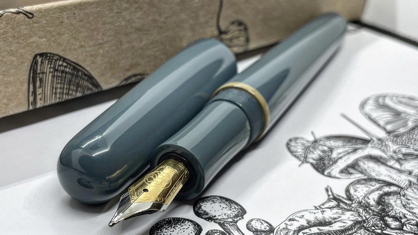
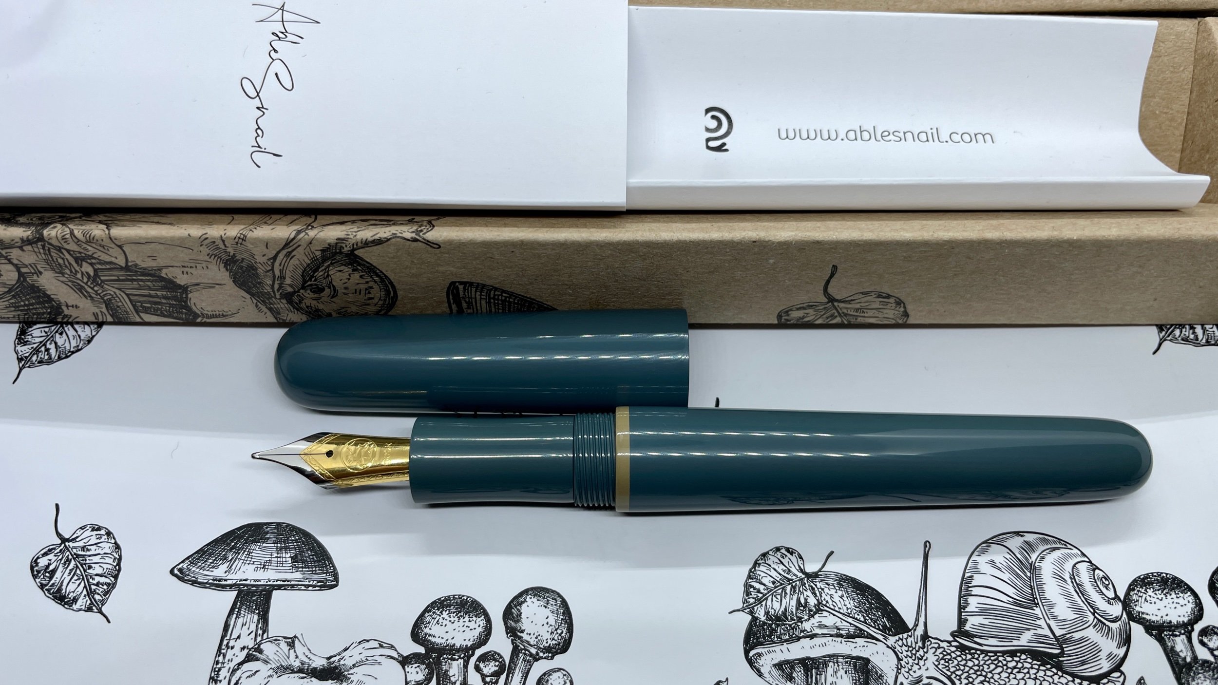
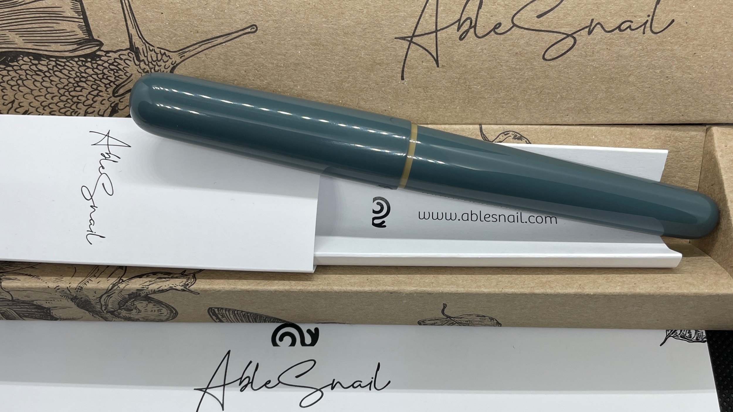
Most telling, for me, is how the details are attended to. The Bock nib was perfectly tuned out of the box — with evidence that Grezgorz at Able Snail saw to the tuning personally.
Every area of contact within the pen is rounded, angled and polished. The threads within the cap are finished. So the threads don’t scratch the body of the pen if I post the Snail.
The interior of the cap follows suit with a polished taper that prevents the cap from scratching the sand accent band above the section. Even the point of contact where the section and the body touch is rounded and polished. Muah.
I’m excited and happy with my new pen day. Time will tell to what extent the Snail grows into a continued “good” purchase.
Outgoing / trades or sales. Progress. Sweet, heart-warming re-homing of a sturdy, pretty pen. A pen my summer review highlighted sat un-inked in my pen tray far more often than I reached for it.
I sold my Faber-Castell Ondoro to a member of my local pen group. Faber-Castell’s steel nibs are excellent, stiff writers. Perfect for those who write with rollerball pressure or are worried about splaying their fountain pen nibs. Faber-Castell’s nibs will withstand nearly any abuse.
And their high-end steel nibbed pens, like the Ondoro, are sturdy with an art-deco flair. Stylish bonus.
Currently reading and listening
Fiction. I continued onward with my forway into Bill McCurry’s Death’s Collector series. Another 192 iPhone-sized pages.
Bib, the main character, is dark and sarcastic. I initially disliked Bib. His masculinist worldview made him challenging to root for. However, his character opens up. Let’s down his walls with the reader. And Bib eventually reveals the good person he yearns to be. He is, 200 pages in, beginning to try on those feels.
As an optimist, I am rooting for him to continue growing. To live his stated values more directly. Aren’t we all.
Nonfiction. My nonfiction reading time was a continued rarity last week. Looking back at my past three weeks of reflections reveals a growing pattern. I will need to intentionally disrupt the cycle.
My lesson: next week needs some scheduled reading times. And with a holiday break from work next week, I have my opportunity to do so. Silver lining.
Music. Sigur Rós recently released a remastered version of my favorite album by them: (). Also known as the “Untitled” album. Complete with alternate versions of four tracks.
A metal band’s energy. The balance and arrangements of classical symphony. And an ability to facilitate focus akin to the best of lo-fi. I can’t encourage you to try Sigur Rós on enough.
Plus, Jónsi plays his guitar with a cello bow. Cool. Well, cool to me.