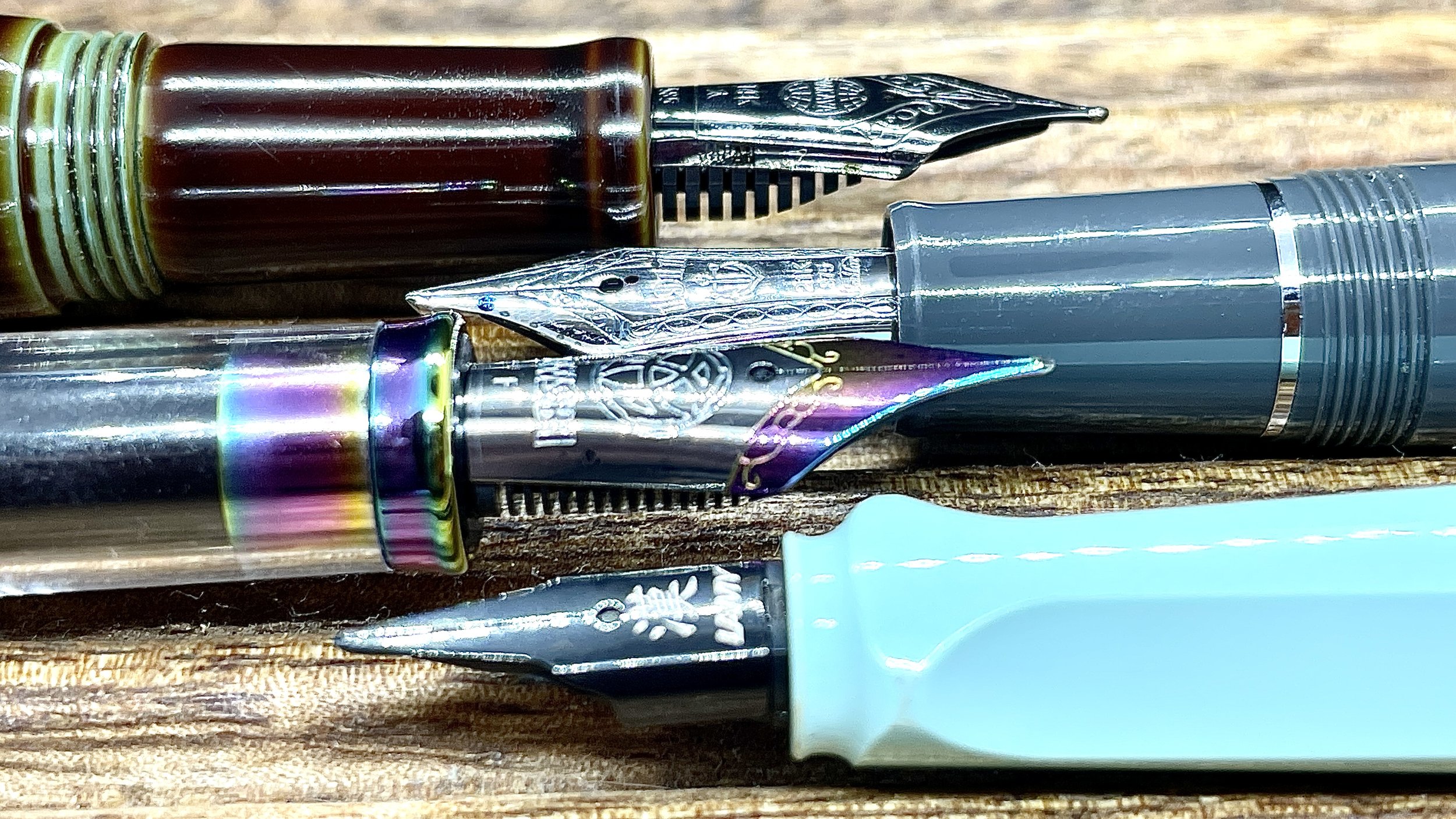
Writing with an edge and an angle

Four ground nibs sit in my Franklin-Christoph penvelope. Two sharp grinds offer accent blues for slow, methodical writing tasks. I chose to spread the love, so to speak, and kit out one broad line (Zoom Architect) and another fine line (F CSI). Happy writers while held level with the page. Sharp once rotated away or towards me. Use as directed.
Another two ground nibs offer more forgiving writing-angle tolerances. Tokyo Station Pens’ excellent Naginata-togi grind opens my beloved Nakaya up to all sorts of writing tasks. Low angles offer the same M-B line widths the Nakaya B nib was designed to produce. Middling angles produce a F — which works for routine information writing and meeting notes. High angles and reverse lay out neat, disciplined EF lines. The detail-oriented work that dominates heavy lesson-planning weeks. Take that, lesson planning.
Lastly, Lamy’s seriously fabulous cursive nib continues on in my Blue Macaron. Toffee and the cursive nib are life partners. Toffee is lubricated enough to ensure a smooth writing experience. Feedback without snagging on paper threads. And the cursive nib brings out Toffee’s shading. A dig a nib-ink pairing that brings out the best of both parties.
This week is all about nib shape to accommodate writing, both personal and professional. And both quick jottings and slow, thoughtful reflections. A septet to carry my writing into the coming weekend’s Pelikan Hub.
Grey/Black
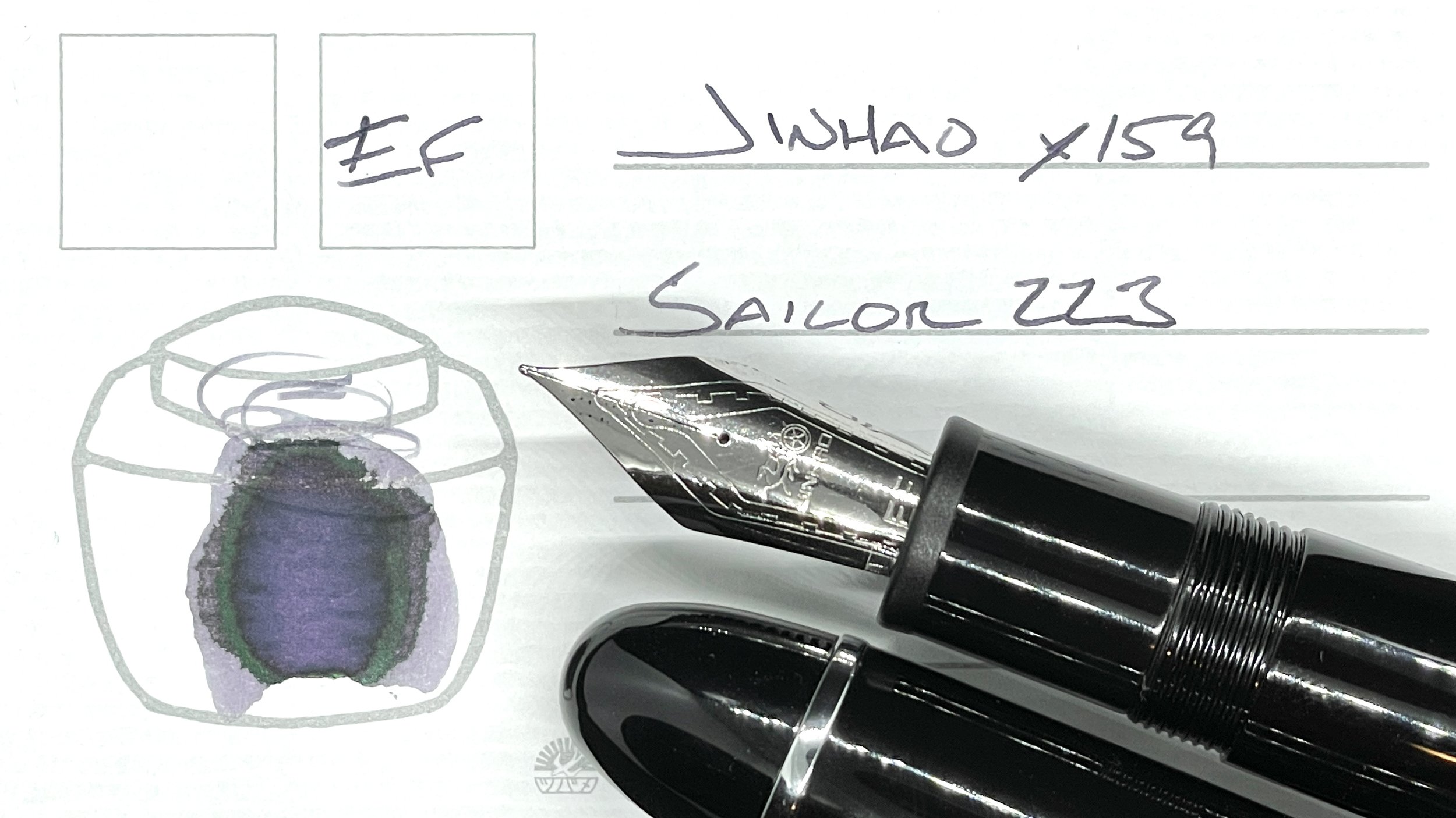
Jinhao x159 Black (EF). Sailor Ink Studio 223. A number eight sized nib for fewer than ten dollars. An EF nib that arrived to me perfectly tuned. And EF nib that produces a consistent European-width EF line — sans hard starts or burping. The best daily driver is a no-fuss daily driver. My — immense — task management combo: Hobonichi calendar, teaching weekly, meeting notes, lesson plans, and scratch notes.
Blue/Teal

Sailor Pro Gear Graphite Lighthouse (Z Architect, by Custom Nib Studio). Diamine Enchanted Ocean. Enchanted Ocean’s sheen will be useful in the lecture notes I need to sketch out for my research class. Running students through designing methodology demands easily-viewed reference notes on sampling and bias management techniques. I swapped a Zoom Architect nib into the Pro Gear to ensure Ocean’s sheen is prominent enough to render my squiggles readable. Lecture notes, lesson plans, journaling, and pocket notes. Also: this pair is my pocket carry for the week.
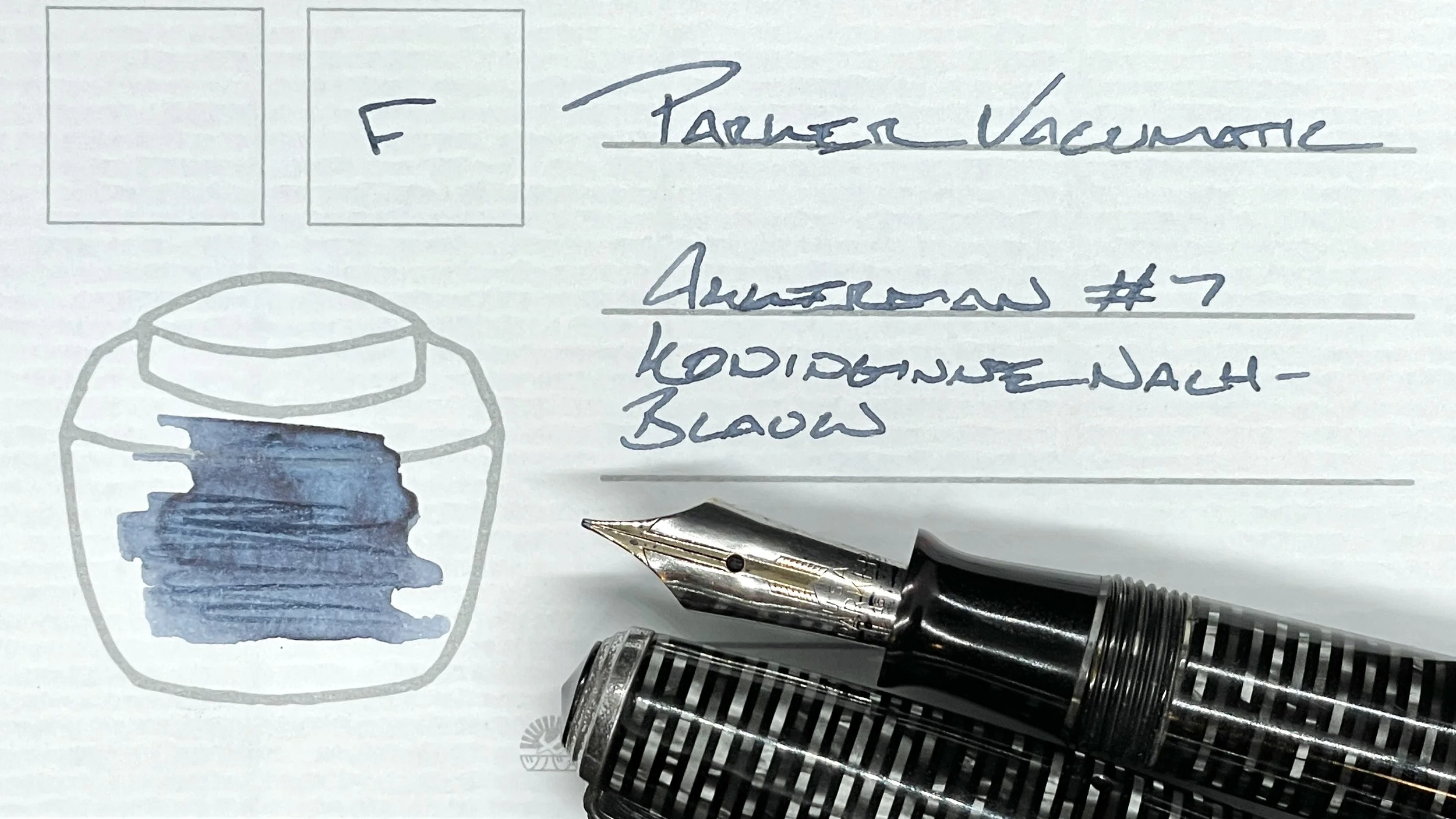
Parker Vacumatic Silver Pearl (F). Akkerman Koninginne Nach-Blauw, 7. Akkerman’s steady blue-grey offers a fun alternative ink color for detailed reading notes, lesson plans, and meeting notes. All without adding distracting color to my notebook pages. My primary meeting notetaking. The professional Silver Pearl colorway easily fits in at a meeting table. No distractions for others either. Winning.

TWSBI Vac700R Iris (F CSI, by Pen Realm). Kyo-no-oto Hisoku. A dry combination. Dry by choice. Hisoku resorts to a dusty blue-teal at its driest. Dusty blue works great as an accent color against 223, and Koninginne, and Ocean’s murky teal. Triply varied uses as an accent notetaker. And journaling because the CSI grind is fun on a stick.
Earth Tones
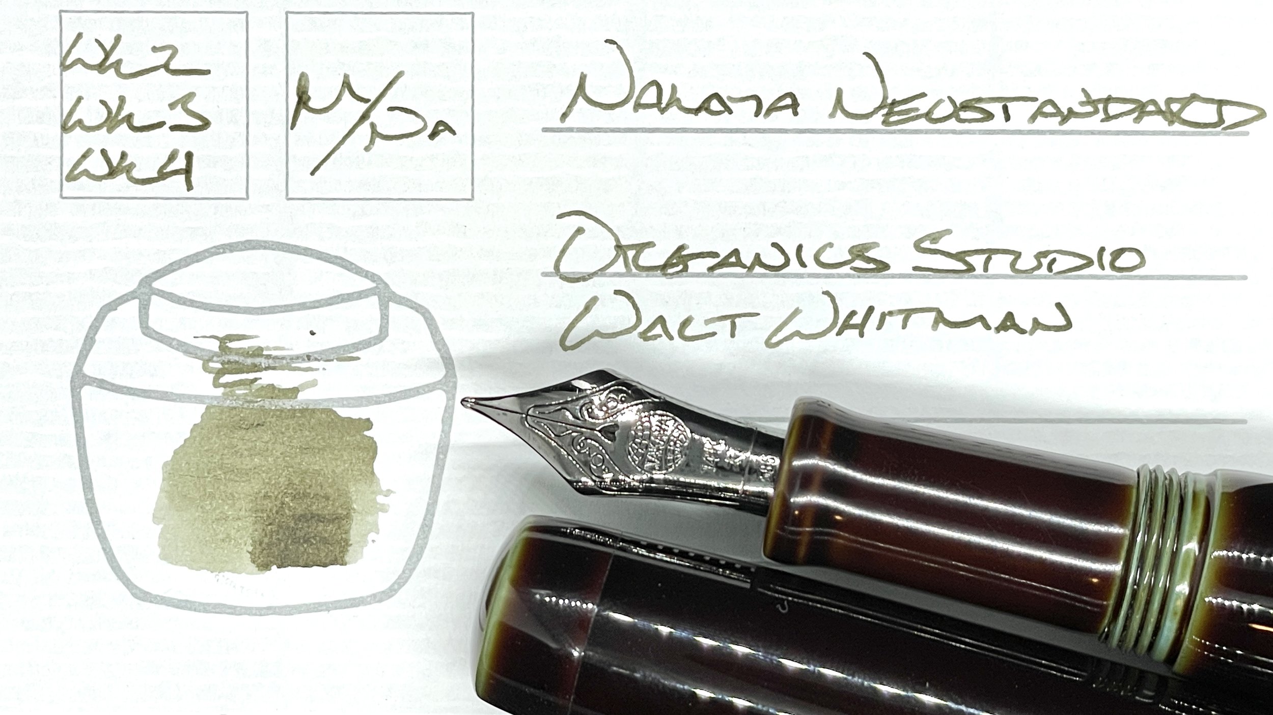
Nakaya Neostandard Heki-tamenuri (M Naginata-togi, by Tokyo Station Pens). Organics Studio Walt Whitman Leaves of Grass Dark Green. Whitman sits in a happy medium for me. Dark green where it shades, which suits lesson plans, reflections, journal entries and even grading. Whitman is also a light, dusty yellow-green where it runs thin at the beginnings of letters. This suits accent notes — especially while reading. And especially-especially while making notes on absorbent papers.
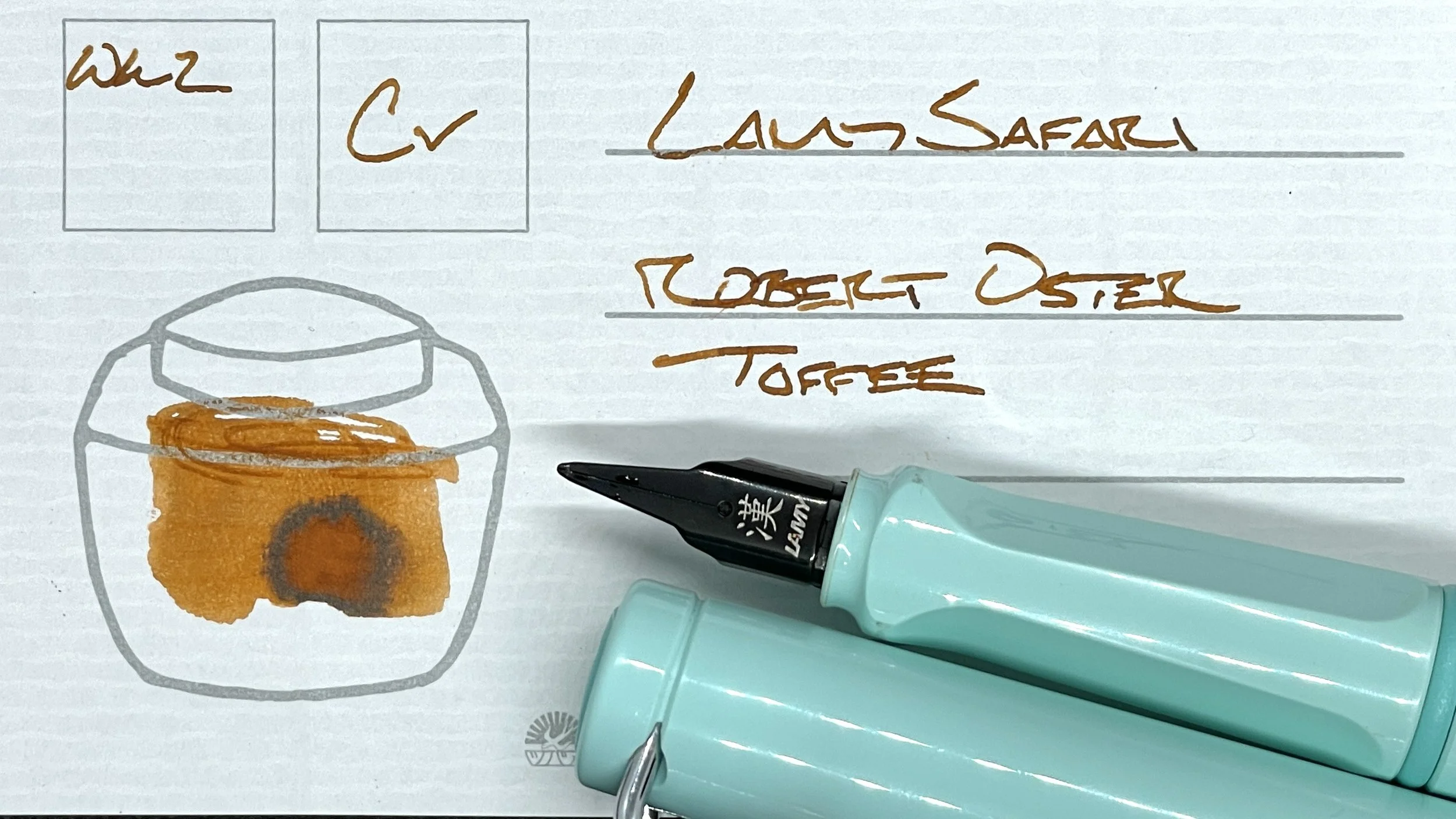
Lamy Safari Blue Macaron (Cv). Robert Oster Toffee. A hall of fame pairing for my shading-loving heart. The Cv nib is soft, which lends a surprising spring to longform writing tasks like journaling, teaching reflections, and letter writing. The narrow F-width lines also suit accent notetaking while reading and while highlighting new tasks during meetings.
Wild Cards

TWSBI 580 Smoke RoseGold II (F). Ferris Wheel Press Lady Rose. Lady Rose is a particularly soft, whispy ink. My self-modified F nib keeps lines narrow, approaching Sailor’s MF line width. I like this pair for accent notes and reading notes. I particularly enjoy this pair for scratch notes. The reason is purely subjective. I inexplicably dig whispy pink scribbles while thinking through half-formed ideas. My brainstorming combo this week.
