EF nibs and accent colors for an asymmetrical work week


I rely on a small assortment of six pens this week. One grey ink in a large capacity Vac700. Blue Guitar adds a lovely pop for accent notes and lesson plans. Two earth tones geared for poor paper. And the rocking pop of Andy Warhol purple for accent work.
There is a decided lack of symmetry in my color selections. The first half of the week will be reading heavy. Accent colors that stand out from my usual muted palette make reading notes more easily referenced. So: bright blue, purple and orange are all in the pen tray.
Also of note this week is the combination of nib choices. My daily driver pen is a ground F. I usually lean on an EF for task management. The wider lines may prove cumbersome, but change keeps me motivated.
Three nibs are ground, two to italics and one to a multipurpose EF and M. The remainder are round F and EF nibs. Not a B in the bunch. I anticipate a lot of curriculum planning this week. The narrow line widths will keep my handwriting clear on the 3.7 mm grid of my work notebook.
Grey/Black

TWSBI Vac700R Iris (F CSI, by Pen Realm). KOBE Kaigan Stone Grey, 31. I dig mixing a wild pen design with understated ink; and the inverse. The CSI (cursive smooth italic) is forgiving enough for quick writing. This week is an experiment: will the F provide a narrow enough line for managing tasks in my 3.7mm Hobonichi grid?
Blue/Teal

TWSBI 580-ALR Prussian Blue (EF/M Hybrid Predator, by Nibgrinder). Rohrer & Klingner Verdigris. This week may be the final week for this pairing. My focus is using this combo for lesson plans and meetings. Pocket carry.

Franklin-Christoph 46 Philly 2020 (F CI, by Masuyama). Troublemaker Blue Guitar. The sharp CI is best saved for slow writing activities like journaling and taking reading notes. The bright blue will work well as a fun accent color in reading notes. Lesson plans, reading notes, journaling.
Earth Tones
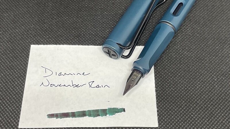
Lamy Safari Petrol (EF). Diamine November Rain. I intended to use this combo for lesson planning notes. NR is a muted pink on Tomoe River paper. It will add fun flair to my curriculum planning. Lesson plans, journaling, scratch notes.

Diplomat Aero Sunset Orange (EF). Ferris Wheel Press Pumpkin Patch. I far prefer orange to red when marking papers. I also enjoy orange when editing manuscripts. Orange is legible and easy scannable. The combo is dry in this EF Diplomat feed. Even absorbent copy paper should be brought to heel. Marking, editing manuscripts, lesson plans, journaling.
Wild Cards
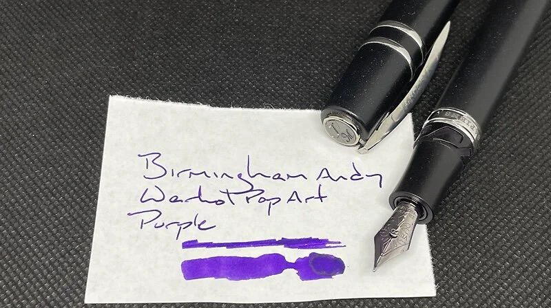
Visconti Homo Sapiens Silver Age (F). Birmingham Andy Warhol Pop Art Purple. My primary reading notes accenting pen. And its wet lines are great for journaling on slow nights when I can wait for AW to dry before turning the page. Reading notes, journaling, lesson plans.
