Inking three long-ignored pens


I asked my spouse to suggest a name for my color palette this week. They said, “clouds or something stormy.” I can see where the palette evokes clouds and storms. We’re going with ‘seafoam storm.’ For the first time in a while, I have only one earth tone inked. Cool blues and purples take the day.
Most of my work this week involves sketching out lecture notes and other process writing — which only I see. And my writing will happen entirely on fountain pen friendly paper. Together: I can choose broader nibs and potentially troublesome pairings without inviting too much headache. And experimenting is fun.
This week’s total is seven pens. Two are Japanese, neither of which has seen ink in a while: a special edition Sailor profit for Nagasawa and a grey Pilot Kakuno. Both are M nibs. The Nagasawa is a true Japanese-width MF. The Kakuno runs wider, like a European M.

The many faces of M
Another is a gift that I’m inking for the first time: a metal AG Spalding & Bros. in M. It’s outside of my recent preferences in pens, but gifts should be honored. The remaining four are holdovers from last week.
Grey/Black
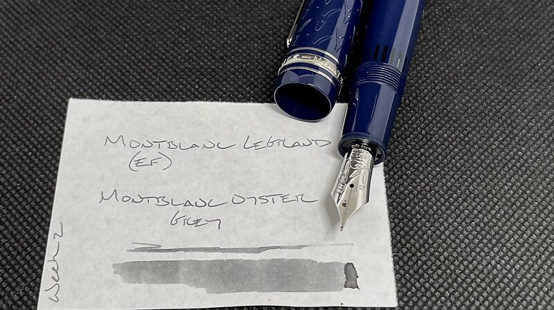
Montblanc LeGrand Le Petit Prince and Fox (EF). Montblanc Oyster Grey. Daily driver. EF is my preferred nib size for managing tasks in a 3.7 mm grid. The feed dried out on me twice last week. More consistent use as my only task management combo this week may prevent that problem from repeating.
Blue/Teal

Kaweco Classic Sport Blue (BB). Diamine Smoke on the Water. This pair continues to struggle with hard starts. Waiting for the capillary action to restart makes this combo ill-suited for taking quick notes. I’m relegating the Kaweco to slower writing like journaling and lesson planning.

Nagasawa Profit Black Proske (H-MF). Papier Plume No. 13. These two were made for one another. 13 is a light, dusty teal in Sailor’s MF nib. I intend to try this combo as an accent color on my weekly spread. Accent notes, task management, reading notes, lesson plans.

AG Spalding & Bros. BRFT253 (M). Diamine Aurora Borealis. The 253 is a generous M. The wet feed brings out the darkest aspects of Aurora. This combo is so wet it will need coated paper to prevent ghosting. Dries surprisingly quickly. Meeting notes, accent notes, lesson plans, journaling.
Earth Tones
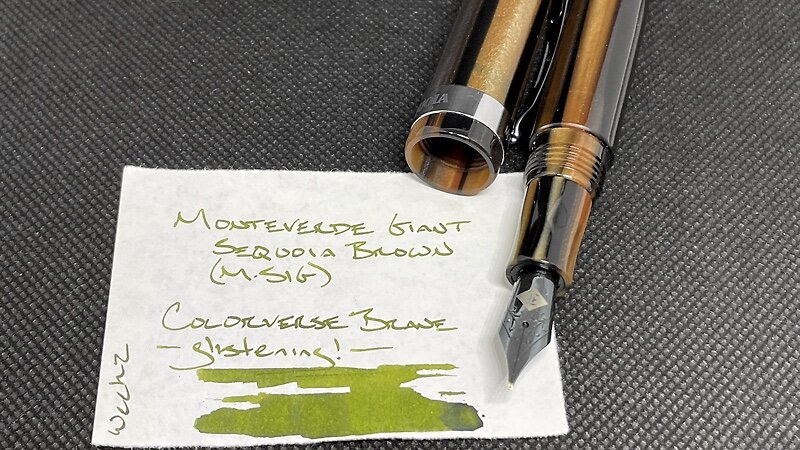
Monteverde Giant Sequoia Brown (M-SIG, by Franklin-Christoph). Colorverse Brane Glistening. An outstanding pair. This SIG nib is the smoothest I recall with Brane in it. I will be brave and try this sharp nib during meetings this week. Journaling, meeting notes.
Wild Cards

Pelikan m805 Stresemann Anthracite (F Architect, by Custom Nib Studio). Sailor Shikiori Yozakura. Yozakura is one of my favorite inks: a dusty pink with dark shading. Fantastic accent color that remains easy to read at a distance. And the multitasker nib makes the combo useful as a pocket carry. So: scratch notes, lesson plans, accent reading notes, meeting notes.

Pilot Kakuno Grey Smiley (M). Noodler’s Purple Wampum. The darkness of this combo suits subdued accenting in lecture notes. This is also my accent pen for headings during meetings. Accent notes, meeting notes, journaling, lesson plans.
All in the family


Smile, you read it all