A tweak, a tuck, and a newly engraved nib
Slight tweaks tailor last week’s currently inked — which was chosen by my good friend, BF — for the upcoming heavy-hitting work week.
The first change is swapping out the Visconti. The feed and Franklin-Christoph’s Honeycomb proved too wet of a combination for even my Tomoe River. I have student papers rolling in this coming week. As such, I will be better served with dry writers that can navigate the variety of often-absorbent papers I will be marking. And I have five of those already inked.
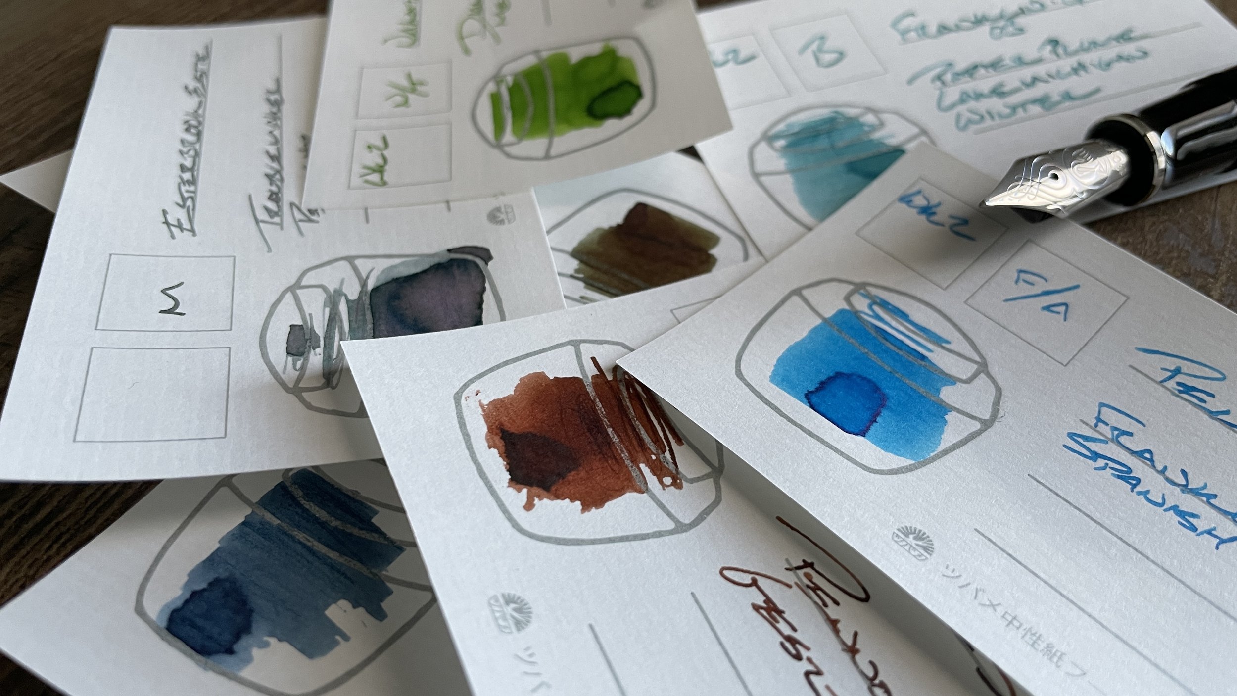
Five of last week’s pen-and-ink pairings write narrowly enough to serve as reliable detailed notetakers and planners. Three EFs, a European F, and a Japanese M. The Blues, Rikyu-cha, and Gesztenyebarna offer colors muted enough to carry content. The remaining two, Spanish Blue and Meadow, shout brightly as accents over the top of the other three. Easily seen in margins and as boxes around the other pens’ lines.
That leaves the Franklin-Christoph 03’s B nib as my sole wide-line writer. Workable during a week I anticipate will involve hours of detailed handwriting — on papers, my own curricular drafts, and in reading notes.

The new swirly nib at the topmost keystone spot
I also have a new M nib from Able Snail. I installed the nib into my Esterbrook Estie Raven. The all black colorway leaves Able Snail’s wonderfully detailed engraving center stage: the only silver object on the pen. I chose a similarly intricate ink in Troublemaker’s Petrichor to compliment.
Grey/Black
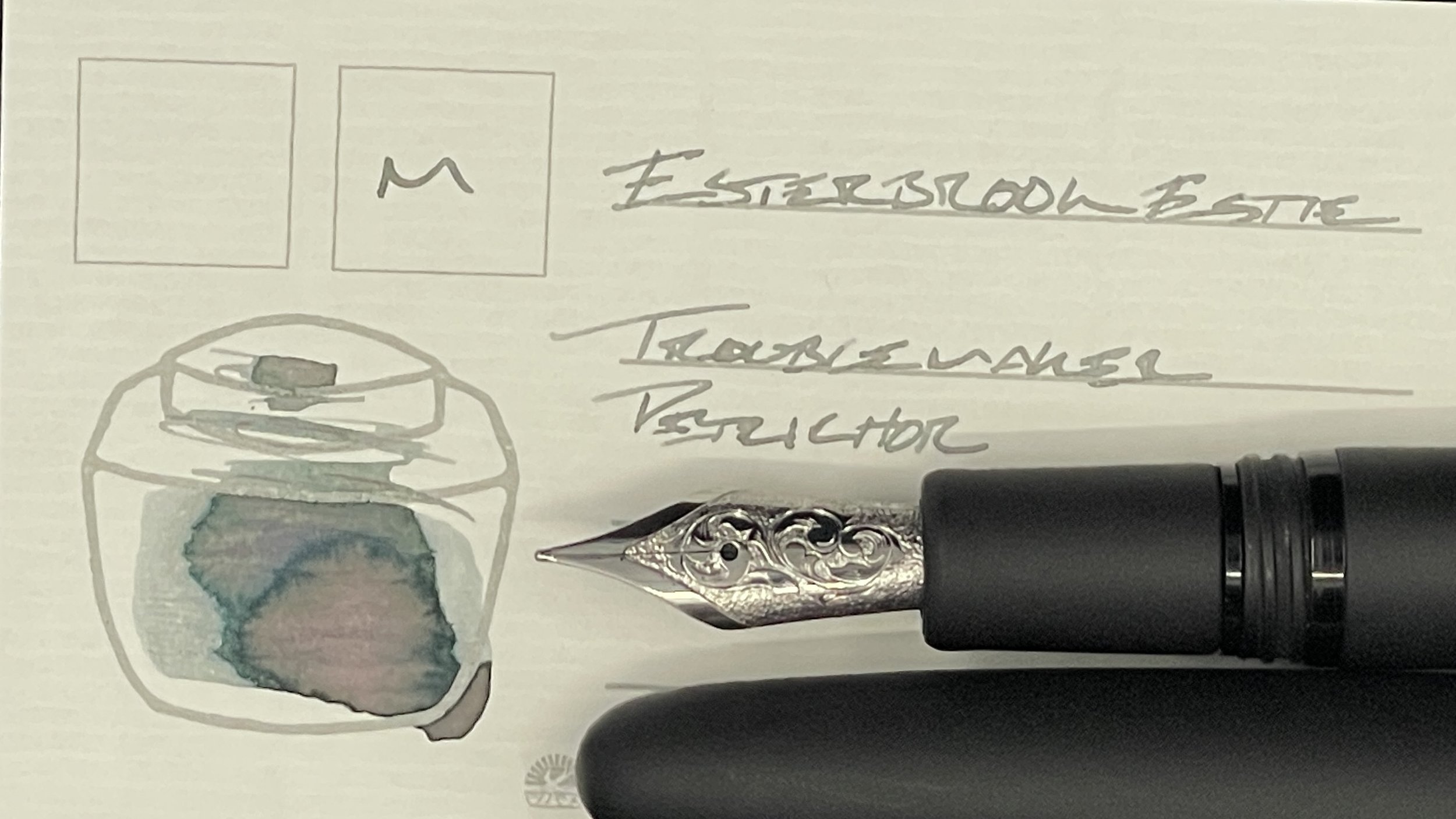
Esterbrook Estie Raven (M). Troublemaker Petrichor. The M nib on my new Able Snail engraved nib produces a disciplined FM line. A fence-sitter between narrow detailed letterforms and forgiving broad lines. Petrichor dries to a light grey with a watercolor wash of pink and purple undertones. The Raven’s all-black colorway will fit in well during administrative meetings, too. A wide daily driver that can produce hairline EF lines on the reverse when needed.
Blue/Teal
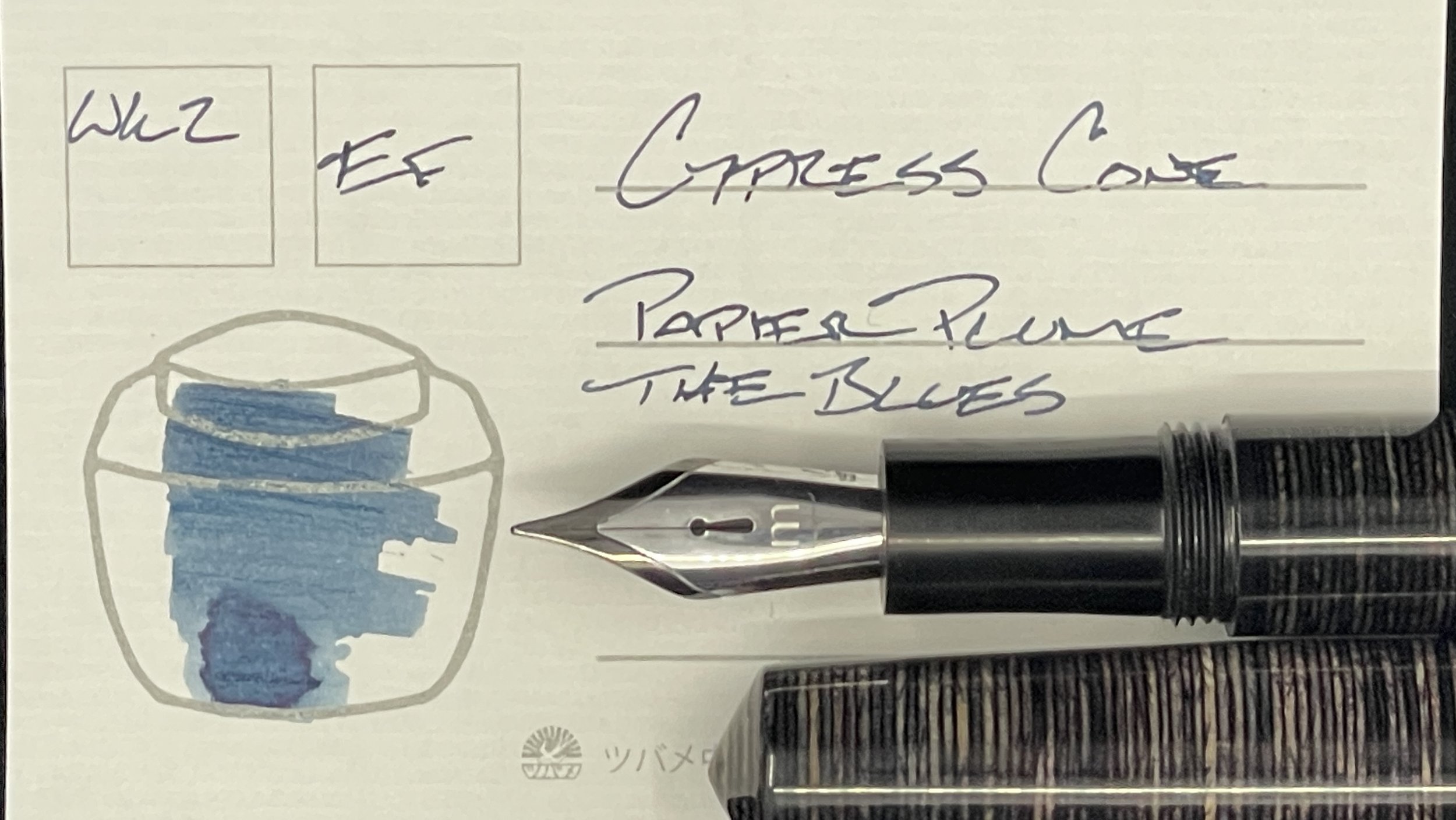
Mr. Cypress Cone Micarta (EF). Papier Plume The Blues. The dark denim of Blues proved muted enough to serve well during list-making, notetaking, and scribbling that benefited from precision letters and few distractions. The EF nib doubled-down on all three. Continuing on this week: meeting notes, lesson plans, project tracking, curriculum planning, and D&D notes.
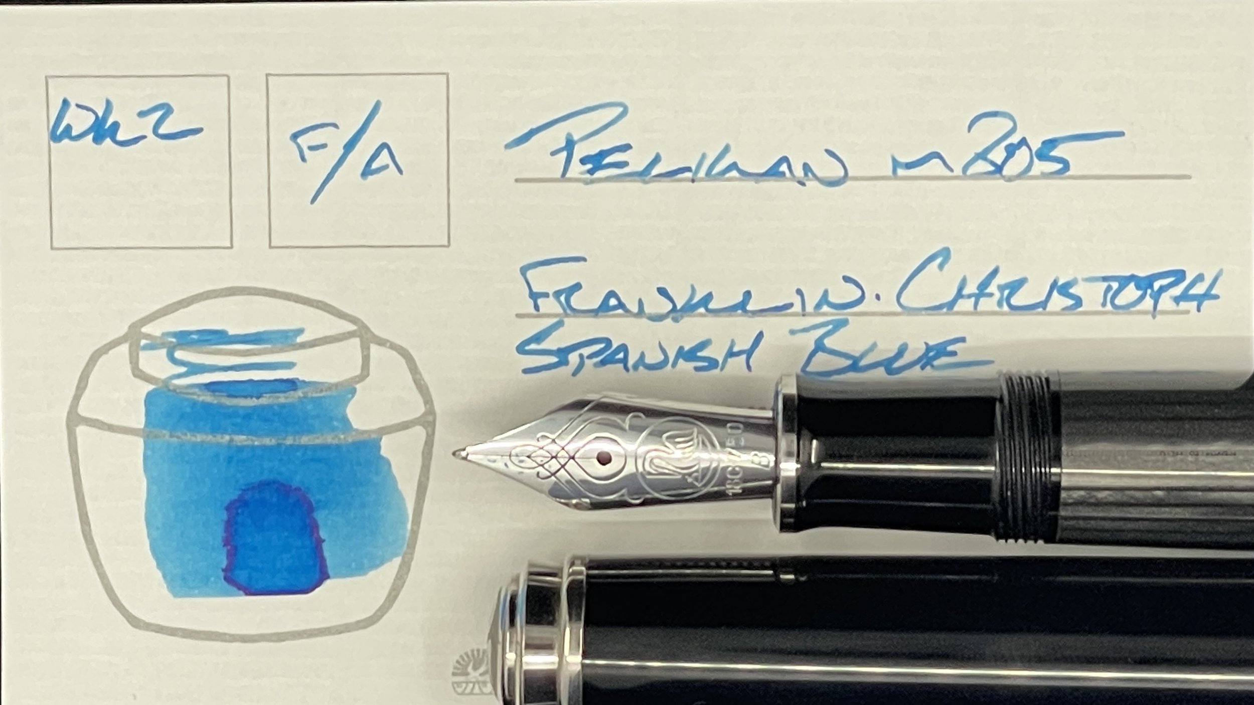
Pelikan m805 Stresemann Anthracite (F Architect, by Custom Nib Studio). Franklin-Christoph Spanish Blue. The pair of Spanish Blue and Architect are made for one another, creating lovely line variation with a smooth writing feel. Best of all worlds. I’m leaning into the 805’s sizable section, which is comfortable over long writing sessions. This pair is targeted for mid-length and long reflection work: teaching reflections, journaling, creative writing, reading notes, and some lesson plans.

Franklin-Christoph 03 Ghost (B). Papier Plume Lake Michigan Winter. The B nib proved useful while sketching out teaching notes (diagrams and concept maps) alongside my students last week. This pair will keep on keeping on as my go-to scrawler during tutoring sessions, journaling, and accenting work against meeting and reading notes.
Earth Tones

Kaweco Skyline Sport Fox (EF). Sailor Jentle Rikyu-cha. The dry combination of EF feed and Rikyu-cha were excellent at creating clear, unsmeared tasks. The same characteristics render this pair suited to margin notes and reading notes as the dry combo minimizes feathering and spreading on soft, absorbent copy papers. Also: this is my pocket carry for the week given Kaweco’s easily pocketable design.
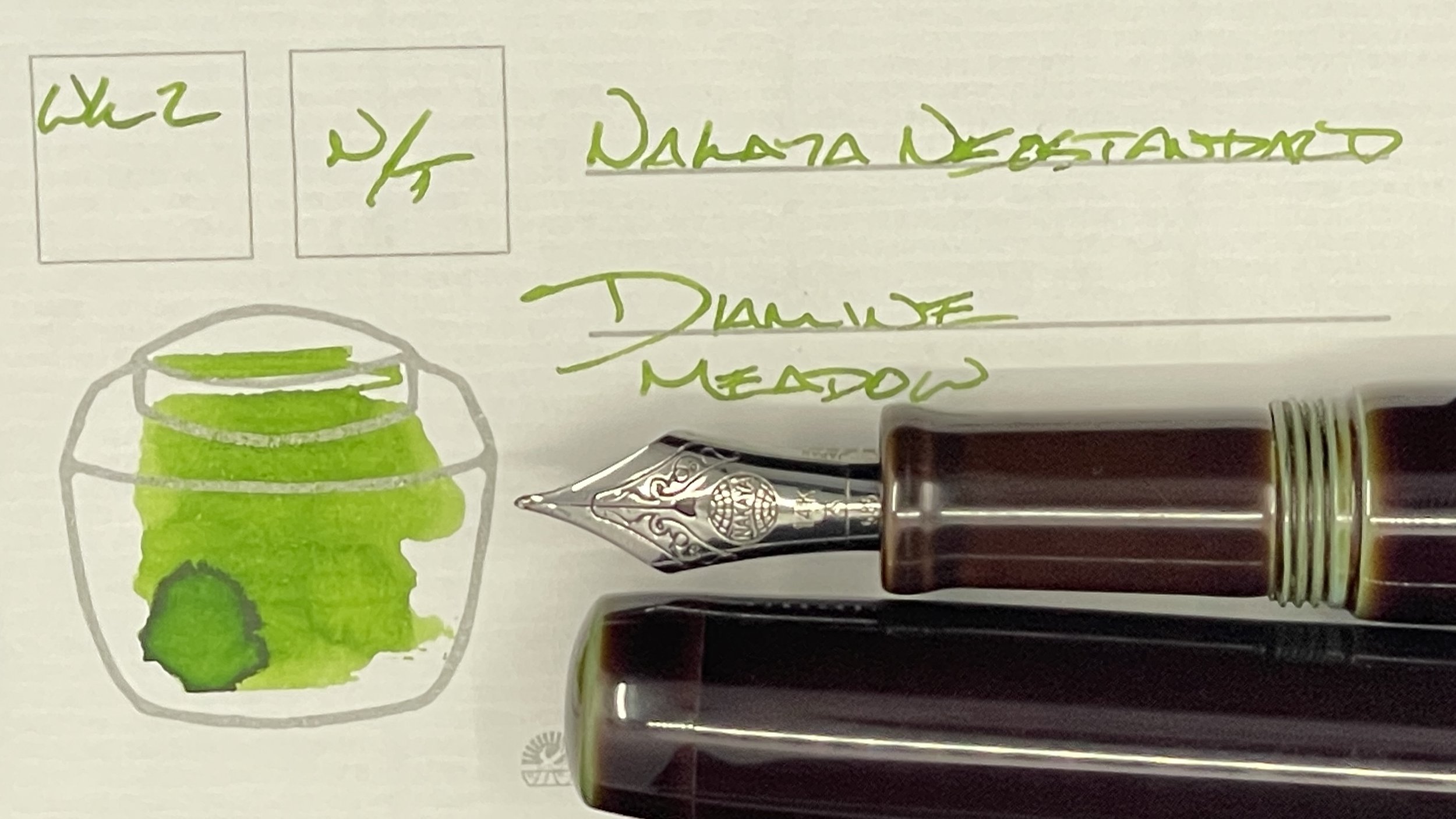
Nakaya Neostandard Heki-tamenuri (M Naginata-togi, by Tokyo Station Pens). Diamine Meadow. Meadow is this week’s second ink well-suited to accenting notes. The disciplined M grind suggests the pair would also serve well marking student papers and editing my own writing. Meadow’s bright green is easily legible against blank printed ink and this week’s muted palette. Also: journaling, D&D notes, and reading notes.

Able Snail Classic Powder Blue (EF). Pennonia Gesztenyebarna. The shading the wet Bock EF nib and Gesztenyebarna produce is top level. The titanium nib’s earthy feedback keeps me focused — a tactile reward while writing. I like this pairing for longform writing: journaling, creative writing, nonfiction drafting, and teaching reflections. Detailed thoughtful work would also benefit from sportingly shaded narrow lines: curriculum planning, lesson plans, and D&D notes.
Wild Cards
… crickets …
