A six-pen repeat with aspirations of empty pens

I find myself continually drawn back to my desk. The six pens I inked last week continue to soldier on, holding my interest. Solid justification to write on with last week’s sextet.
A week of writing taught me how I might better allocate each of the pens. So while last week’s six carry on, they carry on with revised duties. How formal of me.
And excitingly, three pens enter this week nearing empty. Longform writing aplenty rests on my horizon. And I know that I am distractable during long self-reflective writing sessions. Experiencing the success of writing a pen empty should motivate me to keep on.
Sticking to. Emptying pens. And enjoying the mini challenge of it all.
Grey/Black

Franklin-Christoph 03 Antique Glass (EF). Sailor Ink Studio 223. An EF with a playful multi-shading grey ink makes routine, targeted writing tasks enjoyable. And enjoyable tasks are more likely to get done-did. My custom nib has no-nonsense EF tipping. Perfect for reliable, precise task management, reading notes, and commonplace notes. 223 brings a little party to my business-forward daily driver.
Blue/Teal

Nahvalur Nautilus Caldera Sea (BBG, by J.J. Lax Pen Co.). Colorverse Warped Passages. Warped Passages’ denim blue shades strongly. The BBG grind on this Nautilus ensures shading throughout each word. Steady, prominent shading keeps long writing sessions exciting. And Passages’ bright blue hue accents the moody 223 well. Journaling, reading reflections, letter writing, manuscript drafting.
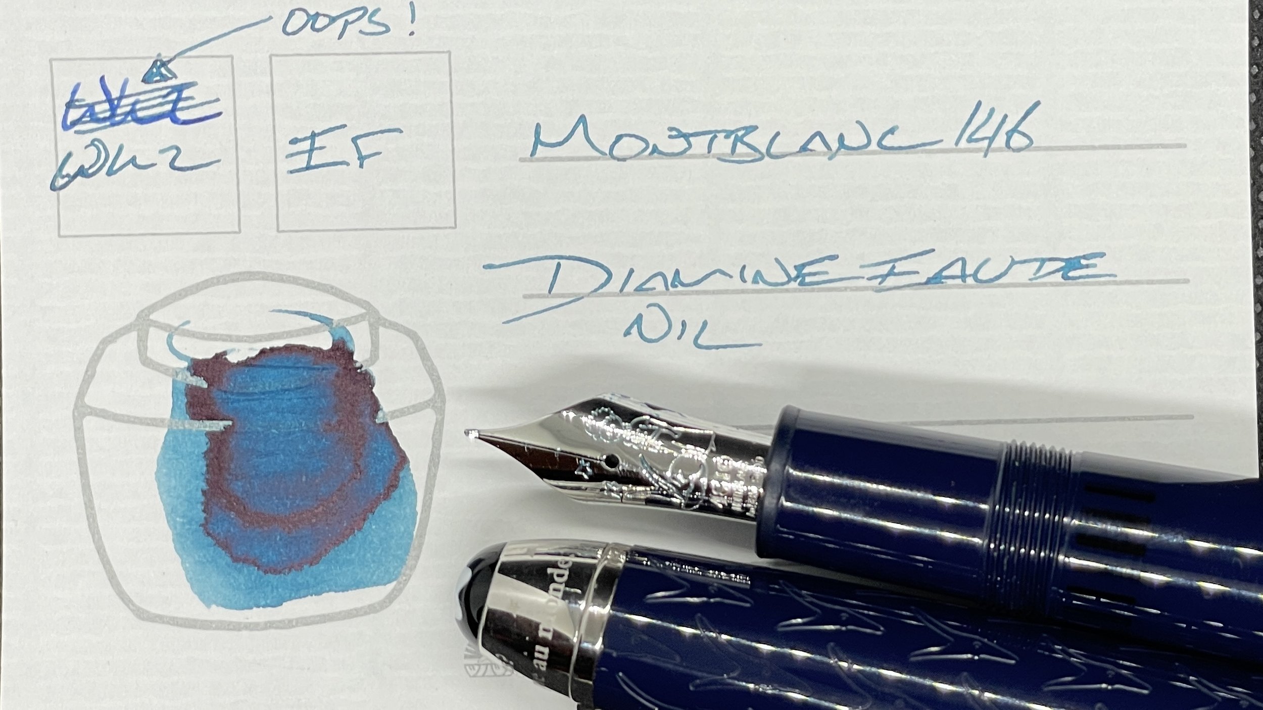
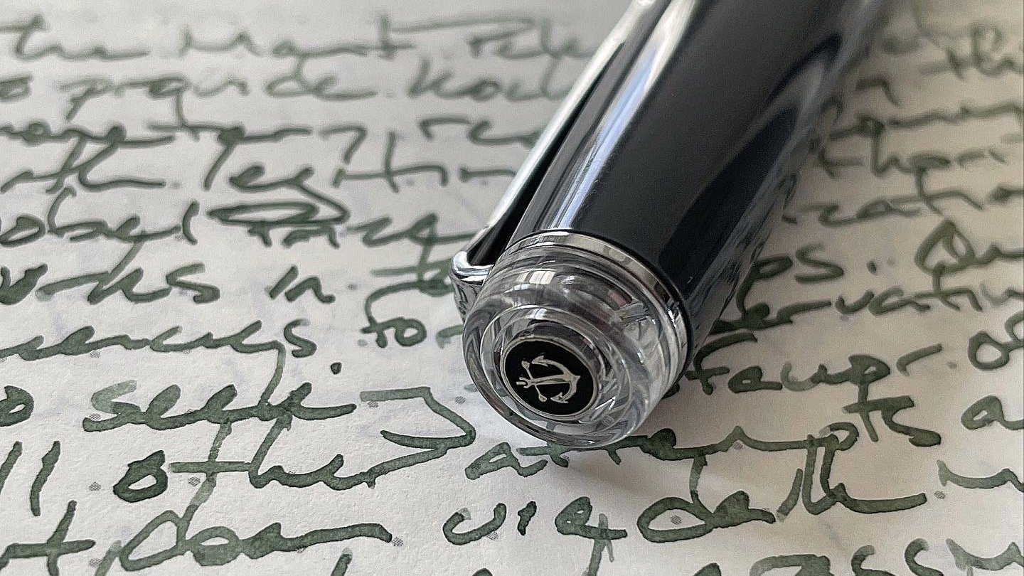
Montblanc 146 Le Petit Prince & Fox (EF). Diamine Eau de Nil. Eau de Nil is a fence-sitter — sitting squarely betwixt blue and green. A true chameleon teal. Squared-off EF nibs are uncommon within my collection. I own only two. Precise notes, written with deliberate care are a consistent and smooth experience. Small rotations of the Montblanc can result in scoring pages with the edges of the EF nib. So: manuscript notes, reading notes, slow types of journaling (e.g. analytic entries), and commonplace notes.
Earth Tones

Sailor Pro Gear Graphite Lighthouse (Z Architect, by Custom Nib Studio). Colorverse Project α Psc. Psc in this wide Architect nib is an altogether different accent color than the Nahvalur. Psc’s whispy green contrasts 223’s murky greys. And the wide lines are easily discerned as different from the Franklin-Christoph’s narrow EF. Accent via a subdued route. Journaling, manuscript drafting, reading notes and commonplace notes.
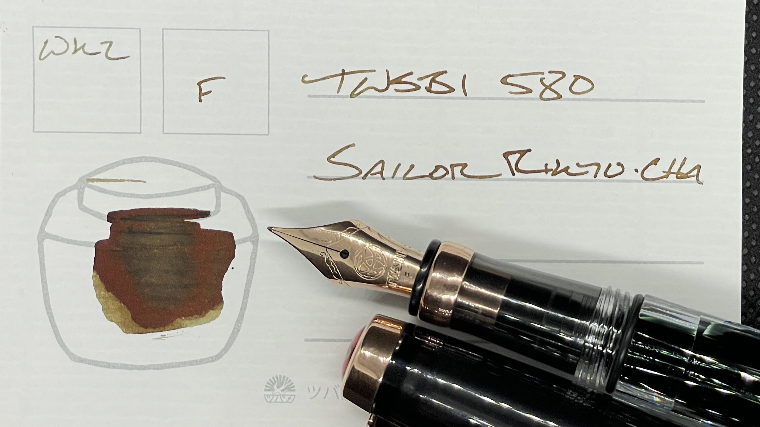
TWSBI 580 Smoke RoseGold II (F). Sailor Shikiori Rikyu-cha. A wet combination that lends a needed moodiness to this week’s color palette. The TWSBI nib and feed manages to keep ink in a disciplined F line — which offers a lovely balance of smooth and precise writing. Oh yeah. The width of the 580’s section is comfortable during short and long writing sessions. This is an all-round pairing: journaling, creative writing, reading notes, letter writing, and commonplace notes. All of the non-task-management duties.
Wild Cards

KACO Green Edge in Black (F). Diamine All the Best. All the Best is a playful ink. A pairing of F nib and shimmer ink that surprised me last week with its consistent flow and refusal to clog. When a pairing is right, it’s right. This combo will bring play to my editing, margin notes, and journaling. I also anticipate lending All the Best’s gold shimmer to my creative writing. Shiny.
