All doubled up on black
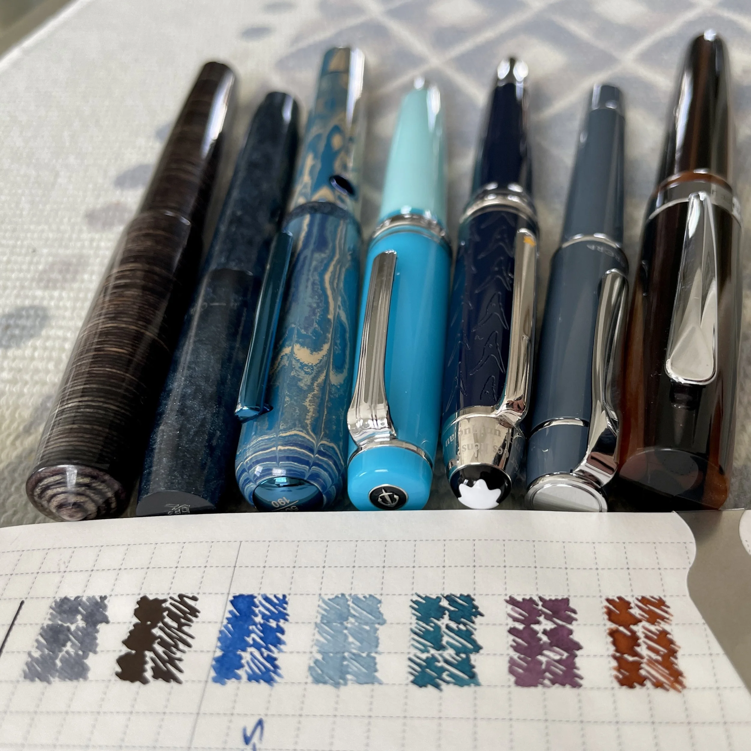

I’m all doubled up: one light grey and one light black ink. The Sailor’s B line widths should render that pair an effective accent against Cypress’ narrow F lines and light purple grey.
The goal is to use black as an accent color. Usuzumi’s sheen is simply too fun not to return from last week. Back in black.
Last week’s two piston fillers continue on into this week’s lineup. I don’t have the heart to empty either.
The Nahvalur saw healthy minutes on the page last week. I’m going to keep the positive combo writing.
The Montblanc was neglected last week. That Little Prince deserves more attention this week.
Two blues, a teal, a purple and an orange-brown. Moody, cool colors. And double grey-black.
Grey/Black

Mr. Cypress Cone Micarta (F). Papier Plume Oyster Grey. The soft F nib gives me control over how lightly and darkly Oyster Grey flows onto a page. My writing can run the full spectrum from light whisps of purple-grey to near-black. A versatile daily driver: task management, reading notes, lesson plans, meeting notes, and commonplace notes.

Franklin-Christoph 45 Blue Diamondcast (B SIG, by Franklin-Christoph). Taccia Ukiyo-e Usuzumi. One method of using black effectively — within how I think — is to distinguish my daily driver’s narrow grey line against a broad black line. Accentuation via width. Journaling, reading notes, virtual meeting notes, and commonplace notes.
Blue/Teal

Nahvalur Nautilus Caldera Sea (BBG, by J. J. Lax Pen Company). Colorverse Warped Passages. I’ve come to enjoy this combo for long journaling sessions and for accenting reading notes. The Nautilus’ wide section and the BBG nib combine for comfortable, expressive writing across multiple pages. Warped Passages leaps off the page against my otherwise muted color palette. Also: lesson plans and meeting notes.

Sailor Pro Gear Blue Train (MF). Wearingeul Demian Lost. Pairing a dry ink with a narrow nib lightens an ink and minimizes how much shading shows while writing. The pale, dusty blue tones of Lost are perfection for detailed accent notetaking while reading and during meetings. I expect to experiment with this pair while journaling, too.
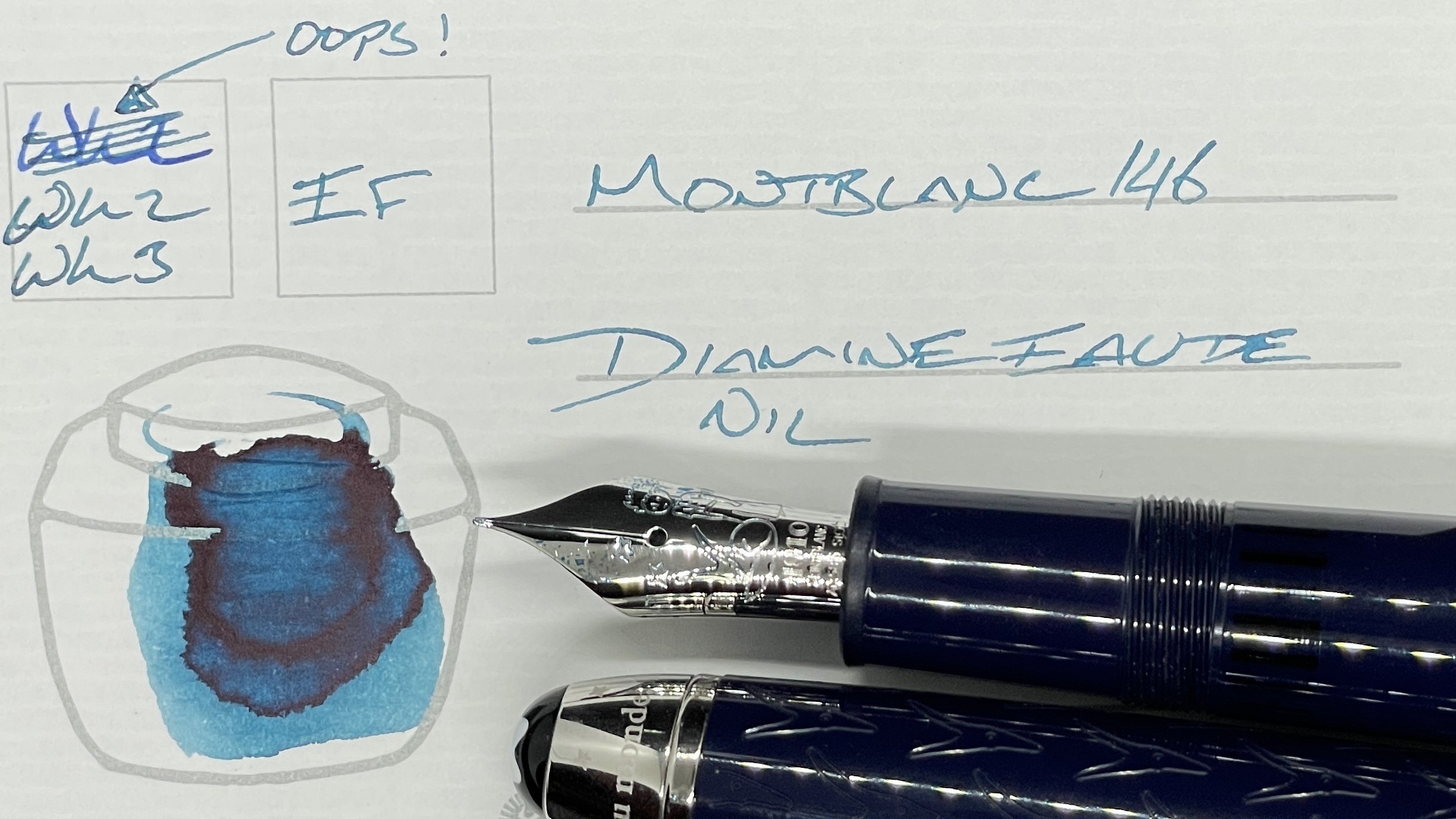
Montblanc 146 Le Petit Prince & Fox (EF). Diamine Eau de Nil. A wet, reliable combination of nib and ink — particularly for slow, deliberate sessions. Lesson plan outlines, teaching reviews, and manuscript revision involve just such deliberation.
Earth Tones

Monteverde Giant Sequoia Brown (F CI, by Mike it Work). Akkerman SBRE Brown. SBRE starts a dark, cloudy brown and ends lines with prominent orange tones. Dual personalities is great when I like both personalities. The sharp CI grind makes this pair a great choice for methodical tasks like lesson planning, manuscript revision and analytical journaling. Brainy.
Wild Cards

Pilot Prera Slate Gray (M). Sailor Shikiori Harahara. Moody purples that are secretly pink at heart are a much-loved shade in my collection. Harahara is giving me those vibes. The round M nib accommodates odd writing angles and in my pocket notebook. This is my pocket pen for the week.
