Thinking in twos while I slow down this week


Breathe. Slow down. And a have a little fun.
A week away from teaching gives me breathing room to take up the desk bound activities that recharge me. Migrating reading notes from two books I finished this passed February into my commonplace notebook. Continuing to draft story for my friends’ tabletop campaign. And journaling. Sweet journaling.
I’m thinking in twos for this week’s welcome slowdown.
Two EF nibs drive my day-to-day writing. Two F nibs provide one loud and one dark accent notetaking option. All four nibs offer disciplined true-to-size line widths. All four nibs end in straightforward round tipping. No surprises. Slow breaths.
My currently inked grows more funky as line widths broaden. The Nahvalur’s BBG nib is ground to a broad stub, with narrow horizontal lines and wide, moderately wet verticals. The Sailor’s Zoom Architect grind provides the inverse: with hairline verticals and moderately wet horizontals. A little fun for the nib-types I lean into for creative or longform writing tasks.
Not to mention two inks from Colorverse, two from Diamine, and another two from Sailor.
Slow breathing with a thematic wink.
Grey/Black
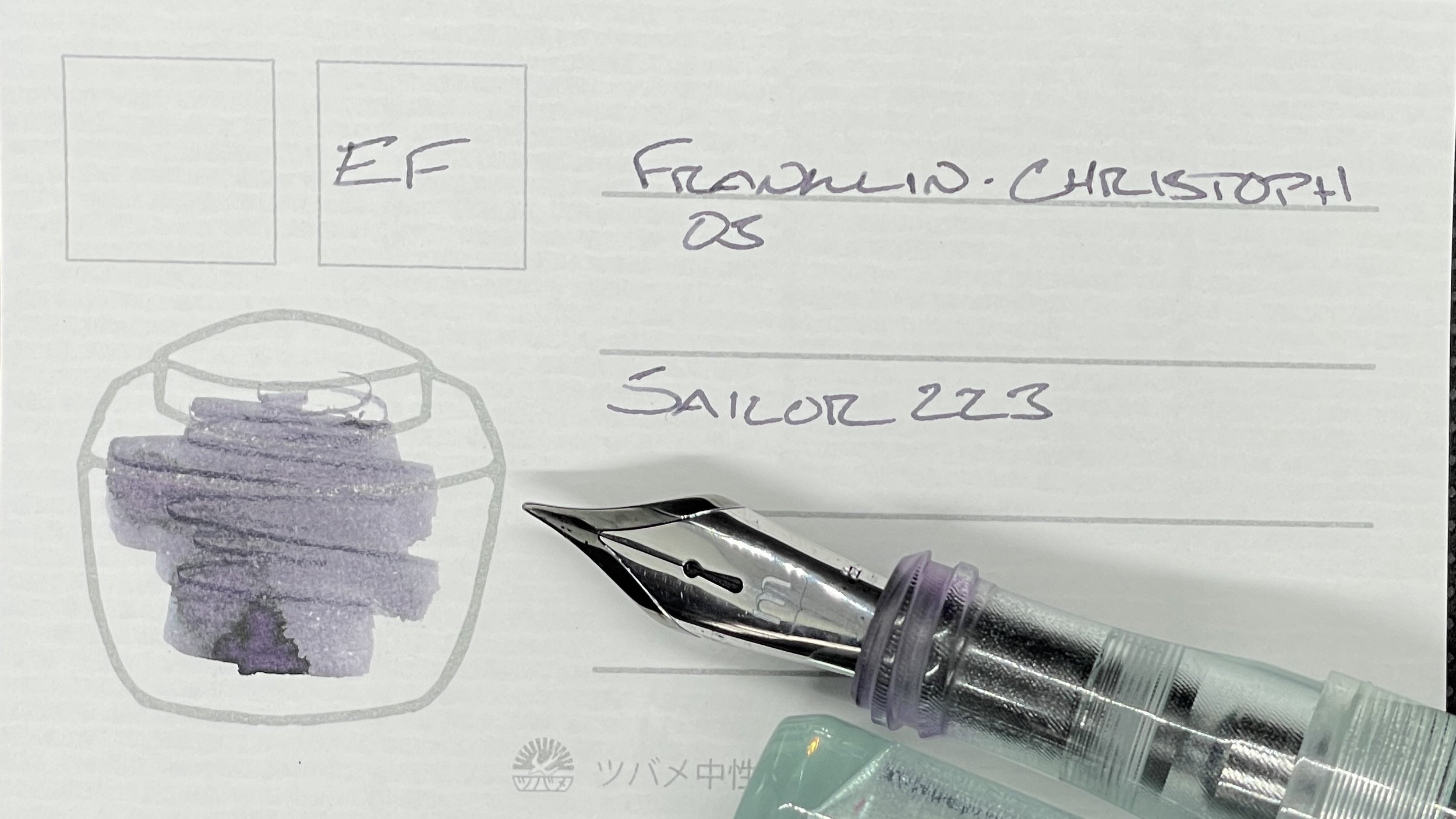
Franklin-Christoph 03 Antique Glass (EF). Sailor Ink Studio 223. I’ve grown to appreciate the light weight of the 03 model — which Franklin-Christoph also calls the Iterum on their website. The threading at the bottom of the section give my fingers easy purchase, and so healthy control while writing precise notes. Design that suits task management, reading notes, margin notes, and commonplace notes well. 223’s variability across paper types lends whimsy to such routine forms of writing.
Blue/Teal

Nahvalur Nautilus Caldera Sea (BBG, by J.J. Lax Pen Co.). Colorverse Warped Passages. Warped Passages is a shout of color against the week’s muted cool tones. I chose the ink as a color-match for the Caldera Sea — and as a fun option for accenting the reflection notes while commonplacing. The broad lines, fun line variation, and large pen size also render this pairing a comfortable option for long journaling sessions.

Montblanc 146 Le Petit Prince & Fox (EF). Diamine Eau de Nil. My Montblanc excels in reliable, precise EF lines. Eau de Nil is slightly above moderate wetness — which ensures prominent shading throughout my writing. A touch of fun to otherwise precise reading notes, editing and revision. I’m also open to analytic journaling based on my reading, depending on how my week develops.
Earth Tones

Sailor Pro Gear Graphite Lighthouse (Z Architect, by Custom Nib Studio). Colorverse Project α Psc. Psc is a shading monster — which makes it a happy monster in my book. Pairing this light green ink with this generous nib grind balances easy readability with a wispiness that makes my writing easy to scan on the page. A perfect combination for reading notes and margin notes. The shading itself keeps long writing sessions engaging: so journaling and creative writing.

TWSBI 580 Smoke RoseGold II (F). Sailor Shikiori Rikyu-cha. This specific F nib and feed encourage a generous firehose of ink onto the page. Post-haunting Scrooge embodied in a pen. Rikyu-cha sits dark brown on both Tomoe River and Regalia papers. And I’m noticing a wealth of coppery-red sheen and the beginnings of lines. Spicy. Reading notes, journaling, creative writing, meeting notes, and scratch notes.
Wild Cards

KACO Green Edge in Black (F). Diamine All the Best. I know that inking a high-shimmer ink in a F nib that is constructed without a breather hole is going to lead to periodic clogging. Given. However, All the Best’s red color and purple shimmer are a comforting combination when editing my own writing. Sure, mistakes are highlighted in red ink. But the purple shimmer is a pat on the shoulder saying, “and now it’s a better draft, yeah?”
