Throwing shade

Choosing a slate of pens and inks that fit the kinds of work I’m taking on this week proved a puzzle. My work writing is primarily quick notes (jottings) and lesson plans. My personal writing is primarily slow writing: commonplace reading notes and journaling. This week’s currently inked pens need to accommodate both extremes.
I chose six inks that both shade brightly where the ink is thin and also shade quite dark. The brightness is useful while skimming notes. My thoughts, action items, and important points all stand out against the grey Lamy Agate.
Two F nibs, a M, and two broad nibs encourage stronger shading – more bright spots sprinkled throughout my writing. The 1.1 Stub may, admittedly, muddy with my small handwriting, but I’m open to experimenting this week. At least, the Stub will provide clearly legible headings within meeting notes.
And the round EF nib in my Mythic Aeschylus to bring out the brightest in Ancient Copper.
Grey/Black

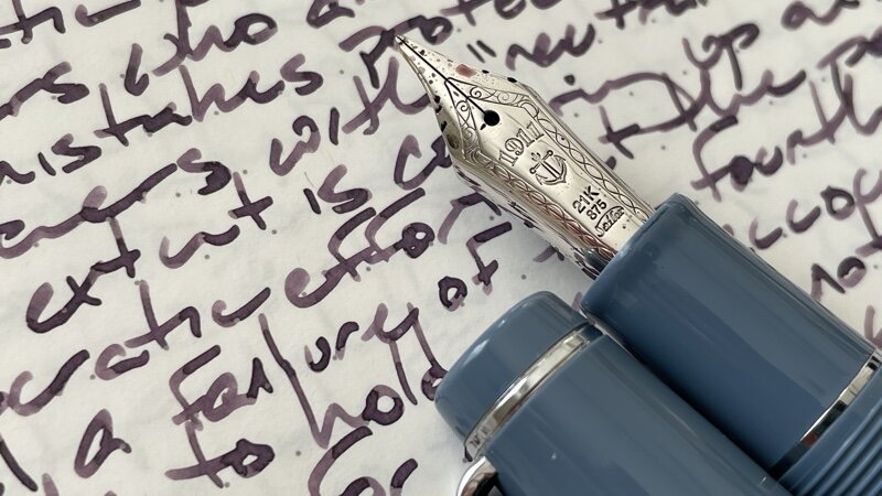
Pelikan m805 Stresemann Anthracite (F Architect, by Custom Nib Studio). Lamy Crystal Agate. Agate remains a bit light, even with Pelikan’s generous feed. I write with the thickest angle on the Architect nib to darken my written lines. Daily driver. Task management, lecture notes (data), reading notes, lesson plans.
Blue/Teal

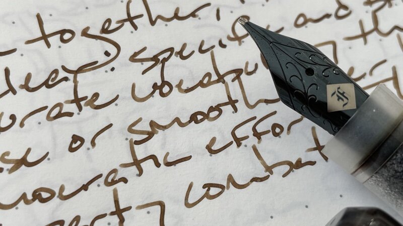
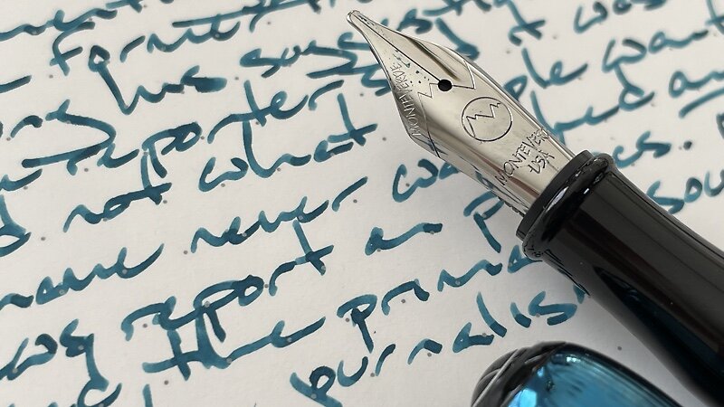
Monteverde Rodeo Drive Polaris (1.1 Stub). Papier Plume Ink No. 13. The Polaris’ miserly feed pairs well with 13’s wetness. The result is a goldilocks zone where 13 is dry enough to shade well without hard starting. My favorite Monteverde nib, by far. I am also using this combination as a highlighter: stars and underlines and boxing text in meeting notes. Meeting notes (headings, accents), lecture notes, journaling.
Earth Tones

Mythic Aeschylus Black & Red (EF). Monteverde Copper Noir. A lovely medium-wet EF. Copper Noir is well-behaved on coated paper. Combined, I have a sizable and comfortable writer for longer accenting and editing sessions. Manuscript marking, lesson plans, reading notes (accent), journaling.
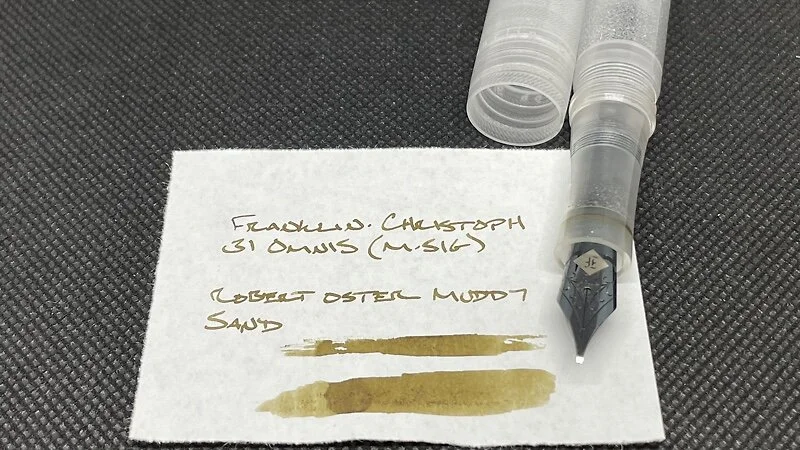
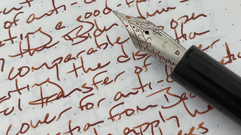
Franklin-Christoph 31 Omnis Smoke & Ice (M-SIG, by Franklin-Christoph). Robert Oster Muddy Sand. A favorite pen. A favorite nib. A brand new, untested ink. The combo shades strongly. A mellow-hued alternative for detailed notes, and sub-headings. Lesson plans, lecture notes, meeting notes (headings), journaling.

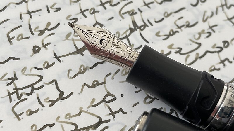
Visconti Homo Sapiens Silver Age (F). Organics Studio Walt Whitman. Bleeds and feathers on uncoated papers. Shades wonderfully on Tomoe River and Cosmo Air Light. An apt combination for at-the-desk writing jobs as that is where I use my most fountain-pen-ink-friendly papers. Lesson plans, reading notes (accent), journaling.
Wild Cards

Sailor Pro Gear Slate (Z Architect, by Custom Nib Studio). Kyo-no-oto Sakuranezumi. A glorious dusty purple with phenomenal shading. The feed dries out when writing quickly. Most suited to slower writing tasks. But I will experiment with meeting notes as headings are often short, and so avoid the drying out issue. Lesson plans, lecture notes, meeting notes, journaling.
