All inked up, suited up, and ready for fancy writing


I’m carrying a serious look into the coming week. Three pens in black and white and chrome. One’s suit pants, suit jacket and shoes. A white and black Visconti. One’s dress shirt. The Cypress’ muted earth tones serve as one’s classic leather watch band. And a tangerine Sailor for a pop of memorable color. Or, as my old roommate used to say: always wear one piece of clothing that doesn’t match.
I stand before you all inked up, all suited up, and ready for the coming flurry of end-of-year meetings.
Grey/Black

Pilot Custom Heritage 912 (SF). Bungukan Kobayashi Sohayanotsuruki. This most-excellent combination scribbles on into its second week as my daily driver. The SF nib lends a spring to my writing — and so generous shading at the beginnings and ends of letters, where I tend to press harder onto the page than in the middles of letters. Task management, lesson planning, meeting notes, and a mountain of brainstorming notes.
Blue/Teal

Jinhao x159 Black (EF). Papier Plume Ink No. 13. An ink that shades in an EF nib is a treasure. The combination of massive x159 and narrow EF nib makes for a surprisingly comfortable detailed notetaker. Add the x159’s business suit of a colorway (black and chrome) and I have a well-tailored meeting note accent pairing. Meeting notes, reading notes, analytic journal entries, paper marking, and manuscript editing.

Pelikan m805 Stresemann Anthracite (F Architect, by Custom Nib Studio). Sailor Manyo Hinoki. Hinoki seems made for this Pelikan nib. Hinoki flows so generously that the F-width architect provides a smooth writing experience, architect grind notwithstanding. The multiple hues of Hinoki’s shading lend a incorporeal feeling to my writing. Fun for journaling — especially over long writing sessions. And light enough in color to serve as an accent combo in meeting notes, reading notes, lesson plans, and D&D story drafting.
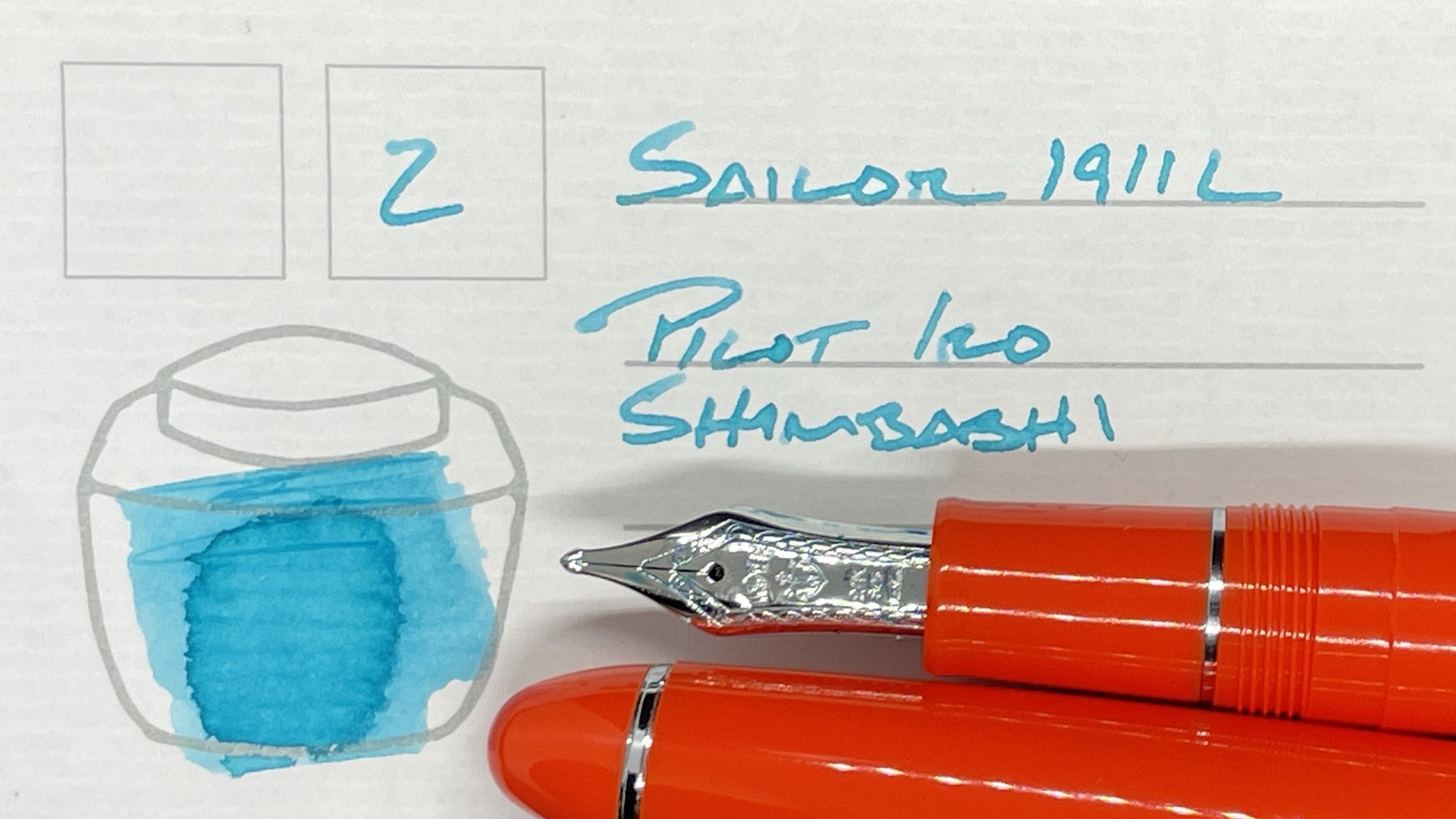
Sailor 1911L Tangerine (Z). Pilot Iroshizuku Shimbashi-Iro. I’m a sucker for inks that contrast the color of a pen. I dipped into Shimbashi’s bright sky blue for a pop of cheery color that stands out amidst this week’s color palette. Pop enough to match the 1911L’s pop of tangerine orange. The Z nib fills journal lines quickly and Shimbashi is easily readable for lecture notes and reading notes. Pop-pop-pop.
Earth Tones

Mr. Cypress Cone Micarta (M SIG, by Franklin-Christoph). J. Herbin Terre de Feu. I am firmly in my honeymoon phase with the Cypress, swapping nibs and repeatedly inking the pen as I experiment towards the kinds of writing I like this particular writer for. This week: a crisp italic M and Terre de Feu — a pink-strong brick with prominent shading. Feu stands out easily against Sohayanotsuruki’s somberness. This is a headings, task migration, and journaling duo.

Visconti Homo Sapiens Blizzard (EF). Lennon Tool Bar Atmospheric Firmament. My Homo Sapiens sports a quirky EF nib that gets along with few inks extraordinarily well and carries a strong distaste for most others. The introvert of fountain pen nibs. Firmament is wet, generous and outgoing. Exactly what an introvert needs to be spurred out for a night of writing. Journaling, brainstorming, lesson plans, reading notes, and manuscript drafting.
Wild Cards
Nah na nah.
