We goin’ big for the first week of summer


My latest cohort of students is graduated. Grades are submitted. I’m feeling large and capable. Let’s party.
The substantial transition from the school year into the summer months calls for a similar transition into desk-friendly nibs.
Reading will dominate my time this coming week. And, suspecting I finish a book or two, my writing will be methodical, deliberate and reflective reading notes. As such, I have a lovely window of time that accommodates fun, wild and large nib grinds. Whoo-ah.
Three of six nibs are sharply ground. Two of Franklin-Christoph’s SIG nibs — one M and one B — and a Kaigelu M architect. There will be bountiful line variation.
Four inks out of this week’s palette are subdued with subtle features. Verdigris sports the barest hint of sheen and medium shading. Vert Empire offers stronger shading without sheen. Gris Orage throws up lovely gold shimmer. And Sabimidori changes colors as it dries, shades and sheens. Center stage.

Taken together, I have a solid balance of subtle inks and two pops of accents — one blue and one orange. All in a package of five massive writers. Wide lines, large pens and long writing sessions ahead. Choo choo.
Grey/Black

Platinum 3776 Star Wars Kylo Ren (F). Jacques Herbin 1670 Gris Orage. Watching Disney’s new Obi-Wan mini-series created a craving for my one and only Star Wars themed pen. The disciplined F line provides readable lines in both small 3.7mm grids and in larger 5mm grids. Excellent for task management, reading notes, and commonplace notes.
Blue/Teal

Loft Highworth Teal Ocean (EF, mnml). Lennon Tool Bar Yong Quon (2020). The Highworth is a large pen. The Highworth’s size prevents hand cramps over long writing sessions. The true-to-width EF nib should tame Yong Quon’s tendency to feather — especially with the stingy feed I paired it with. Yong Quon’s piercing blue jumps off the page: excellent accent notes in page margins and reading notes.

Franklin-Christoph 45 Diamondcast Blue (B SIG, by Franklin-Christoph). Rohrer & Klingner Verdigris. I cleaned the comparatively tiny 45 and swapped to this generous, if picky, B SIG. The result is a wet pairing that still manages to bring out Verdigris’ cobalt side where horizontal lines are thinnest. The broad line thickness stands out easily against Gris Orage. So: commonplace notes, letter writing, and journaling.
Earth Tones

Monteverde Giant Sequoia Brown (M Architect, by Kaigelu). Taccia Ukiyo-e Sabimidori. The Giant Sequoia is a tree branch of a pen. I installed a fun M Architect nib by Kaigelu. A true-to-size M with excellent line variation. Sabimidori changes colors as it dries, which makes for playful writing whenever I have time to sit and watch the ink dry. So: journaling, D&D notes, letter writing, and commonplace notes.
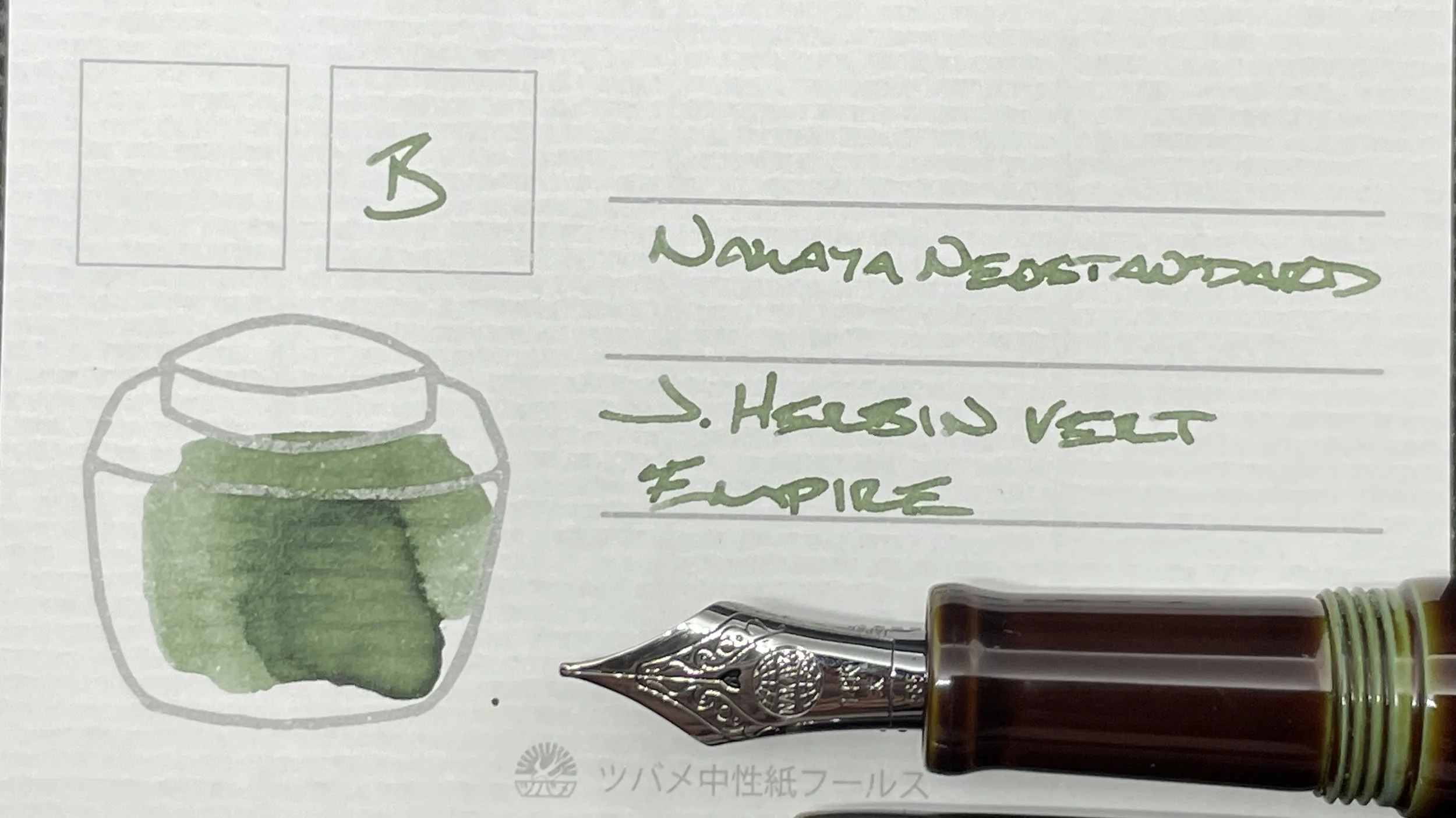
Nakaya Neostandard Heki-tamenuri (B). J. Herbin Vert Empire. The Nakaya makes a welcome return to my rotation this week. The flawless B nib ensures that Vert Empire shades and halos readily. Empire’s grey-green resonates strongly with me when I’m feeling creative. So: journaling, manuscript drafting, and reading notes.

Mythic Aeschylus Black & Red (M SIG, by Franklin-Christoph). Ferris Wheel Press Pumpkin Patch. Pumpkin Patch is a dry ink in this feed. As a pair, the M SIG and Pumpkin Patch lay down a dusty orange with infrequent haloing. Well suited for accent notes in my commonplace notebook, in scratch notes, and in D&D notes. This combo is also comfortable to write with during analytic journaling sessions, again as an accent color.
Wild Cards
None this week. Twist ending.
