A currently inked for poolside journaling

I am away on my honeymoon for the next two weeks. The kinds of writing I expect to get into are quite different than my typical fare. And my contributions to this site may be ad hoc compared to my typical regular schedule.
There will be poolside journaling. One hopes there will be poolside journaling. “One,” in this scenario, is me.
I’m excited to record what my partner and I do and how I feel throughout our first cross-country trip together.
There shall be reading, but no reading notes beyond margin notes inside the books themselves. And a healthy amount of pocket notes as I’m out and about on a handful of planned excursions.
These changes translate into two priorities while choosing pens and inks for the next two weeks. First, survivability. Each pen should hold enough ink to survive two weeks of mostly journaling. Nib choice should also be rather narrow — sticking to EF and F — to extend how long I can write without emptying a pen.
Second, variety. I’ve learned that variety, for me, is closely related to whether the ink is cool toned or warm toned. The color itself — purple or red or blue — is less reliable at keeping me interested. A cool blue and a warm blue will keep me excited longer than a cool blue and a cool purple will. Self discovery.
Four of last week’s inked pens already fit both criteria — piston fillers all. Two are inked with warm toned colors: the Eco’s Oyster Grey and the Visconti’s Yama-Budo. The other two carry cool colors: Bondi Blue and Queen’s Night Blue.
I added two more piston filler pens to the lineup. One with a cool ink: Sailor’s Yozakura. And one with a warm ink: Monteverde’s Fireopal.
Lastly, I inked a dedicated pocket carry. Because life is to be lived. And the Kaweco makes me happy. It fails criterion one, but with style.
Grey/Black

TWSBI Eco-T Mint (EF). Montblanc Oyster Grey. Continues on as the daily driver. Oyster Grey has grown wetter in the week it’s settled within the Eco’s feed. Still dries quickly enough to avoid smearing. Why change what isn’t broken? Large piston filler, warm toned grey.

Kaweco Sport Fox (EF). Diamine Earl Grey. Pocket carry. I elected one small pen to carry as part of my EDC on the trip. I’m proud of the new black and orange color way I cobbled together. The EF nib will work great in my Word Adventure Log notebook. The world’s smallest converter, cool toned grey.
Blue/Teal

TWSBI Vac700R Iris (F CSI, by Pen Realm). Robert Oster Bondi Blue. My writing this week will happen whilst sprawled poolside in the deserts of the US southwest. A teal is appropriately thematic. The CSI will add flair to my descriptive journaling. Super-sized piston filler, cool toned blue.

Pelikan m805 Stresemann Anthracite (F Architect, by Custom Nib Studio). Akkerman Koninginne Nacht-Blauw. The business-forward Stresemann colorway is offset by the fun architect ground nib. The EF suits pocket scratchings as well. The F architect will keep journaling enjoyable, especially in this week’s new Tomoe River journal. Large piston filler, cool toned blue-black.
Earth Tones

TWSBI 580-AL Turquoise (B). Monteverde Fireopal. A wet, earthy ink in the only large nib of this week’s bunch. The combination of turquoise aluminum and orange-brown strike me as appropriately “American southwest.” The B nib proves a wider, more forgiving line. Broad, round nibs accommodate journaling sessions where I write quickly — like when completing morning pages. Large piston filler, warm toned sienna.
Wild Cards

Visconti Homo Sapiens Silver Age (F). Pilot Iroshizuku Yama-Budo. This combination sported plentiful gold sheen on CAL paper. I’m interested to learn how the same combination fares in my new Tomoe River paper journal. Average sized piston filler, warm toned purple.
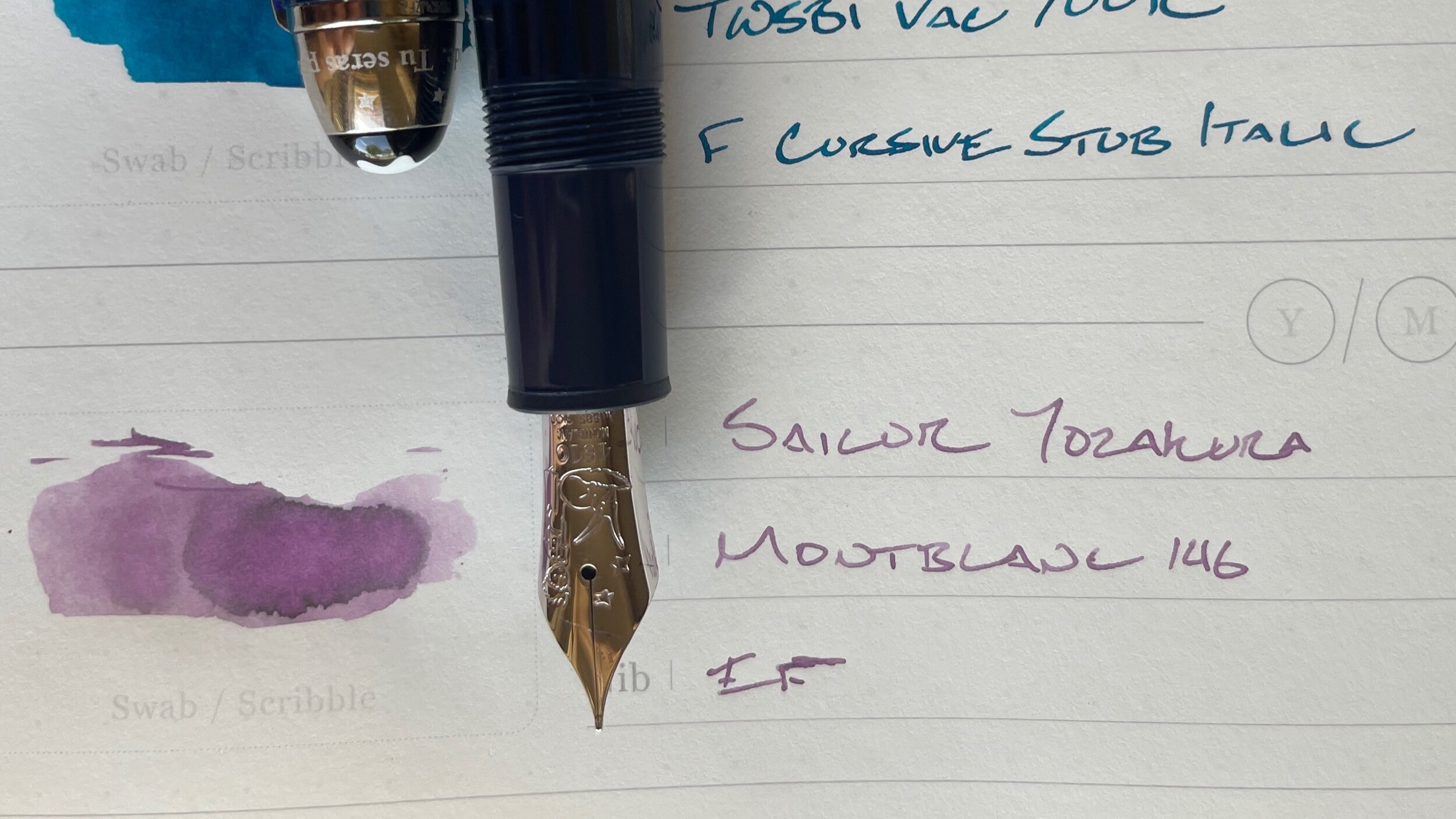
Montblanc 146 Le Petit Prince and Fox (EF). Sailor Shikiori Yozakura. A pairing suggested by my friend in my local pen group. The disciplined EF nib brings out Yozakura’s lighter, dustier side. Combined, this pair offers a subdued escape from the remainder of this week’s palette. The Montblanc feed is just wet enough to encourage gentle feedback while writing journal entries. And my accent pair for task management while on vacation. Category headings, marking the status of tasks. Large piston filler, cool toned pink.
