Small tweaks, happy impact


Small tweaks can have outsized impacts. It’s a law of nature in school policy. It also applies to stationery. Two small tweaks this week to keep this week’s writing fun.
I added a murky green ink that favors haloing over shading. Inked into Platinum’s subdued Laurel Green 3776. And I tuned the B nib to provide punishingly wet lines. Why not live outside my typical for a bit?
Four round nibs split in twain, two and two, in F and B. An additional two ground nibs add fun variation — both in the F range of line thickness.
Five pens are large enough to accommodate long writing sessions. Chosen because I anticipate getting back into reading notes and curriculum reflections. Happy impact.
Grey/Black
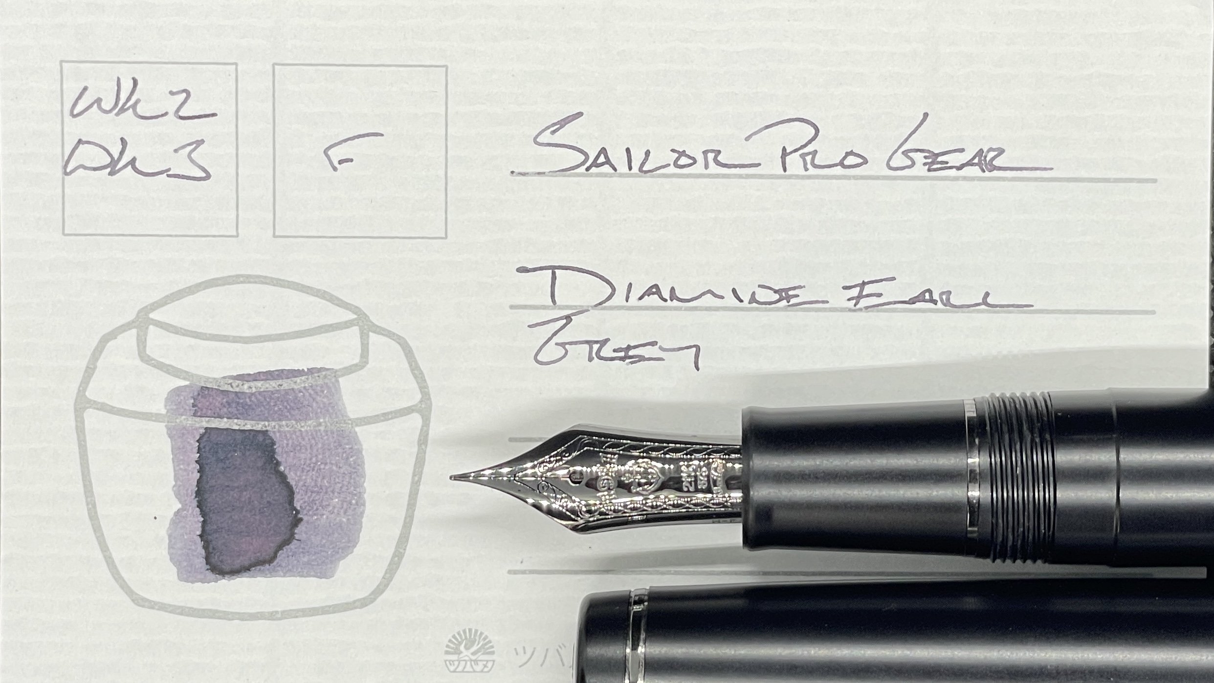
Sailor Pro Gear Imperial Black (F). Diamine Earl Grey. One of my absolute favorite combinations. This particular F nib and Earl Grey. Disciplined narrow lines and consistent writing. With shading. Woo! My daily driver for the week. Hobonichi plan tracking, aquarium bullet journaling, and reading notes.
Blue/Teal

Kaweco Classic Sport (BB). Pineider Blue. Two gifts paired together. Pineider’s Blue is new-to-me blurple. No-nonsense performance with infrequent shading and rare sheen. The Pineider stands out against this week’s otherwise muted, earthy palette. As such, this is a great annotating pairing. Also, my pocket carry for the week.

Pelikan m805 Stresemann Anthracite (F CI, by Custom Nib Studio). Kyo-no-oto Hisoku. A wet feed and a dry ink combine into an excellent writing combination. Healthy shading with moderate, quick-drying flow. Add the 805’s wide section and I have a similarly-excellent longform writer. Journaling, manuscript drafting, and reading notes.
Earth Tones

Platinum 3776 Laurel Green (B). Colorverse ⍺ Psc. A brand spanking new ink and pen pairing. Psc writes wetly in this Platinum nib. The wide B line and Psc’s healthy haloing effect suit this combination for long writing sessions — in both my commonplace notebook and journal. I may wind up topping off the current half-fill if I continue to enjoy this combo as much as my initial impression suggests. What an entrance.
Wild Cards

Karas Kustoms Decograph 1901 Winter Wonderland (EF). Birmingham Cranberry Twinkle. And the Decograph comes roaring back into my currently inked. The wet and wide EF nib are well suited to carrying shimmer inks. The EF’s generous flow reliably staves off clogs. Newfound feature. While Cranberry’s dark hues blend with Earl Grey on the page, the silver shimmer stands out enough to work as an accent writer with short reflections. Otherwise, this is a desk-bound journaling pair.

Lamy Safari Dark Lilac (Cv). Sailor Shikiori Yozakura. This Lamy is the newest addition to my collection by way of a giveaway on the Pen Addict’s giveaways Slack channel. The Lamy feed in this pen is stingy with Yozakura. The result is dusty-pink lines with infrequent shading — sans halos. But still, both Yozakura and the Cv nib are a happy place for me. So journaling and reading reflections aplenty.
