The bookend approach to inking up for commonplacing
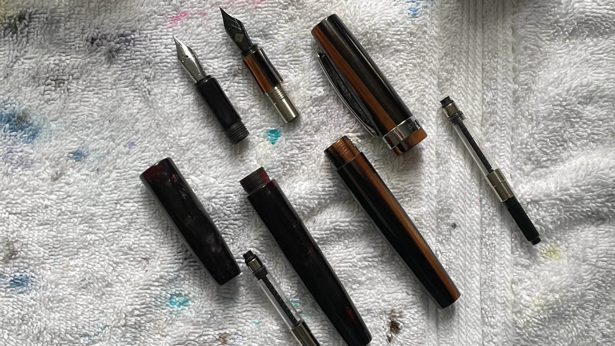
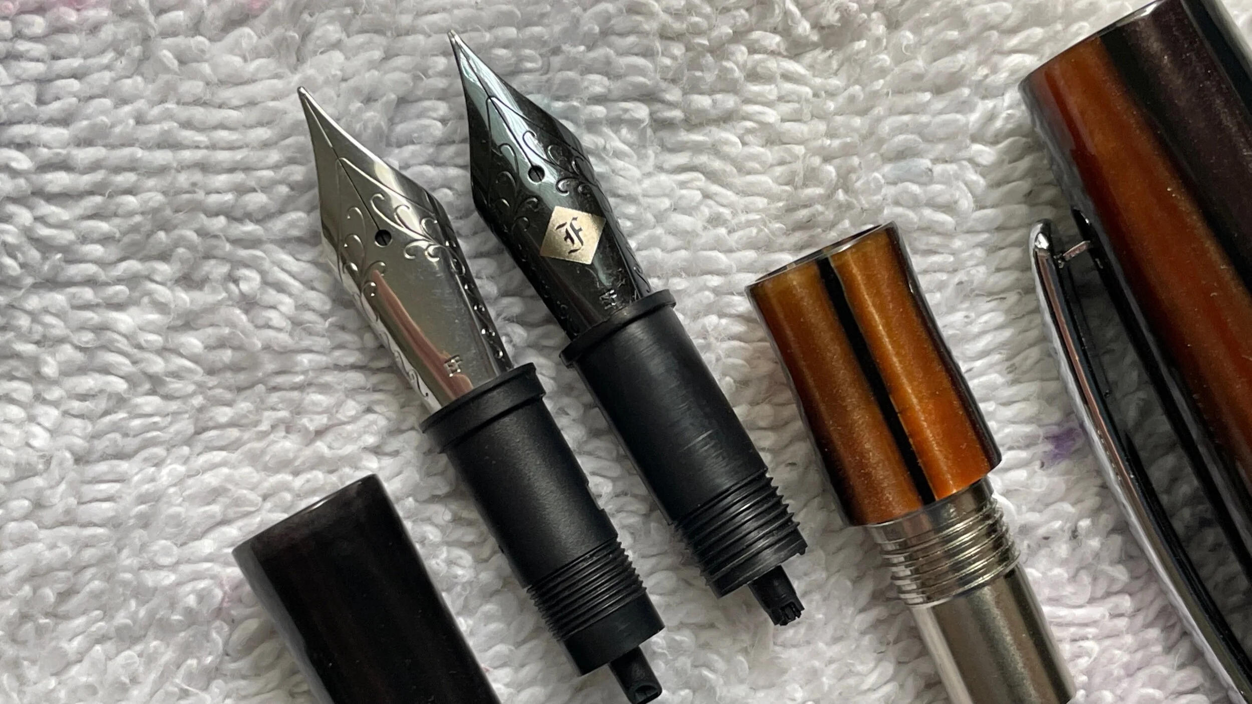
I cleaned two inked pens in preparation for this week. Two threads drive my thinking. The novelty of pen and ink combinations motivates me to get into my work. New choices are always welcome — and effective.
Also, a week of iron gall bravery raised my anxiety. I want my stationery to offer joy, not worry. So, a week without incident or pen damage is capped. I’m happy with how Spring Rain did last week.
My TWSBI Vac 700R was half-filled with Diamine’s November Rain. The pairing was too dark for commonplace notes — which are the brunt of my work this coming week. Rain’s heavy sheen is better suited for personal writing like journaling, letter writing and — come the fall — for reading lesson plans at odd angles and distances.
The Mythic Aeschylus was my iron gall ink experiment. I swapped into an EF SIG and hoped one of my favorite nibs would make it through the week without corroding. Gallery on the nib swap below.
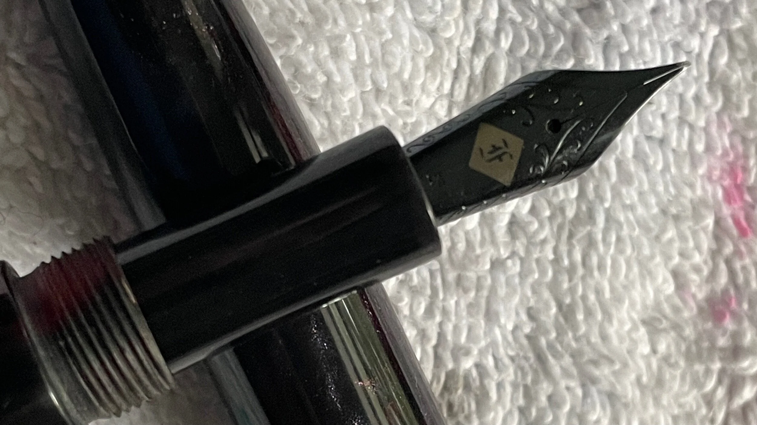
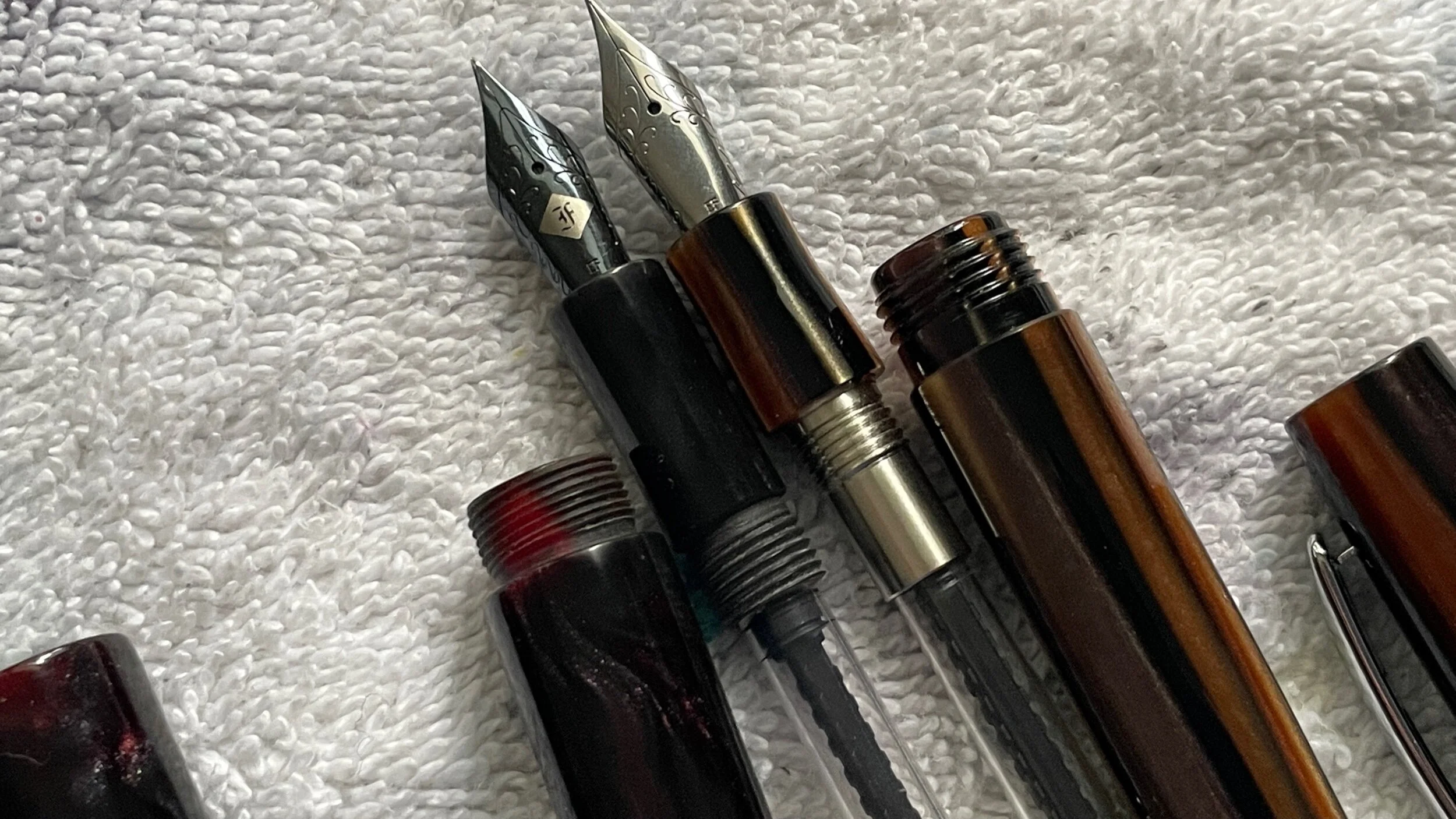
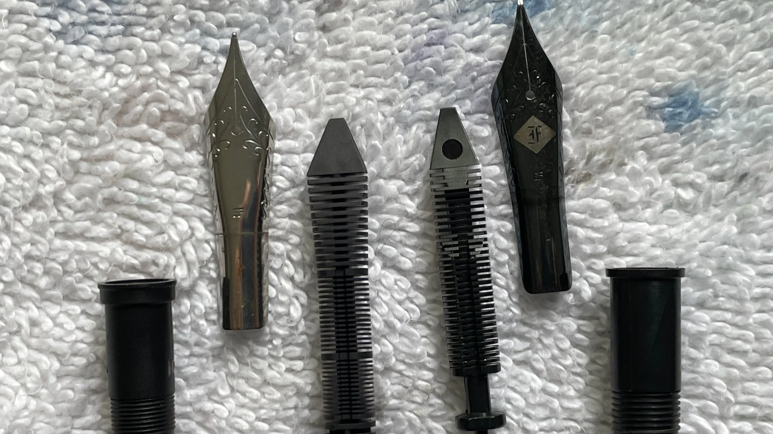
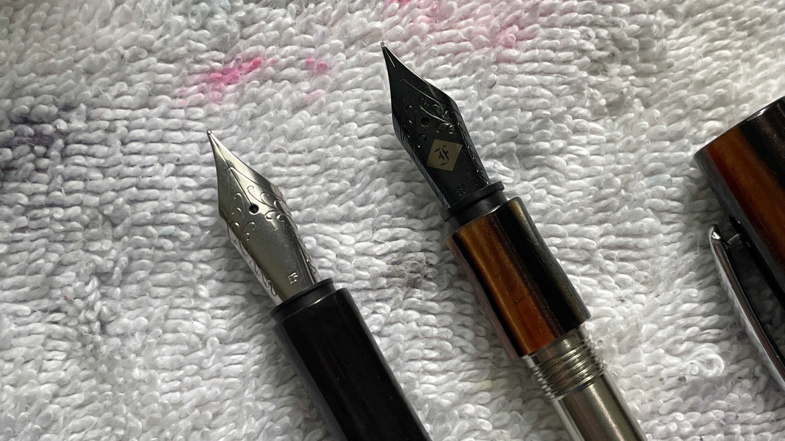
The nib passed with flying colors. It wrote well and consistently. A tad wet for quickly-jotted notes, even with Spring Rain’s quick dry time. Rain may perform better in a stingier feed. Regardless, the Aeschylus is now iron gall clear. And damage free. +1 to Ravenclaw.
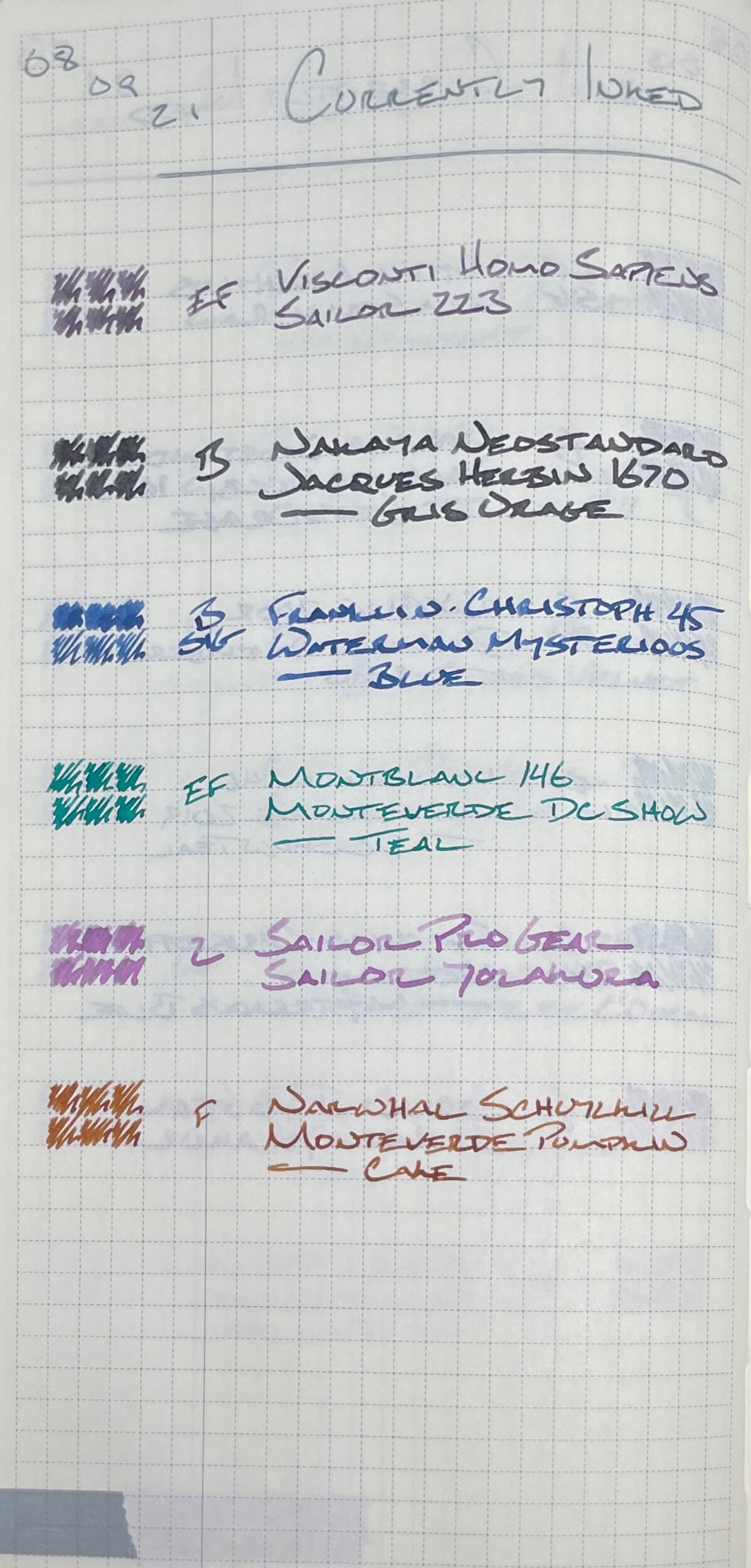
This week bookends nibs across the EF/F and B extremes. One B and one EF in greys. One B and one EF in blues. A F and Zoom (which presents as a B with benefits) across brown and purple.
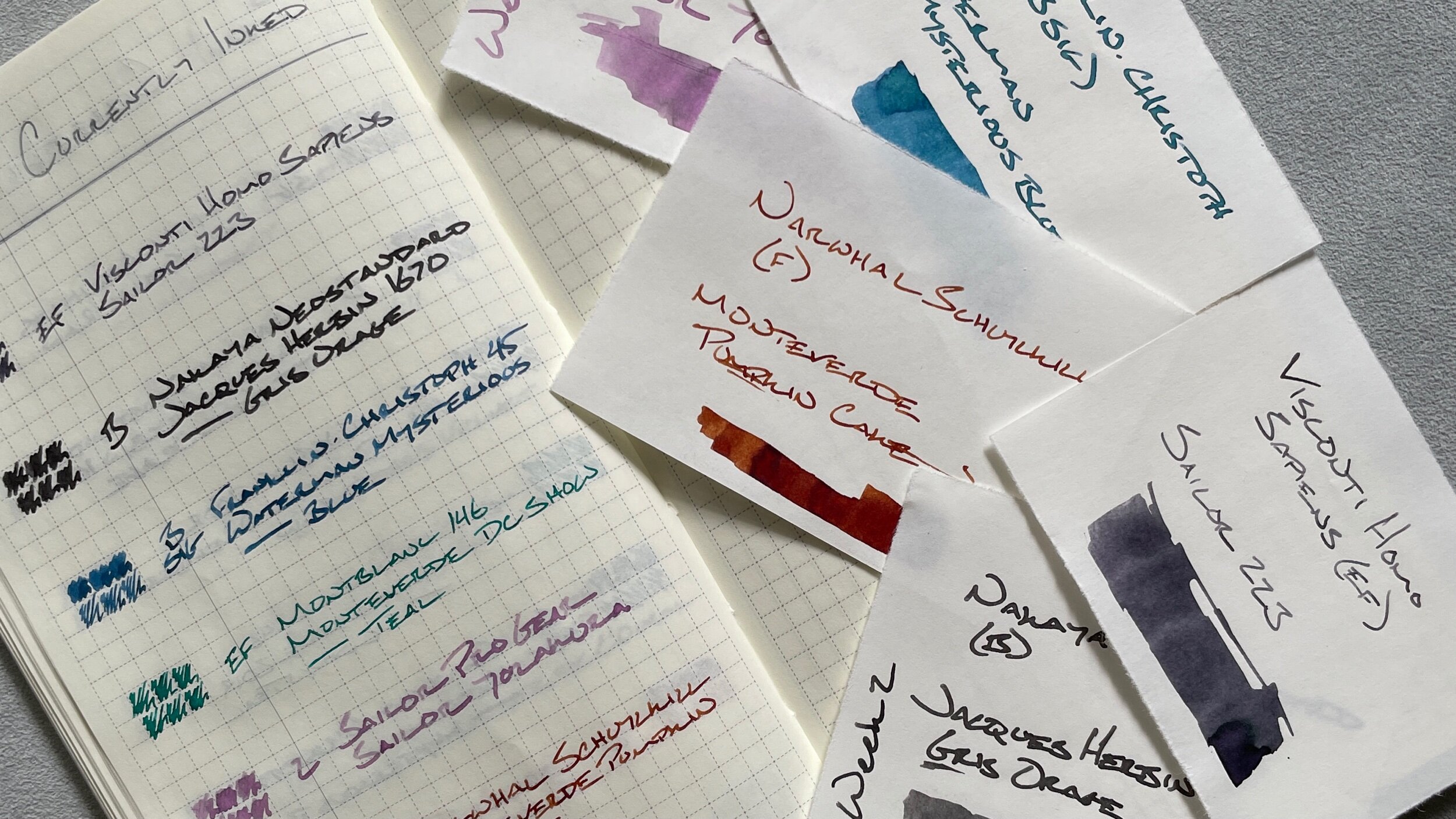
Ink choices heavily favor accent colors given the amount of commonplacing I anticipate settling into. All but Sailor 223 serve as accent colors. DC Teal, Pumpkin Cake, and Yozakura add pops of color to the page. Mysterious Blue and Gris Orage stand out as broad lines with excellent shimmer or shading, respectively.
Grey/Black
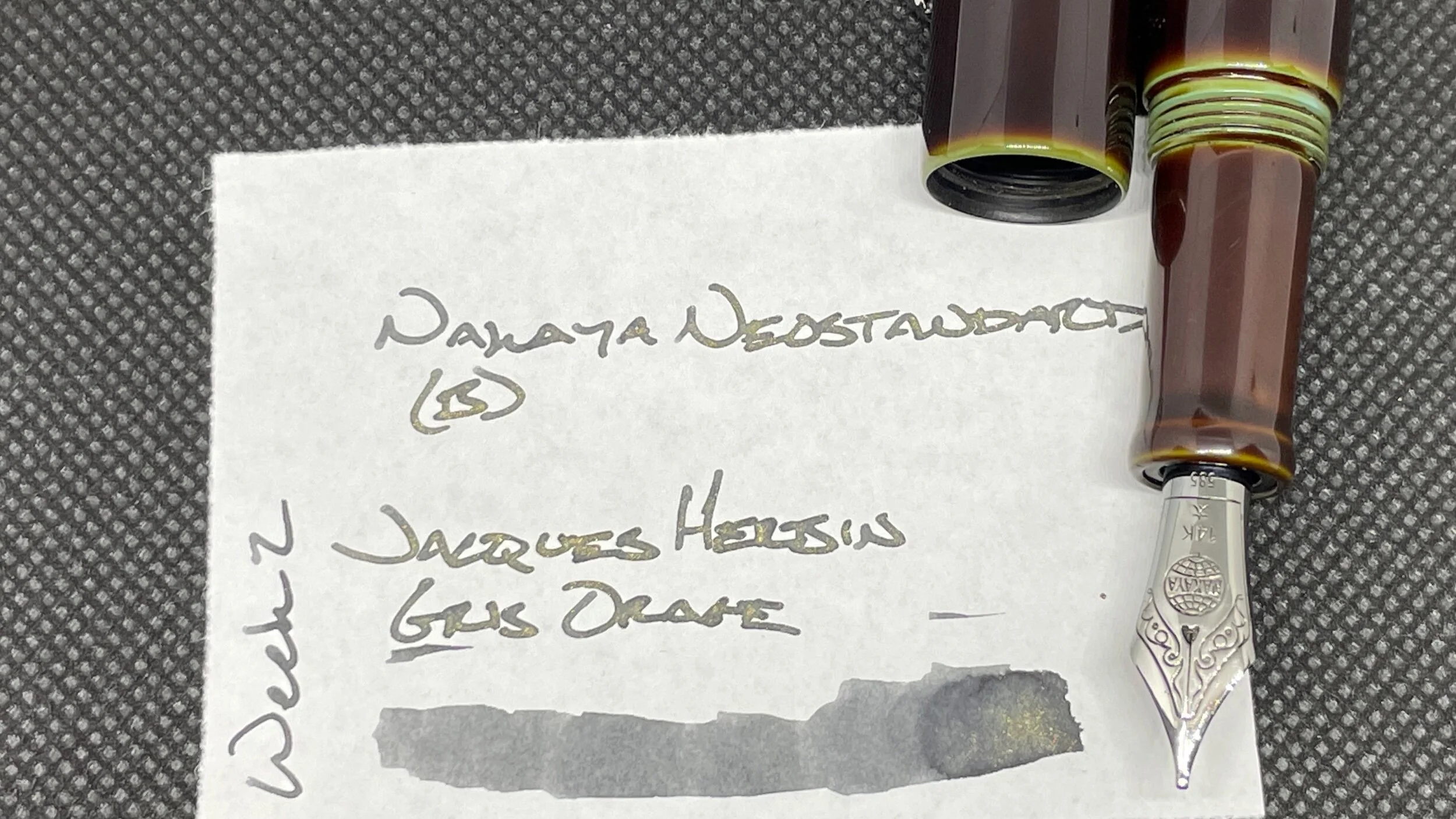
Nakaya Neostandard Heki-tamenuri (B). Jacques Herbin 1670 Gris Orage. The B nib brings out Gris Orage’s darkest notes. Dark enough to work well as a (goth?) accent color. Gold shimmer helps with scanning pages quickly, especially when reading from an angle. Demon sparkle. Journaling, common place notes (accent), letter writing.
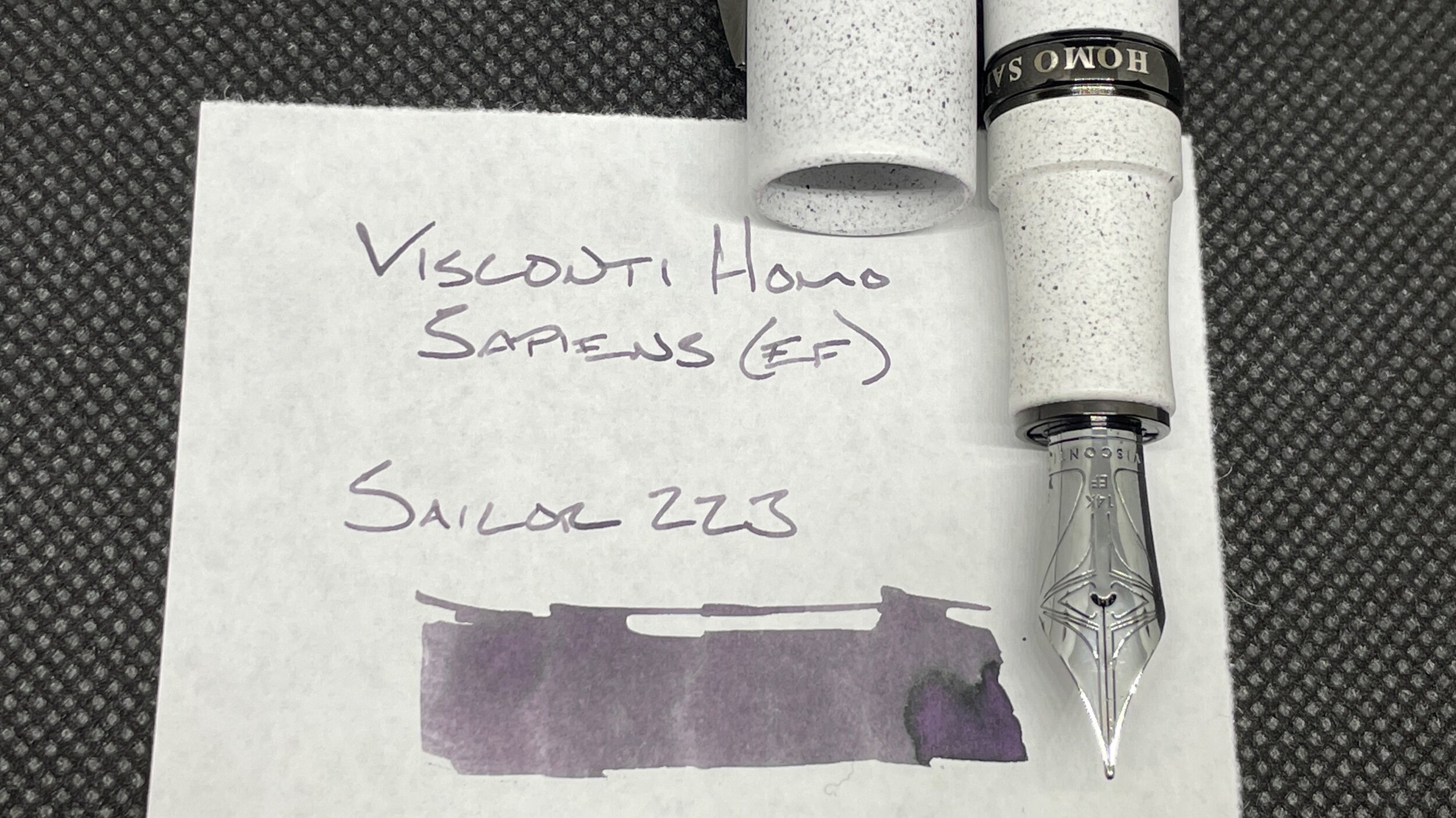
Visconti Homo Sapiens Blizzard (EF). Sailor Ink Studio 223. Daily driver. The pen’s weight and well-tuned EF nib have me searching for excuses to write. 223 reminds me of Diamine’s Earl Grey. Produces a true European EF line. Excellent for passages in commonplace notes, task management, and scratch notes.
Blue/Teal
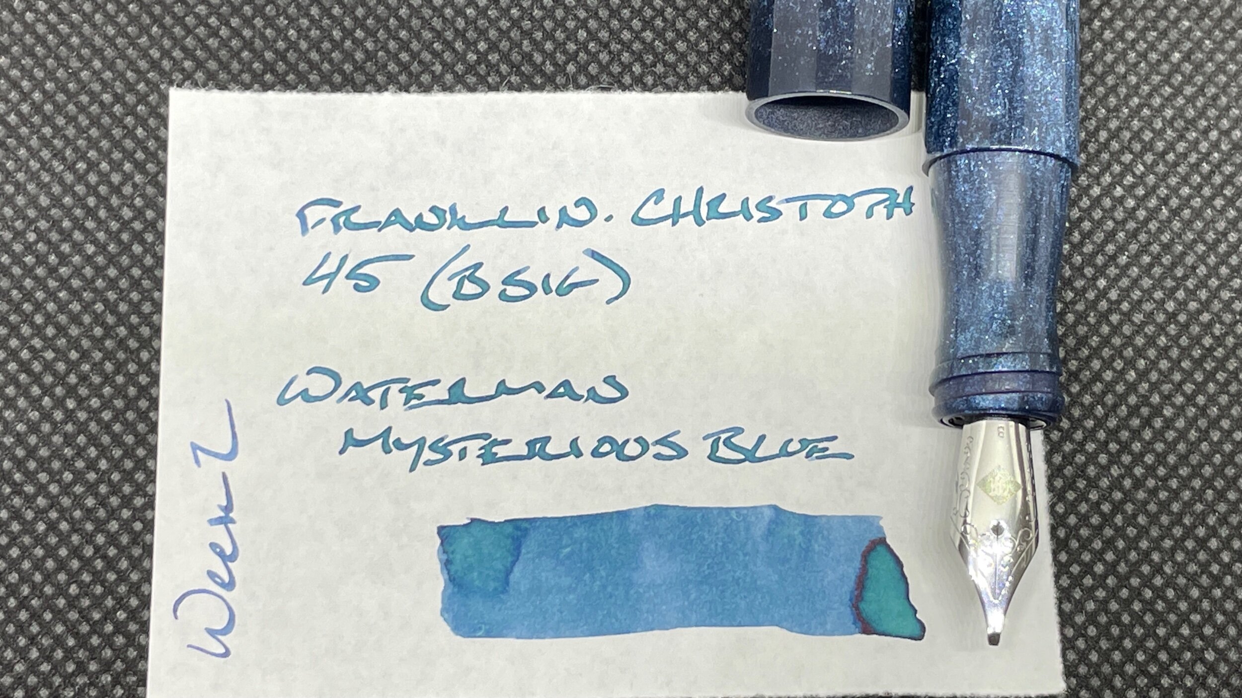
Franklin-Christoph Blue Diamondcast 45 (B SIG, by Franklin-Christoph). Waterman Mysterious Blue. The B SIG offers healthy line variation. Mysterious Blue leaves readily visible shading. The color is too dark in a B line to serve as an easily scanned accent color in notes. However, the B line itself helps the pair stand out enough to serve effectively in commonplace notes. Journaling and letter writing.
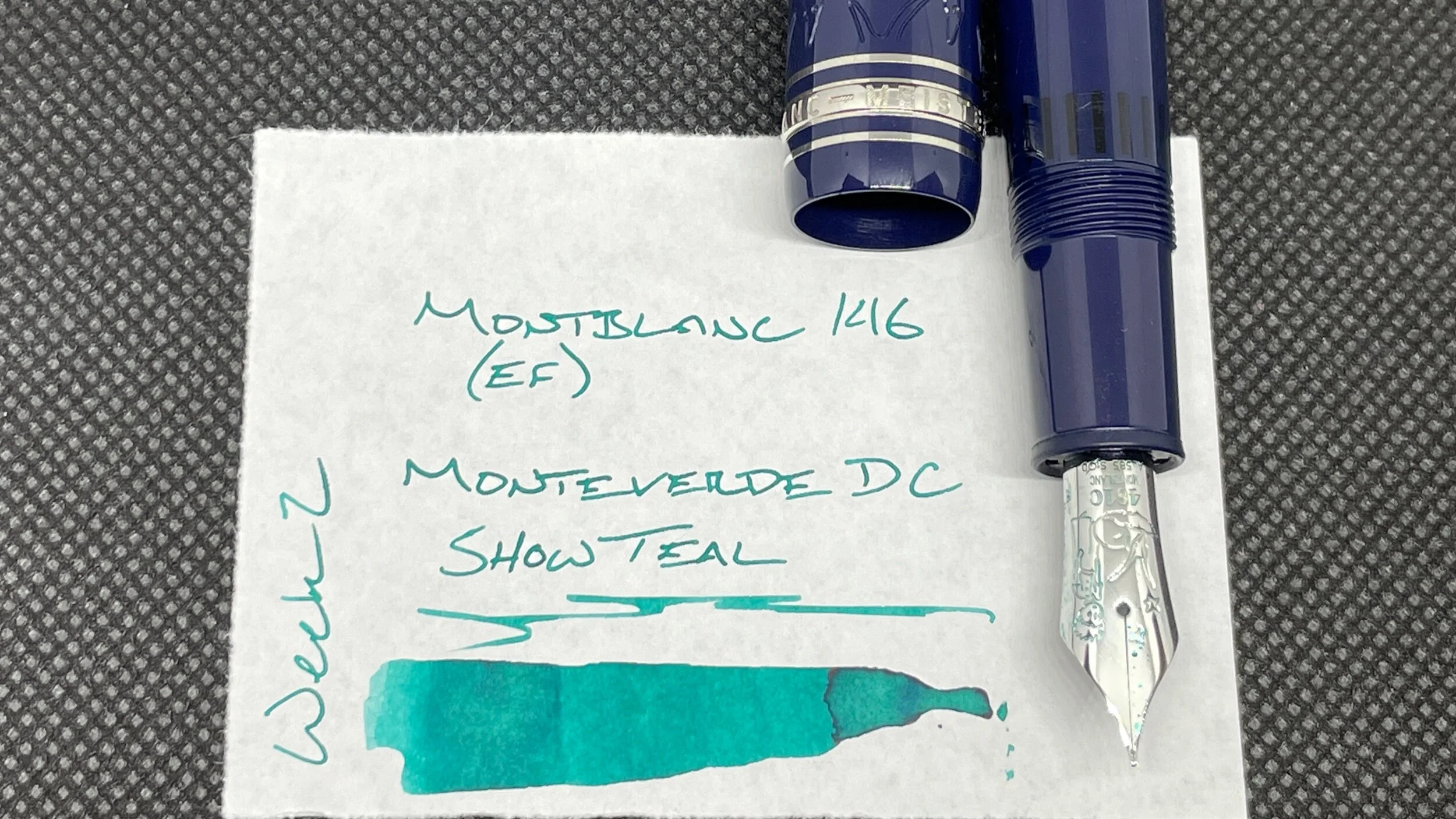
Montblanc 146 Le Petit Prince and Fox (EF). Monteverde 2019 DC Supershow Teal. This pair produces a narrow, Japanese EF line width. Teal remains bright, even where shaded. The combination makes this pair excellent for accent notes while commonplacing, and for accenting tasks or events in my Hobonichi Weeks.
Earth Tones
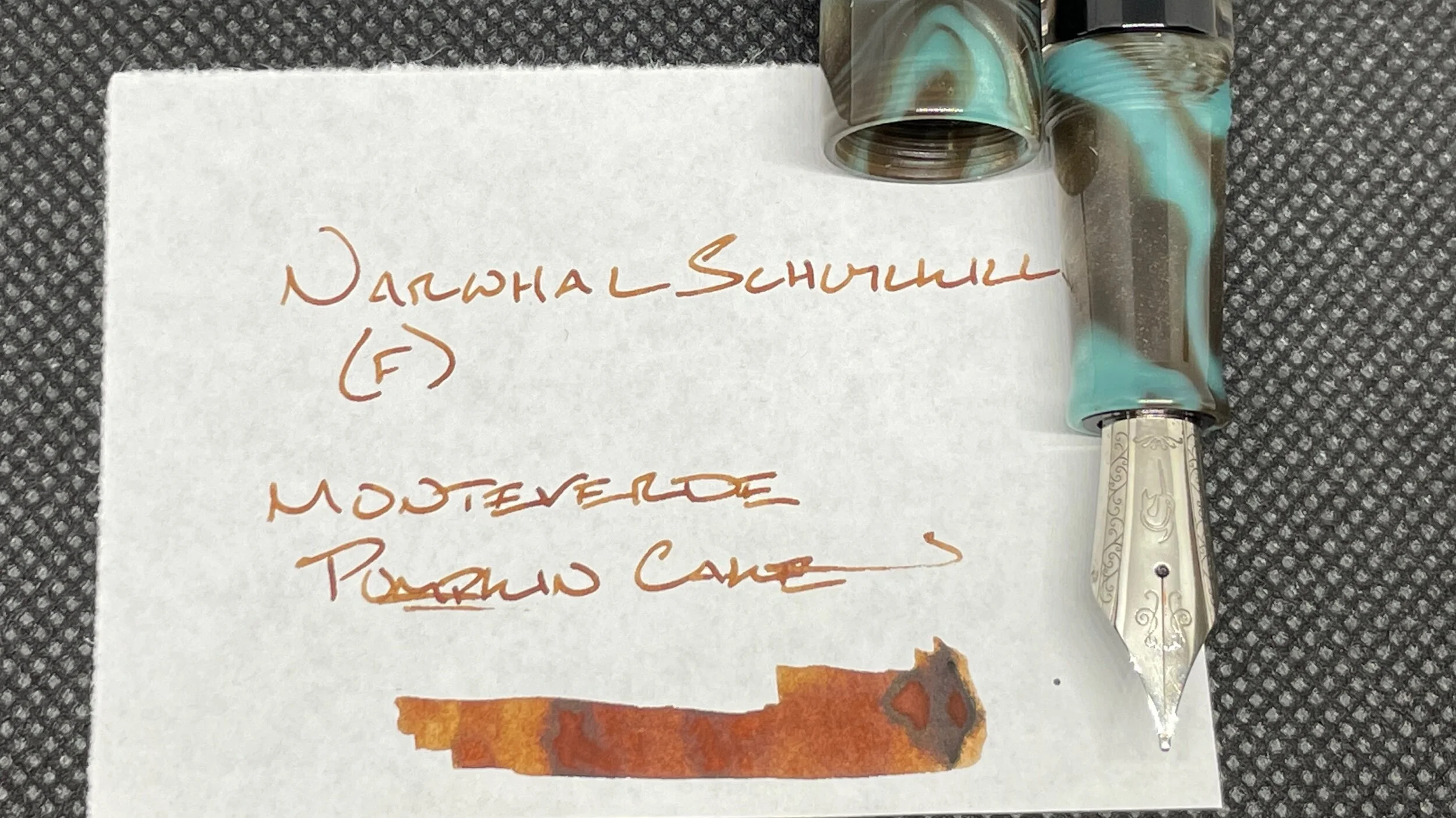
Narwhal Schuylkill Chromis Teal (F). Monteverde Sweet Life Pumpkin Cake. Pumpkin Cake has the first fill honors for my new Narwhal. Cake comes as a recommendation from my father-in-law Brian. Chosen as a matchy-matchy pairing. Cake should also work well as an easily scanned pop of light brown in commonplace notes. Journaling, too. In an effort to test the Narwhal’s clip, this pair is my pocket carry.
Wild Cards
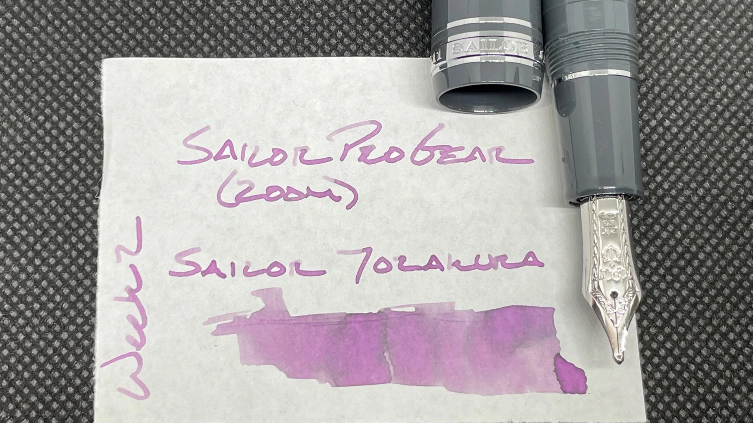
Sailor Pro Gear Graphite Lighthouse (Z). Sailor Shikiori Yozakura. The dry pairing results in feeling the shape of the Z nib on the page. Like biking down a wooded path. You feel every bump and root on the trail but love every minute of the ride. Excellent accent combo for commonplace notes, and for journaling.