A new notebook is a decision prompter
I feel excited when a new notebook enters the game. This was a banner week as two new notebooks have entered the game: a new personal journal and a new teaching bullet journal.
New notebooks are wonderful and intimidating prospects. Because empty notebooks begin the fun process of deciding.
I have a calamity of options for how I might format and index journal entries. Let’s think through my options.
Calamity? More like awesome possibilities …
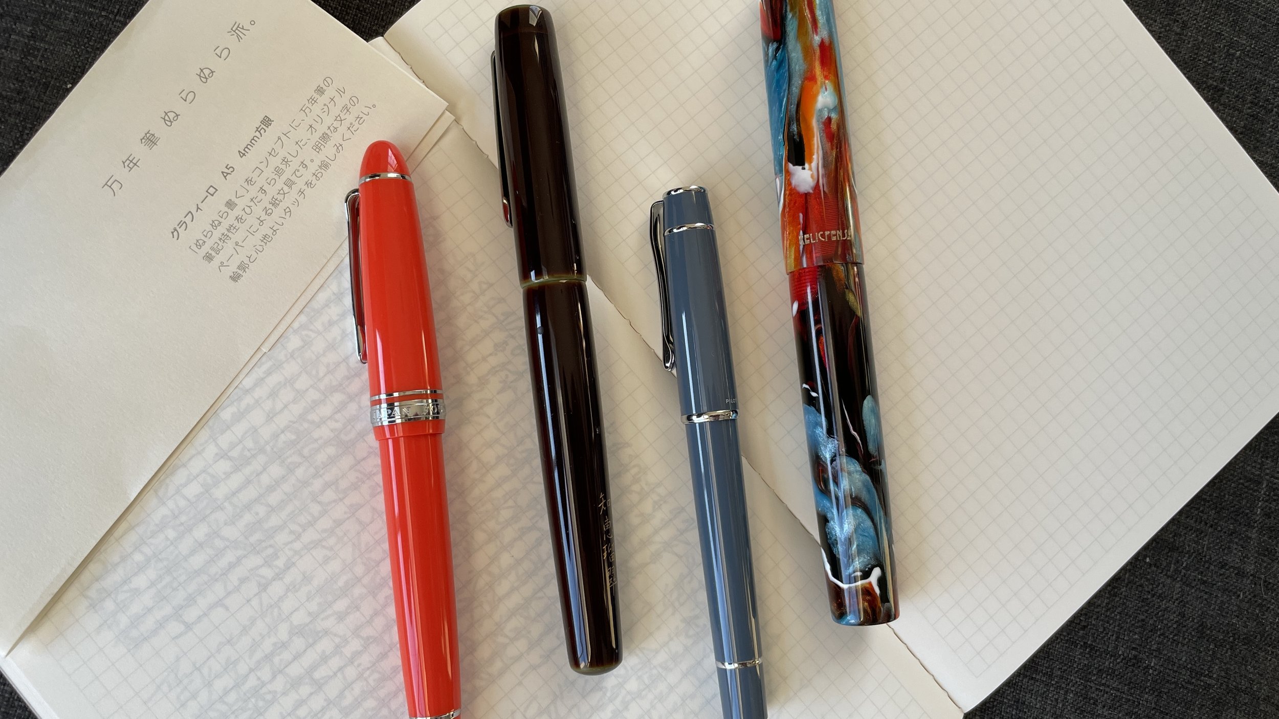
Kobeha’s A5 notebook sports a small grid, measuring 4mm. Such small writing space begs the question: should I write single spaced, within each 4mm row, or should I write across two rows, creating an 8mm line and a double spaced effect?
I tried both ways
I feel more comfortable working within the single spaced approach. Blocks of tightly-packed text are aesthetically pleasing to me. A strong enough reason to run with the decision.
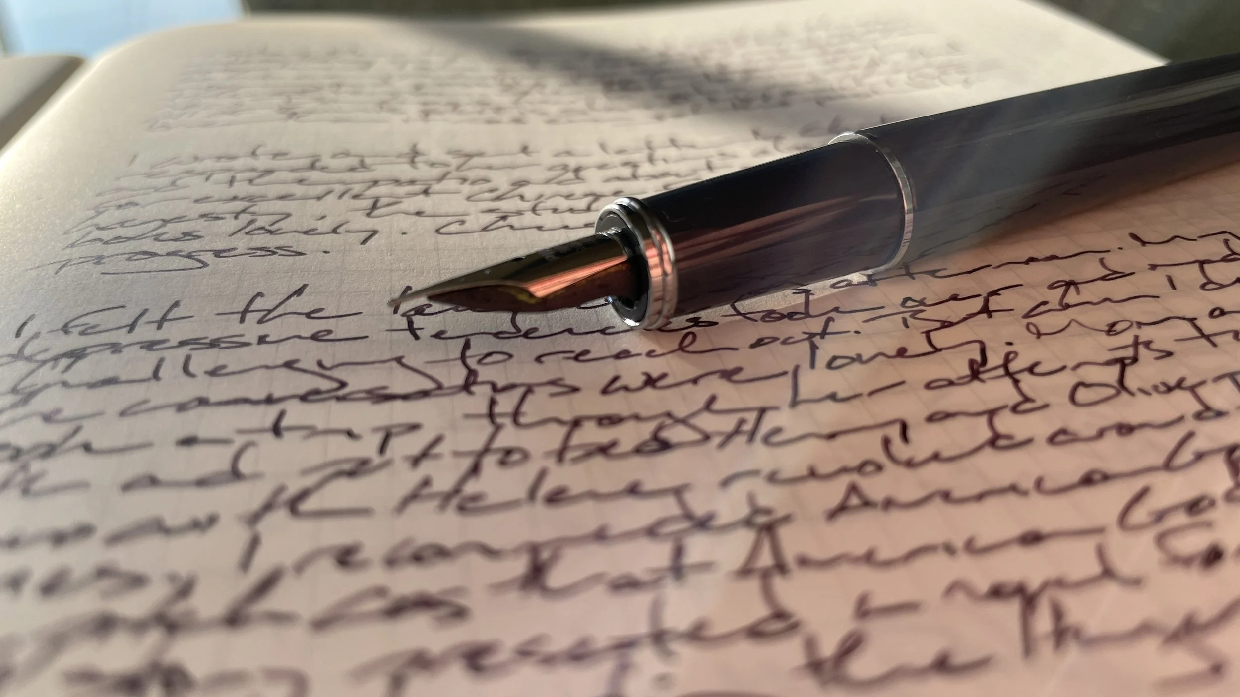
I’m a fan of margins. Empty space between the ends of my writing and the ends of each notebook page is endlessly useful. Narrowing my writing lines renders each line easy to skim. Margins are also skimmable locations to metadata like dates and locations. I opted for the outside bottom corners of my entries for date titles.
I see you looking at my margin date, but my nib is up here.
Poems and prose excerpt entries start with a title and a horizontal line. Infrequent horizontal lines at the top of a page renders citational entries skimmable. Look for the horizontal line.
How do you set up your journal entries?
This week’s Inked Tines update includes last week’s currently inked writing tools.
Toolset
Pens. Diamine’s Solar Storm breathes life into this week’s standout combo: the mini-mighty Pilot Prera. Pilot calls my model Slate Gray. Grey it is. The M nib is smooth, bordering on glassy. Excellent for taking notes with partial attention. Pilot’s Con-40 is great at keeping shimmer suspended in ink. Pocket notes, meeting notes, scratch notes, journaling, and reading notes. 2/5.
Sailor 1911L Tangerine (Z) — Feed only. This pair carried me through two longform letters to my partner. Each letter was over five B5 pages long. B5 pages adorned with my small letterforms.
Nakaya Neostandard Heki-tamenuri (Naginata-togi) — 2/5. Struggled to keep up after a B5 page.
Able Snail Classic Powder Blue (B) — 1/2. This pair was reliable and professional. The single-color cobalt ebonite fit the tone of Thursday’s curriculum planning meeting. Ainezu was suitably straightforward, with enough shading to keep my own writing interesting. Meeting notes, lesson planning, reading notes, and letter writing.
Krusac L-15 Buckeye Burl (EF) — 3/4. The pair grew wetter as the week wore on. As of this writing, the L-15 produces a consistent EF line with light shading. Quick dry time keeps this pair suitable for task management and scratch notes.
Relic Pens “Fire, Earth & Ocean” (M) — 7/8. Puka Puka is a whisper of a blue ink. The Jinhao M nib keeps this pair moderately dry. Accent notes exclusively due to the light hue of written lines. Some reading notes, too. I wonder how Puka Puka will look in a wet nib like a Visconti or Pelikan?
Notebooks. Journal. Kobeha Graphilo 4mm Grid (A5). Writing within Kobeha’s 4mm grid packs a monsoon of ink onto each page. I wrote three entries over the course of last week. Each entry was a longform recounting of my days. Loose histories absent any significant self-analysis. The joy of reliving salient moments.
New inks accompanied me along Wednesday’s and Thursday’s entries. Sailor’s Zoom nib laid down consistent broad lines while my mind wandered while I mentally relived reading a letter from my partner and a work meeting. All in KOBE’s Fairies ink. Exciting.
Troublemaker’s Sea Glass began Thursday’s entry with dominant deep green shading against periodic whispy green-teal. One-and-a-half A5 pages wore the ink flow down until Sea Glass was dominated by whispy green-teals with punctuations of deeper green.
The third entry is carried by the Prera’s narrow M-width lines and Solar Storm’s dusty purple hues. Small lines pack a wealth of words into each 4mm tall row of the Kobeha’s grid. A writing pair so smooth as to be unfeeling. I had to peek sideways at the page multiple times to ensure the nib was actually on the page.
And subtle shimmer
All that writing resulted in five pages. Kobeha’s skinny notebook may last a reasonable duration as my journal. Go Kobeha.
Written dry. The Sailor wrote itself down to only the circus fairies ink that remains in the feed. I partially filled the Sailor’s converter with KOBE’s Fairies after returning from the DC Pen Show last Sunday.
The 1911L’s width sits comfortably over long writing sessions. And the pear-shaped Z nib allows the rotation of my pen to shift as my mind wanders over the course of long personal letters and journal entries. A pen-nib-ink plan that worked.
Nothing wrong with a pear
Newly inked. I’m on a roll with sticking to the plan. Another week with my currently inked secure as my only six inked pens. Hooray.
The collection
Incoming / new orders. Buckle in and buckle up.
The DC Pen Show made this happen …
Ryan Krusac’s pens were the first small maker pens to catch my eye when I attended my first-ever pen show years back. I’ve visited his tables and spent an impolite amount of time asking him questions about his process and his pens at every show I’ve attended since. And he has been wonderfully forgiving and open each time.
This year, I found a grey-toned buckeye burl colorway of Krusac’s shapely L-15 Legend model. The plastic thread housings keep the L-15 feather-light. Suited to quick bursts of notetaking. And the well-tuned EF nib lays down a consistent narrow EF line. Perfect for my small handwriting.
Relic Pens offered a fun option for a large unnamed pen model made with two sections: one for #6 Jowo nibs, of which I have a plethora, and a second section for Jinhao’s #8 steel nibs. The wide sections are rendered comfortable in-hand by a subtle flare out just above the nib. The pen is sized for both short and longform writing sessions. I’m calling the unnamed material: Fire, Earth & Ocean. Historians are historically uncreative at naming things.
Large, swirly pens. Griff sizes with giggly personalities.
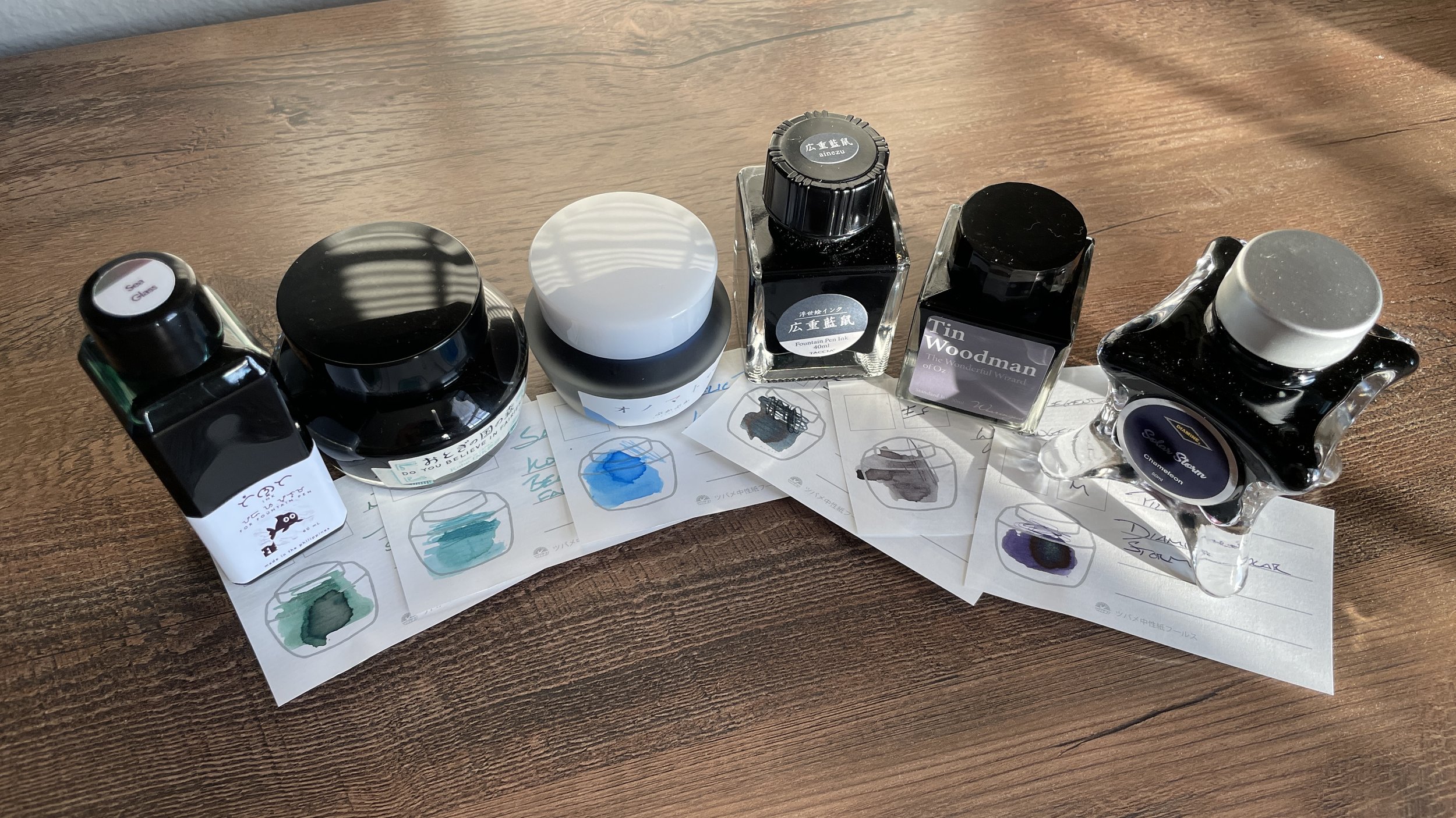
I snagged two special issue inks from Nagasawa’s table. The Inkcredible series bottle contains a strong-shading minty teal ink that is called “Do you believe in fairies?” Old timey aesthetic? Check. Generous flow? Yep. Haloing and shading? And how.
The second is a smaller bottle from an ink line my translation app suggests is called Onomatopoeia. This ink, Google tells me, is called Puka Puka. A windy sky blue that stand out within my existing ink collection.
The Zelda treasure chest song should play whenever I open one of those KOBE bottles
Smruti Pens had a checkerboard of Taccia’s wonderful Ukiyo-e ink line. I dig thoughtful histories. I like a rainstorm. And I adore a good theme. Ainezu captures the blues and coppery reds from Utagawa Hiroshima’s painting of a sudden rain shower. Color me sold.
Another three ink bottles also came home with me. Wearingeul’s Tin Woodman is a mid-toned grey ink with prominent shading. And excellent neutral ink for my daily driver pen pairings. Troublemaker’s Sea Glass lends a green-heavy multi-shading teal ink for when I want to a blue-tinged teal in my palette. And I bought a full bottle of Diamine’s Solar Storm. The combination of dusty purple ink and infrequent multi-colored shimmer has me hooked.
Bursting at the seams.
Outgoing / trades or sales. Ha. Haha. I ran in the opposite direction from paring down either pens or inks.
Currently reading and listening
Fiction. I am 31% through Becky Chambers’ A Closed and Common Orbit. My fiction reading took place exclusively on my iPhone. Apple’s Books app is reliable, easy to use, and always to-hand as it’s installed on my phone.
Becky Chambers has become a fast favorite over the last two months. Her worlds are carefully crafted, with intricate histories and ecologies. I’ve come to adore her characters. Good people who are doing the best they can.
Reading ACCO offered a hit of positivity and heart that I needed during so much unpacking and transitioning.
Nonfiction. Having a desk, unpacked bookshelves, and a functional study helped me dig back into my nonfiction reading last week.
I finished Hemmer’s recent political history, Partisans. A second read-through of the whole book. Methodical annotating to draw connections across chapters and to other authors’ ideas. 300 pages of reading.
My second, detailed read-through brought my Mitsubishi 9852 pencil down to the pencil’s printed logo. It feels great to have a small bowl filled with pencil shavings again. Evidence of thinking.
These are my pencil shavings. There many like them. But these are mine.
Music. Chillhop continues to churn out clever lofi EPs. This South of the Circle compilation has played on repeat since it dropped. If you like mellow accompaniment while you reflect, write or read, give this 30 minute EP a rotation.
The peaceful animation and tight arrangements were my reading soundtrack. I knocked Partisans down to this video playing on loop. South of the Circle kept balance between stoking my attention and staying out of the way enough that I could maintain my concentration on Hemmer’s ideas. Bam.


