The nafety for safety: Three new no nonsense pens and inks for my currently inked


Two of last week’s pen-and-ink pairings did not work well for the kinds of writing I do during the school year. So, I’m playing it safe this week. With inks and pens I’ve come to trust to write unfailingly well.
My experience with Pilot’s Iroshizuku ink line is fun ink colors that are consistently consistent. Good behavior, even on sub-par paper. I chose two accent colors for this week: Yama-budo’s purple-pink and Yu-yake’s shock orange.
I also chose my nib and ink pairings to get to the sweet spots of subtle feedback and moderate ink flow.
Yama-budo is a wet writer. I paired it with a sharp SIG nib. The strong ink flow should smooth out the SIG’s crisp edges.
Yu-yake is a lovely orange that throws off hints of reddish-orange in wet nibs. I put it in my generous Lamy B nib to encourage a little red. Just a little. Nothing so red it might worry students who see it on their returned papers.
I also turned to my all-in-out favorite Aonibi to “dry down” (let’s pretend that’s a real phrase) the glassy-smooth gusher of a B nib that is in my Carolina Charlotte.
Balance and consistency. I do, indeed, have the nafety for safety.
Grey/Black
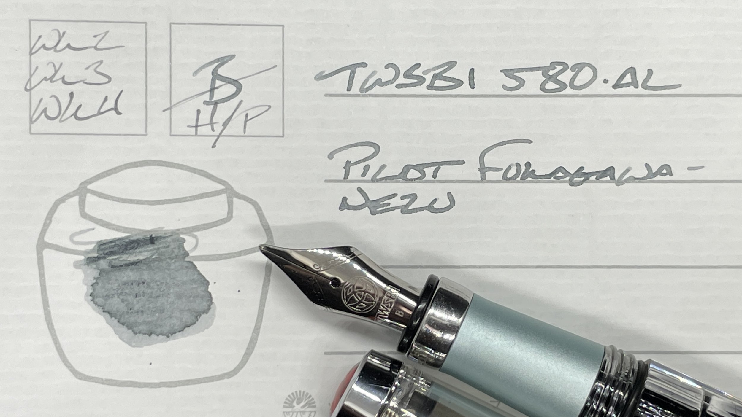
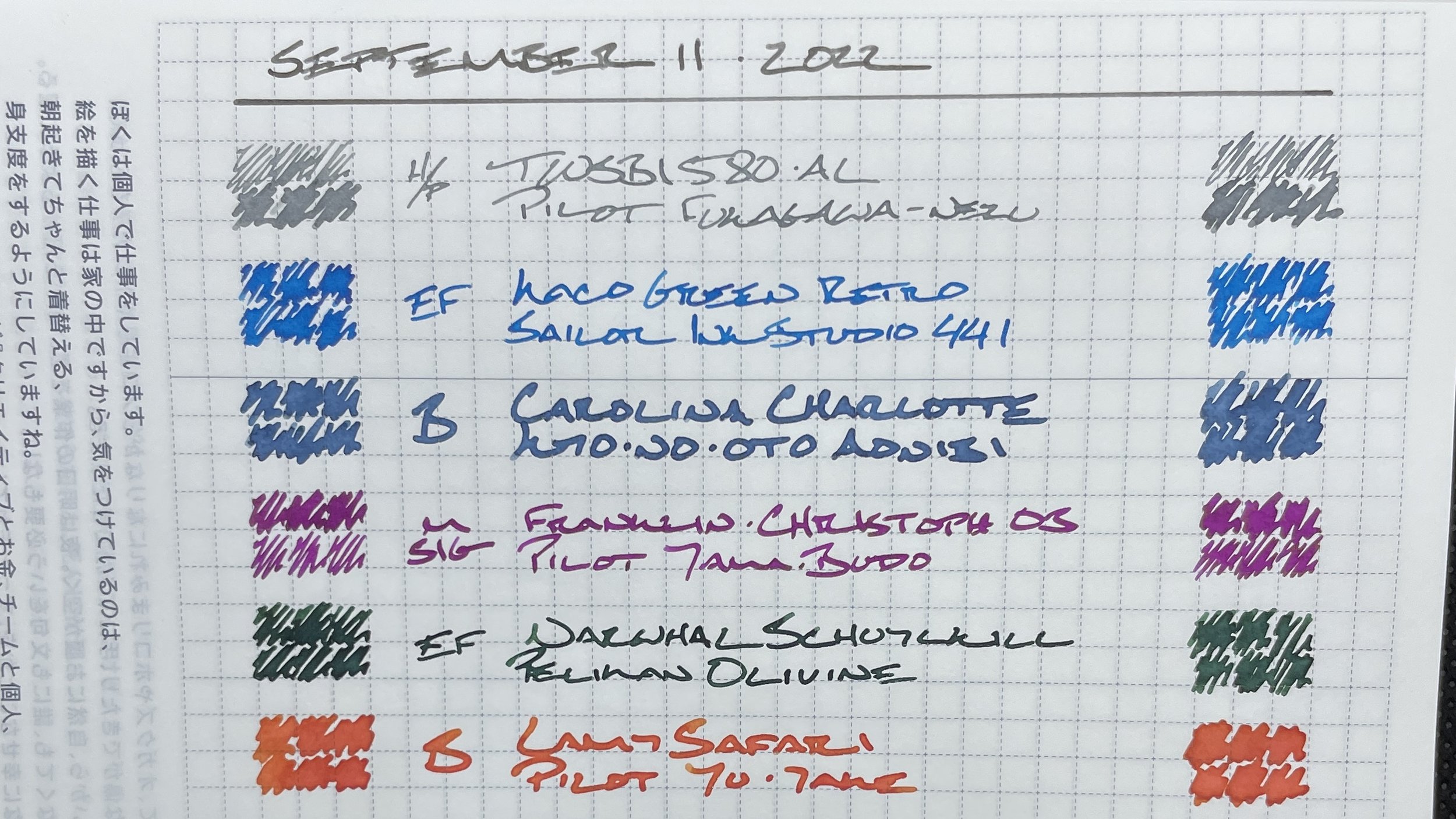
TWSBI 580-AL Turquoise (Predator Hybrid, by Nibgrinder). Pilot Iroshizuku Fukagawa-nezu. Fukagawa-nezu has darkened noticeably since I first inked it in this 580-AL. I enjoy Nezu in its current darker, mid-silver grey. It halos often and shades noticeably, even in the hairline EF of this ground nib. My daily driver for the week. Task management, Hobonichi planning, meeting notes, reading notes and D&D notes.
Blue/Teal

KACO Green Retro Blue (EF). Sailor Ink Studio 441. KACO’s EF nib brings out the best of Sailor’s 441. Smooth, consistent writing without any hard starts or skipping. How a pen should write. Bright enough of a blue to work for gentle grading — especially on early drafts of my students’ research papers. Also, accent notes, reading notes, lesson plans, and some commonplace notes. And D&D notes.

Carolina Pen Co. Charlotte in Dragon Scales (B). Kyo-no-oto Aonibi. The material used to construct this pen is simply stunning. I chose the Charlotte for its looks — and for its storm-like wet B nib. Aonibi is a dry ink. The combination results in deep cobalt blue lines with bountiful haloing — and no consistent shading to speak of. A dark, moody Aonibi limits this pair to non-accent writing tasks: journaling, meeting notes, brainstorms, and some lesson plan outlines. And D&D notes — because: “Dragon Scales.”
Earth Tones

Narwhal Schuylkill Chromis Teal (EF, Bock). Pelikan Edelstein Olivine. This pair is prone to hard-starts. A second’s rest on the page is enough to summon ink back to the nib for writing. Olivine writes neat European F lines in this nib. Easily suitable for detailed notes and accent notes: meeting notes, lesson plans, reading notes, and journaling.

Lamy Safari Terra Red (B). Pilot Iroshizuku Yu-yake. My go-to writer for comments and manuscript edits this week. Yu-yake skirts my prohibition against red ink for grading student work. The B nib also ensures my scribbles are easily skimmed for as the searing orange leaps off the page. Excellent for highlighting important parts of lesson outlines. Nice. Meeting accent notes, marking papers, lesson plan outlines, and journaling.
Wild Cards

Franklin-Christoph 03 Antique Glass (M SIG, by Franklin-Christoph). Pilot Iroshizuku Yama-budo. The M-SIG nib sits in a happy place for medium length and long form detailed notes. Lines have noticeable variation and remain legible despite my small lettering. With small, detailed notetaking in mind, Yama-budo’s wetness is intended to take the sharpness out of SIG’s crisp corners. A fun, purple experiment. Meeting notes, reading notes, lesson plans, some paper marking, and journaling.