The Japanese ink fellowship has broken
I tapped a non-Japanese ink for the first time in 2026. The fellowship, it seems, has broken.
I tapped a non-Japanese ink for the first time in 2026. The fellowship, it seems, has broken.
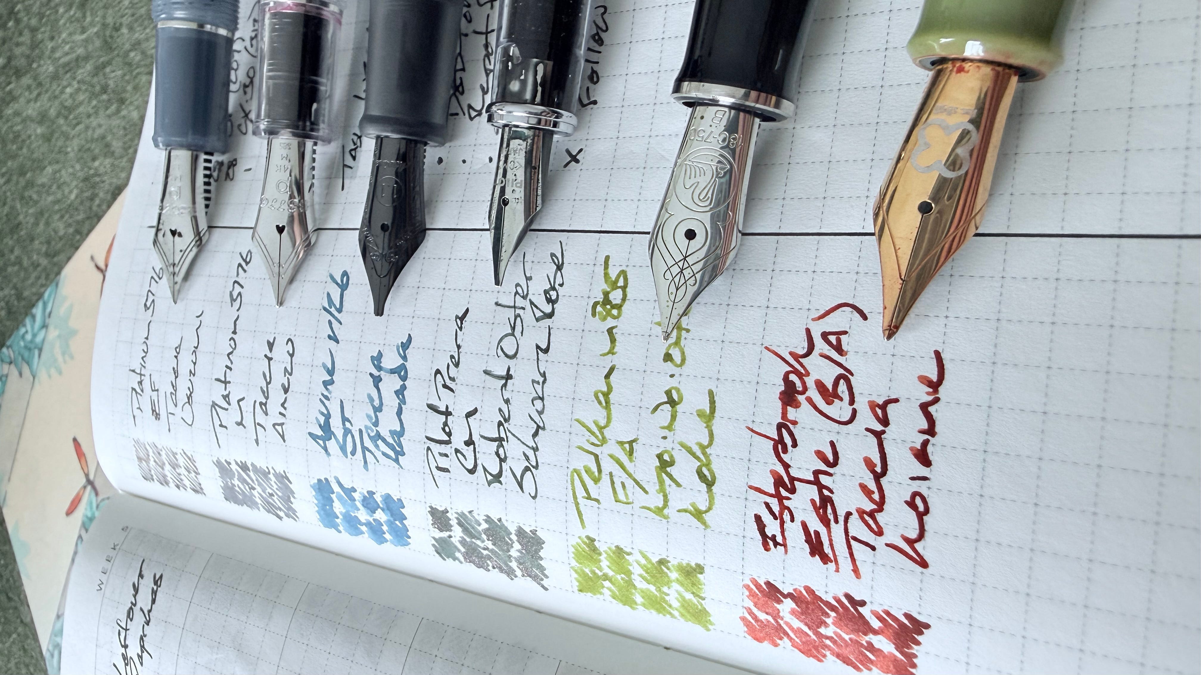
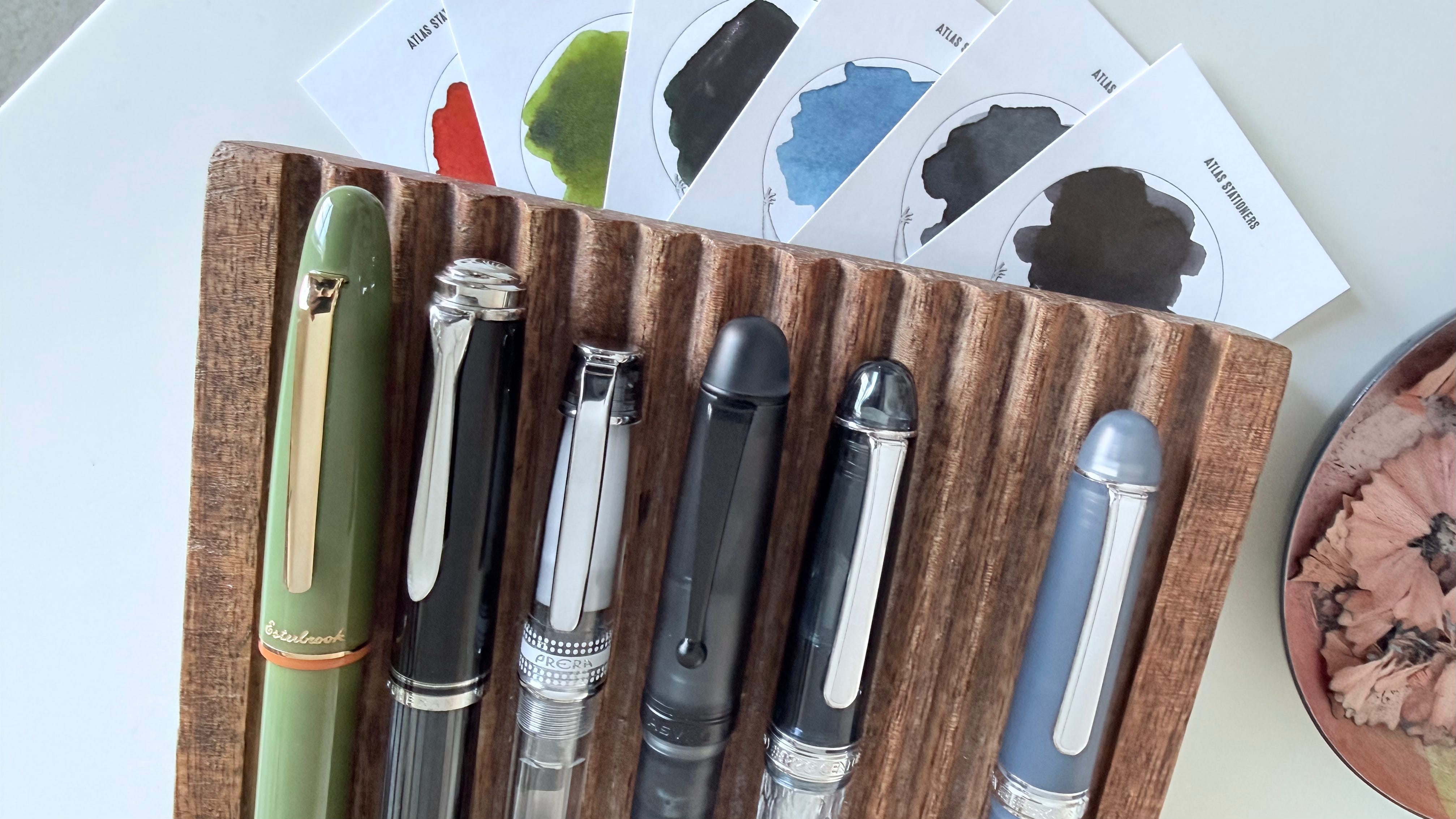
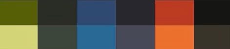
The week’s ink palette is split between three somber colors (Usuzumi, Ainezu, Schwarz Rose) and three bright (Hanada, Koke, Koiame). Even so, my inks’ personalities lean towards a conservative middle. Koiame, the week’s brightest ink, still holds to moody burnt oranges. Schwarz Rose is a dark green, sure, but rose gold shimmer lends welcome flair.
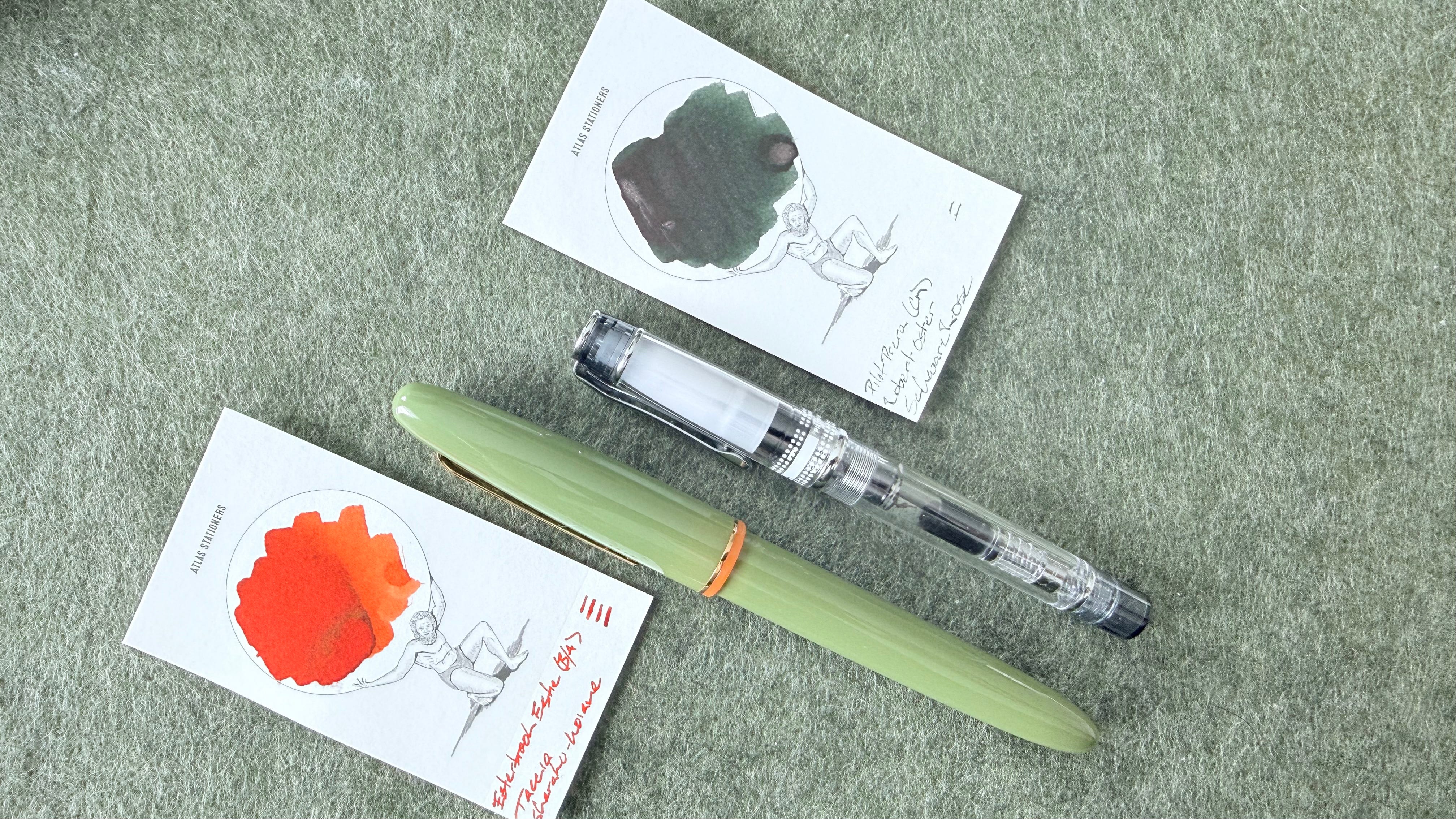
I chose Pilot’s CM nib for the week’s latest ink addition, bolstering my M-wide options to three nibs with line variation. The Pelikan and Esterbrook architects both live between M and B line widths. The CM offers horizontally-arranged ribbons of ink that dry slightly wider than either of the architects. Diversity in moderation.
Grey/Black
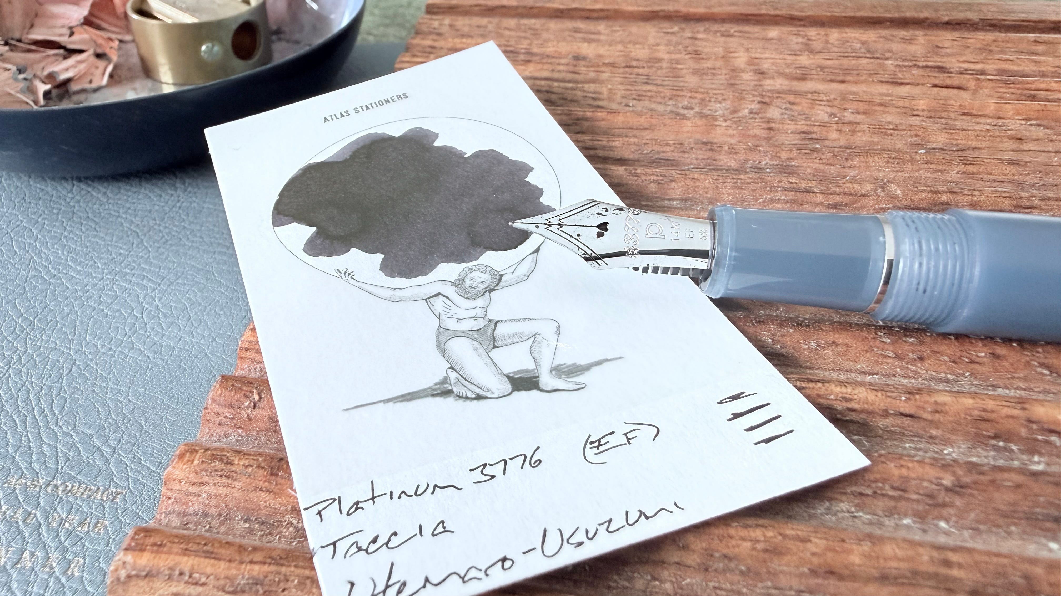
Platinum 3776 Tsuki Kusa (EF). Taccia Ukiyo-e Utemaro-Usuzumi. Pairing a securely-capped pen with a heavy-sheen (and so prone to dry starting) ink makes for a usable and mostly reliable writer. Planning out my scribbling prior to uncapping keeps this pair an enjoyably feedback-y daily driver. The narrow EF lines ensure easily readable detailed notes, task lists, lesson plan outlines, and reading notes.
Blue/Teal
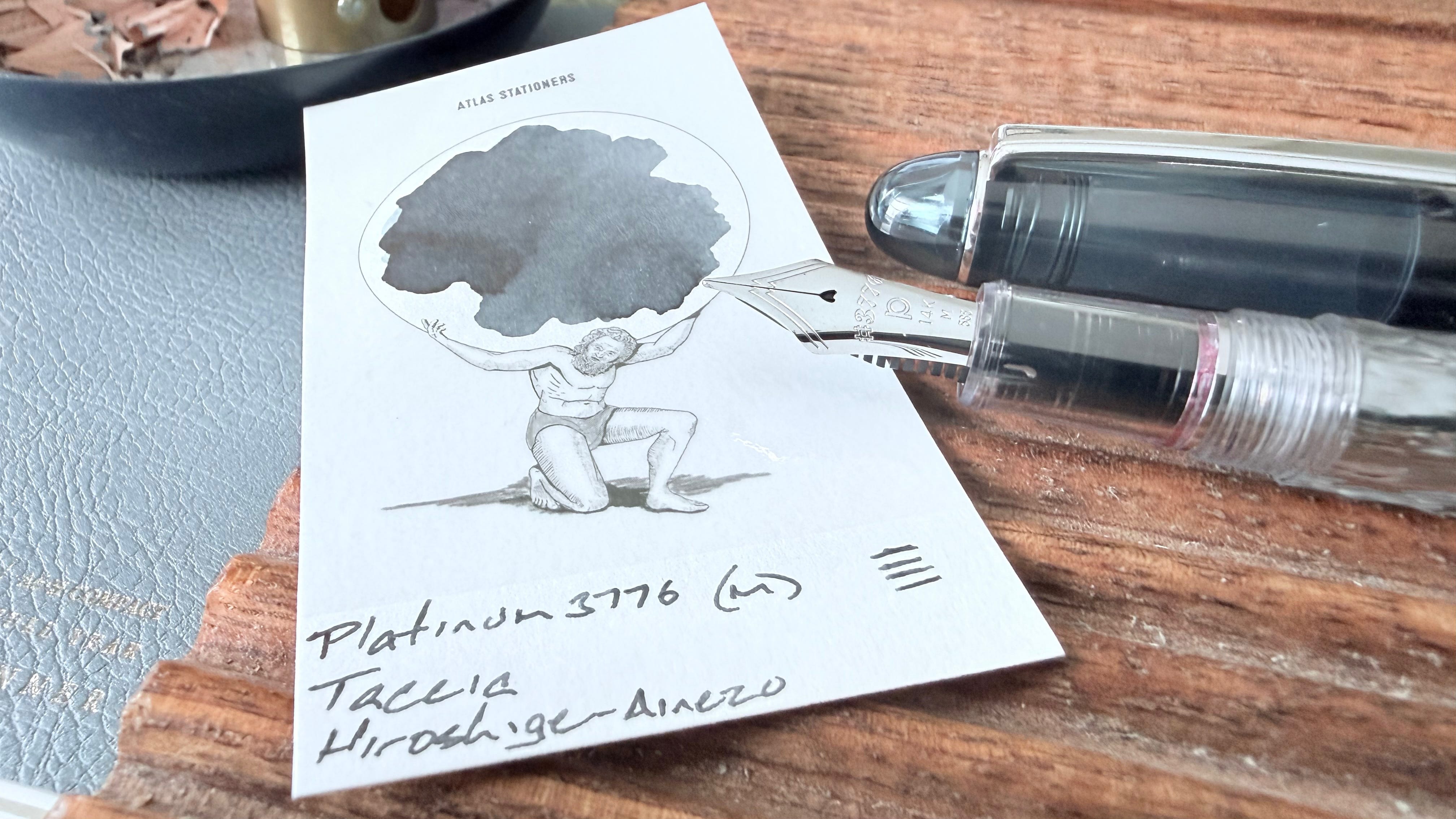
Platinum 3776 Uroko-Gumo (M). Taccia Ukiyo-e Hiroshige-Ainezu. Ainezu is a beautiful denim blue (or a gothic near-black) without being too shouty about it. The Platinum M nib continues holding Ainezu to account in its most denim-forward manifestation. The smooth comination has grown into a go-to for quick-moving mid-length and long writing sessions: meeting notes, journaling, and manuscript drafting.
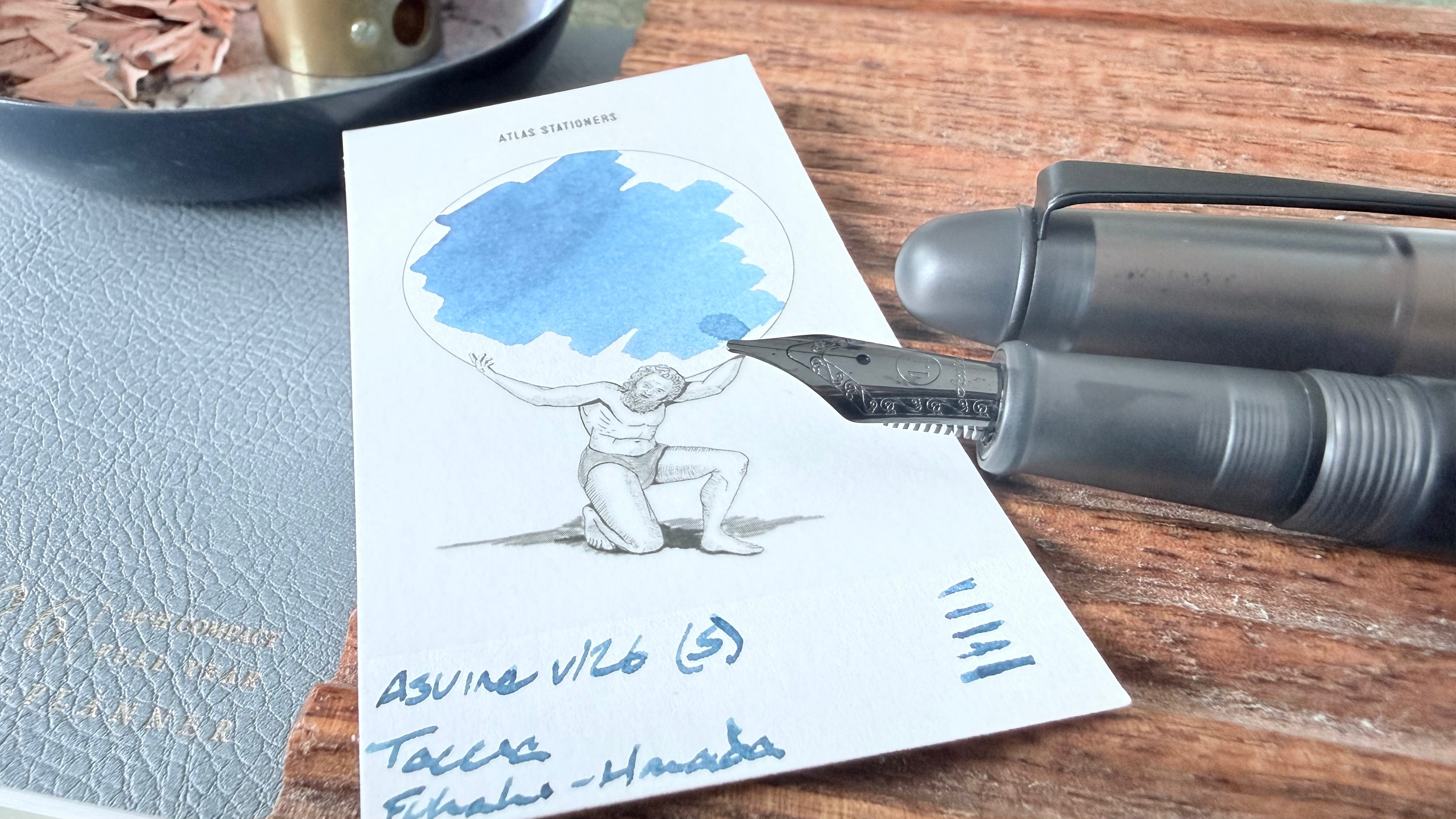
Asvine v126 Matte Black (S). Taccia Ukiyo-e Fukaki-Hanada. The week’s brightest blue opens possibilities for accenting notes and for marking up papers. The Asvine’s stub nib is a forgiving grind, allowing for slow writing and moderately-paced tasks like accenting meeting notes, curriculum design, and longform analytic reflections.
Earth Tones
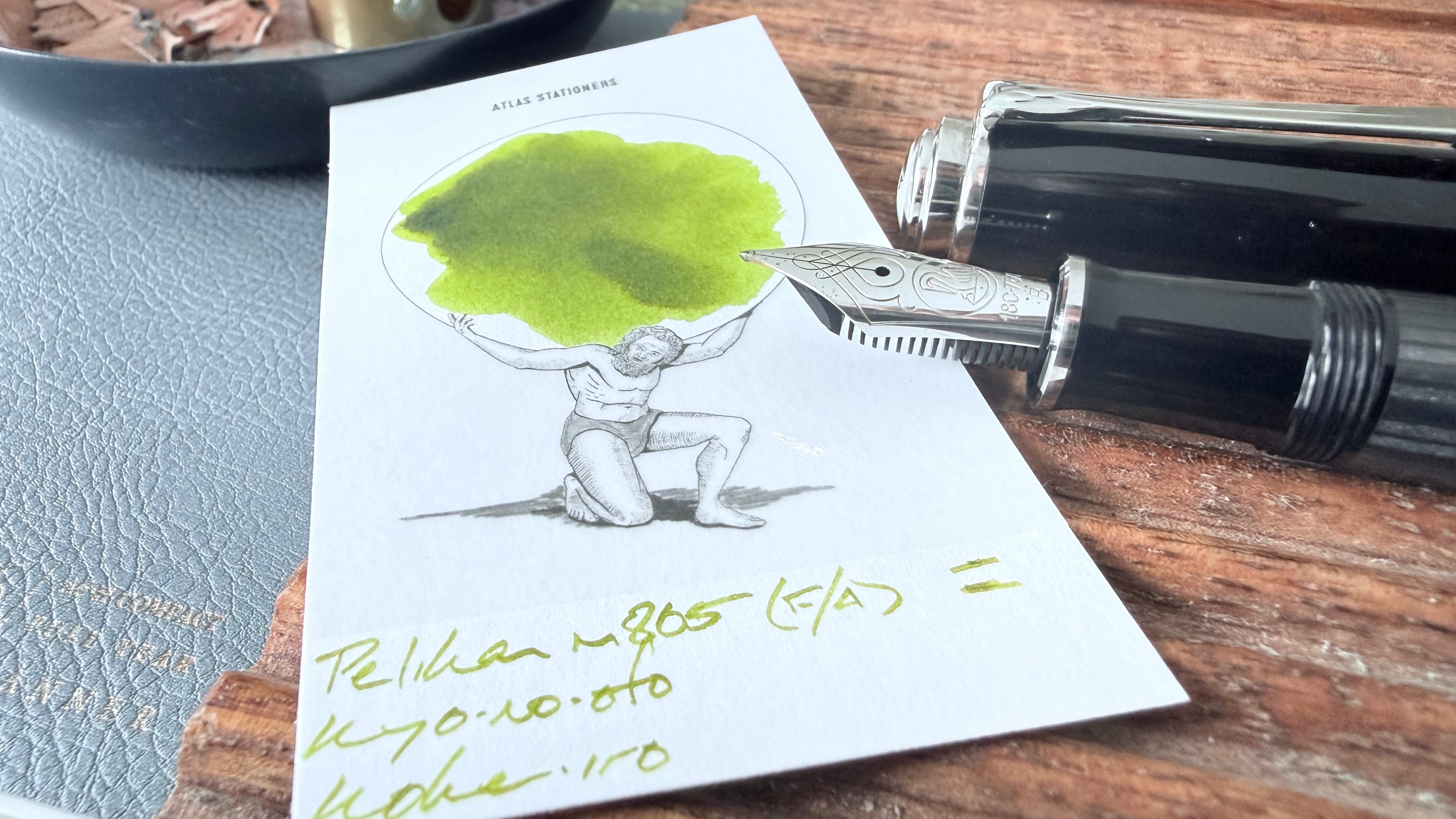
Pelikan m805 Stresemann Anthracite (F Architect, by Custom Nib Studio). Kyo-no-oto Kokeiro. Koke continues on as a whimsy-forward color option for a second consecutive week. The Pelikan’s architect grind shuttles dark pools of ink to the top and bottom edges of my letterforms — adding flair to tedious tasks. Accenting notes, tagging notes for migration, journaling, tracking grading and lesson revision, and lesson plan outlines.
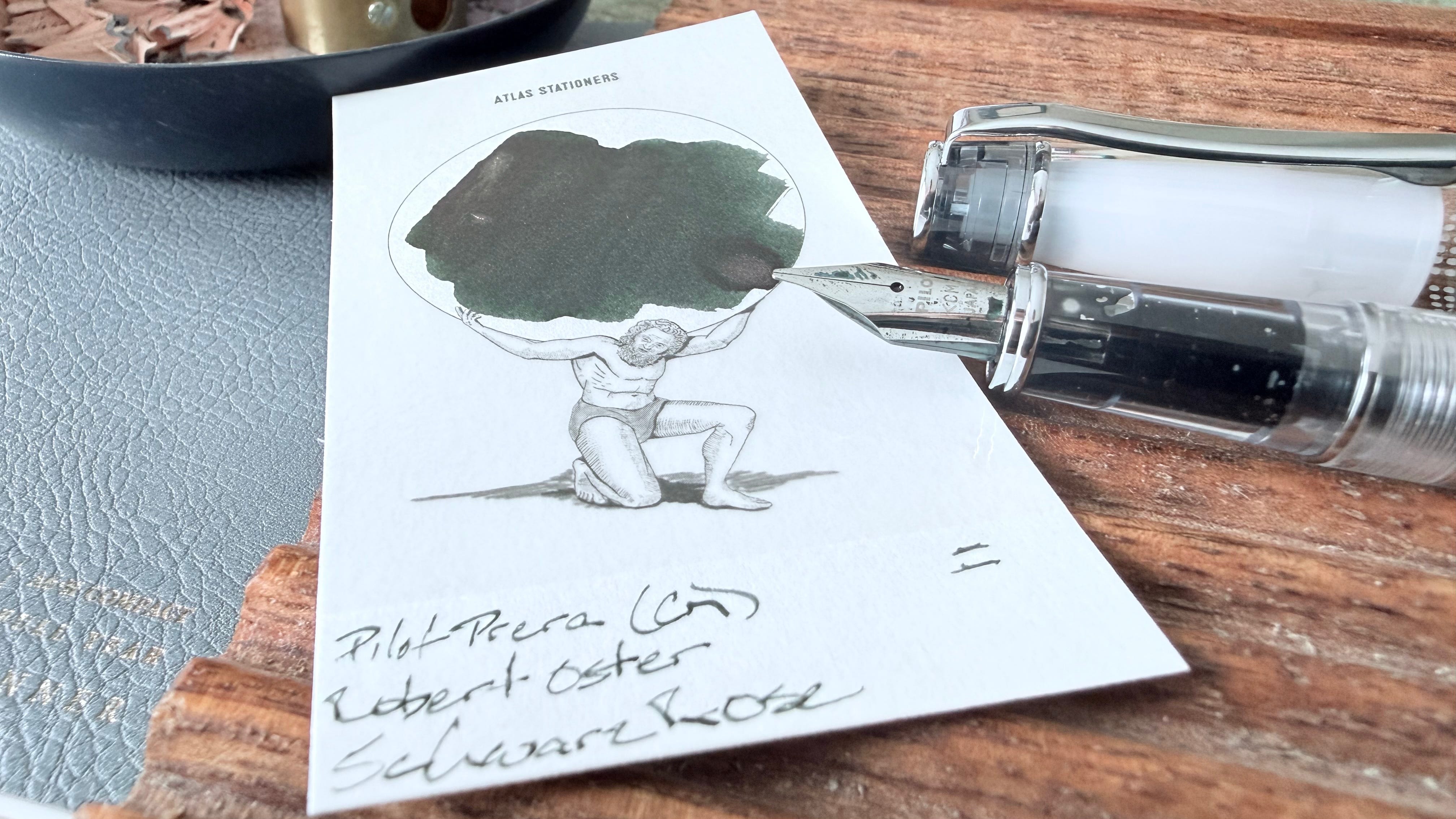
Pilot Prera Iro-Ai (CM). Robert Oster Schwarz Rose. The latest addition to my writing posse (with a mistaken two hashmarks on my swatch card). The Prera is a compact snap-cap writer tailor made for pocket carrying. However, the crisp CM nib requires attention to writing angle — which adds challenge to rapidly-jotted pocket notebook squiggles. Meeting notes, journaling, creative writing, lesson plan outlines, longform reflections, and curriculum design all come to mind.
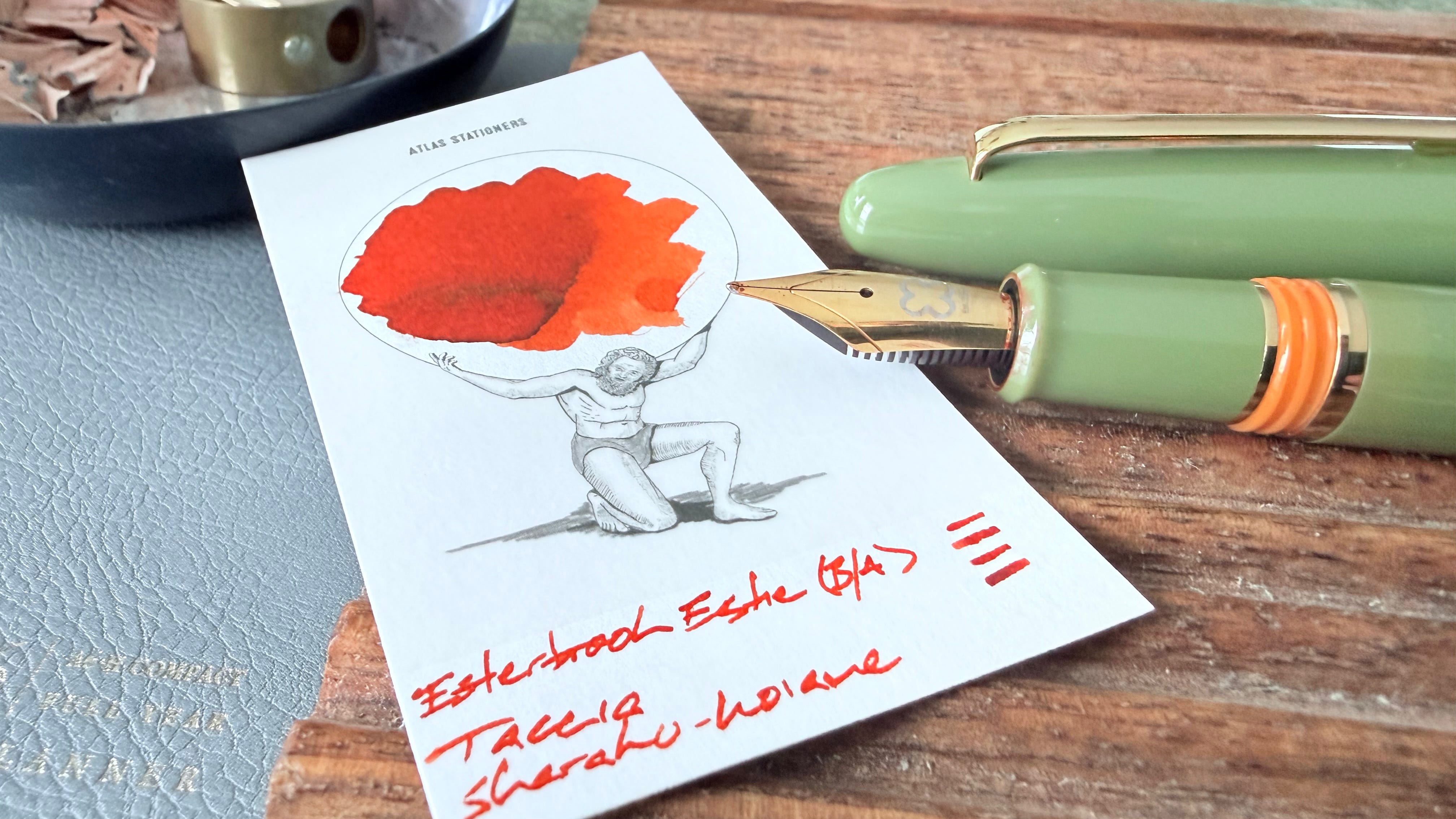
Esterbrook Estie Back to the Land Quirky Leaf (B Scribe, by Josh Lax). Taccia Ukiyo-e Sharaku-Koiame. Koiame is easily the loudest color this week. The orange remains a favorite for marking students’ work because the orange is bright enough to demand ocular attention and not red. Many of my students lose their minds when they see red comments on their work. The architect writes a wide-ish M-B line width, wich is excellent in moderately paced longform writing like journaling, teaching reflections, and curriculum brainstorms.
Wild Cards
Such cavernous emptiness.
All in the family