A little sun, a little shade
Rolling into a new school year is a tide of highs and lows. I’m eager to teach and work with my students again. As much as I will miss getting to spend daytimes with my partner. Sun and shade. Bright and dark.
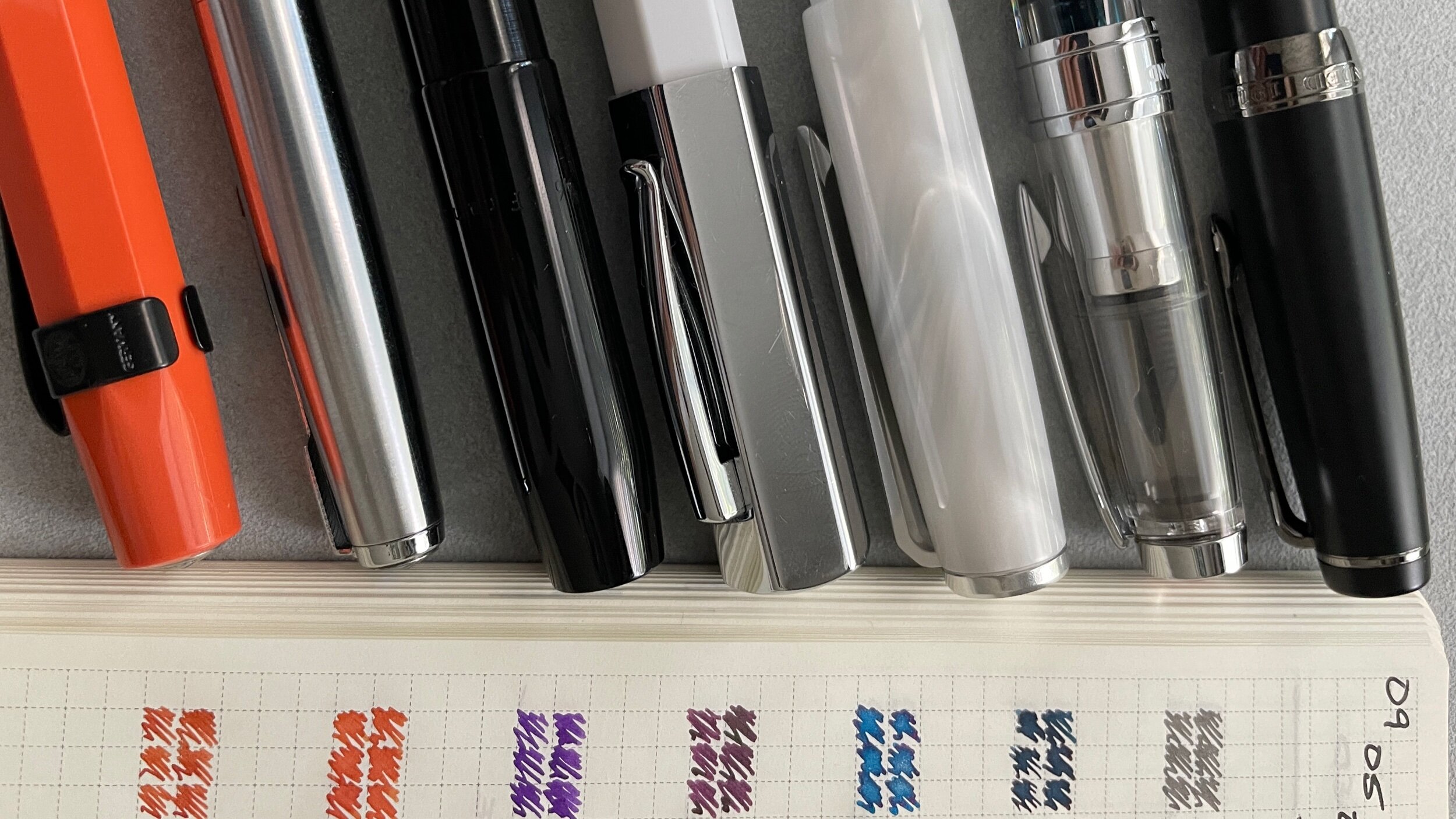
This week, I’m leaning into the contrast between light and dark. I chose one bright ink and one dark ink color for each color family. For a total for seven pairings — because grey.
Messy notes are the medium
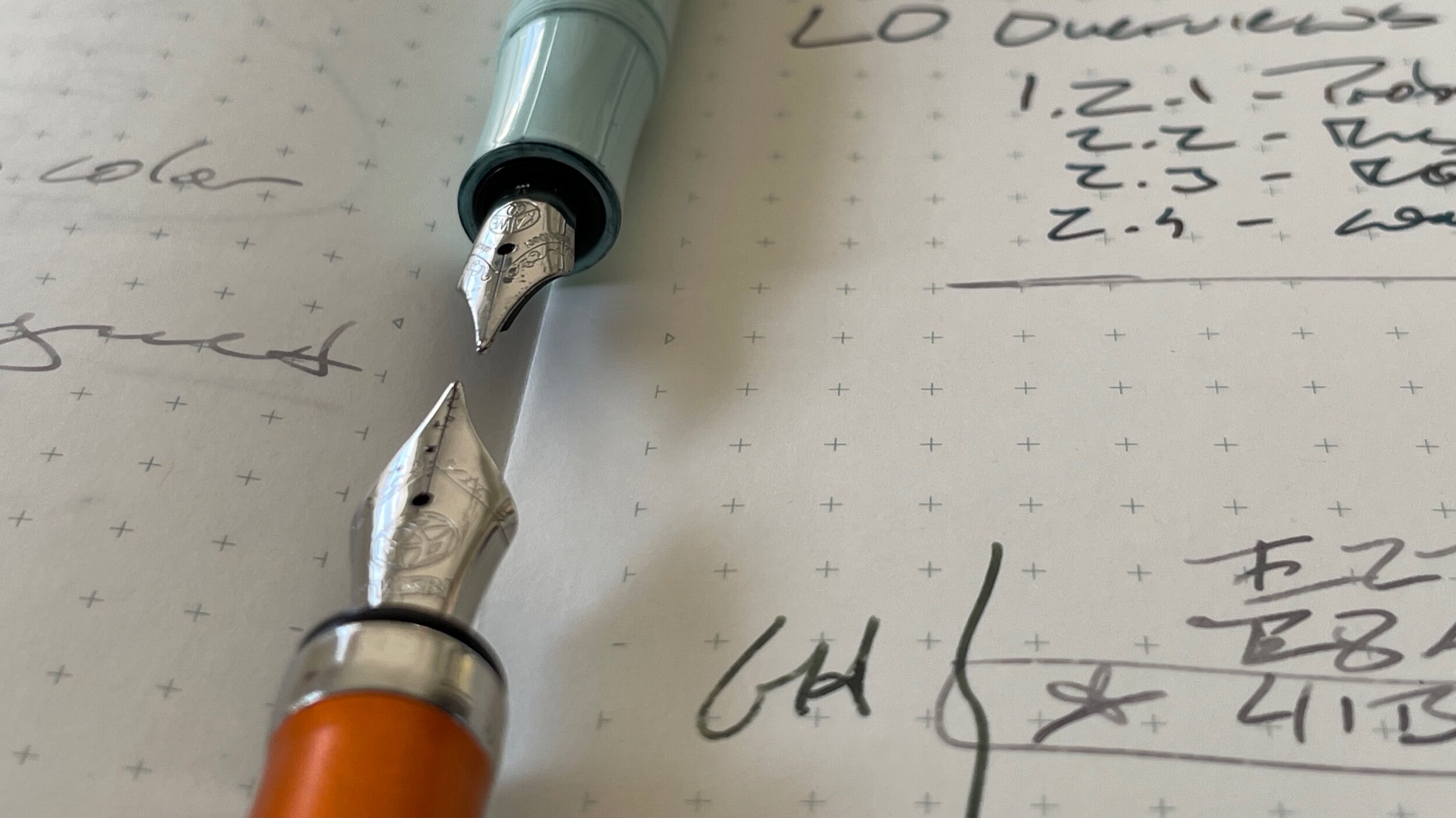
Scratched out words. Lines of text overlapping one another. Page grid optional. Squiggles that barely resemble letter shapes.
Messy notes are where I do my best thinking. Jottings and scratchings and cross outs are how I get from rough ideas to clever. Messy notes are the medium. They’re my work-in-progress.
Back to basics with round nibs
This week’s currently inked returns to basics. I have a pen and ink combination for fast writing while seated and for jotting notes while standing. All balanced against options for slower writing tasks at my desk.
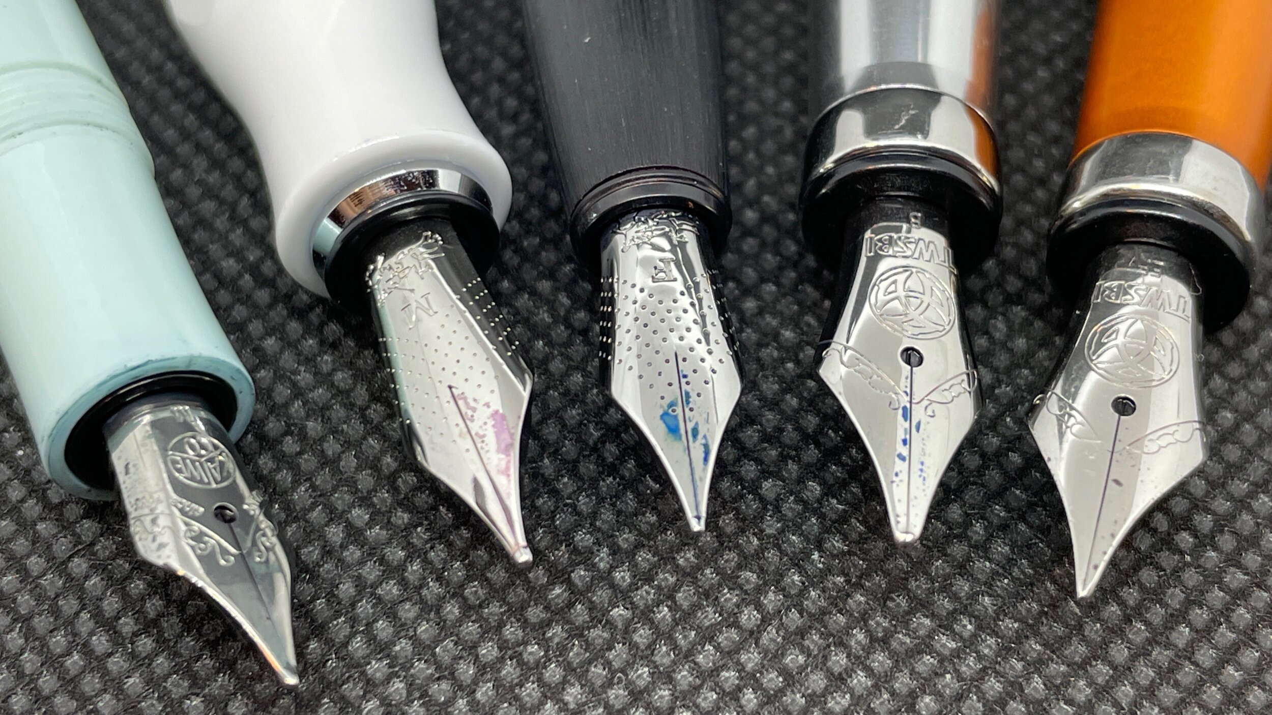
Round nibs are well-suited to fast writing tasks — and at odd angles. The rounded tipping writes smoothly, even when the nib is mistakenly rotated.
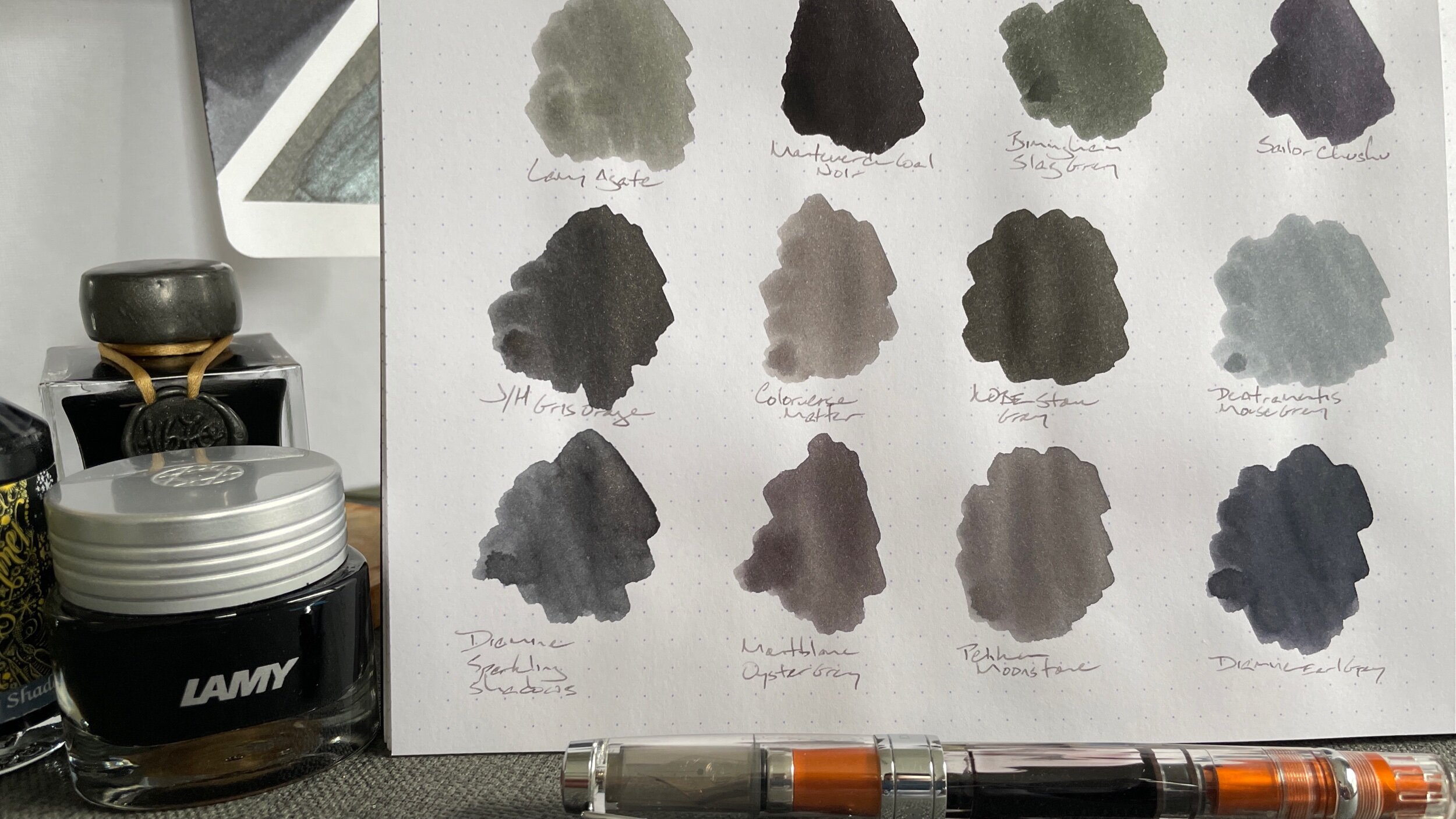
Isn’t grey just wannabe black?
A pen friend — who shall remain anonymous — joked with me this week about my penchant for grey over true black inks. “Isn’t grey just wannabe black?” Pshaw.