Quality simplicity is hard to pull off but makes for fabulous notebooks and reading tools
Quality simplicity holds powerful appeal for me. There is joy to be had writing with a F nib in a notebook with a precisely printed, simple grey grid on white paper. A simple thing done well is quite extraordinary.
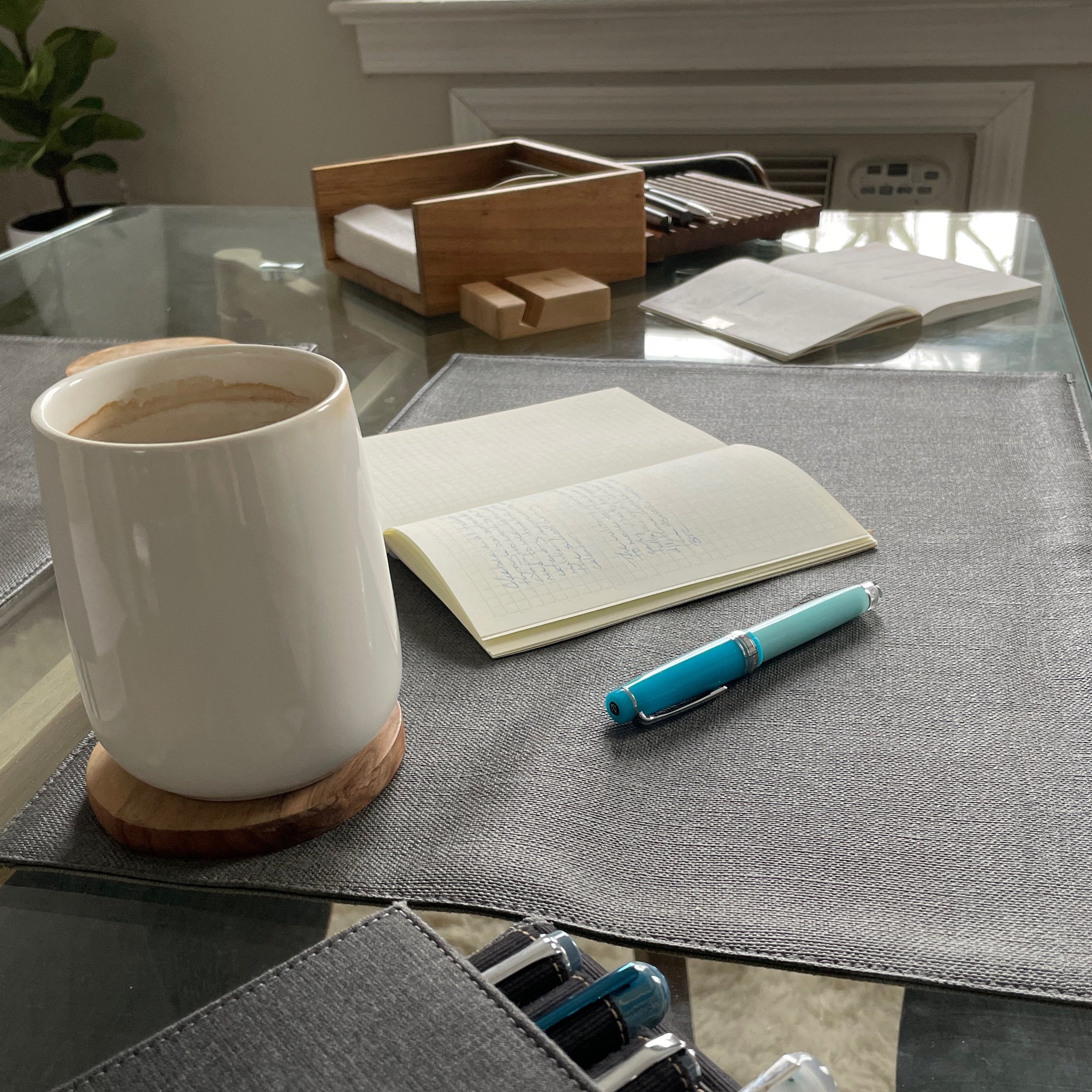
I outsourced my currently inked this week
Time to shake things up. I asked my partner to select three pens for this week’s kit. And I asked my good pen friend to select three inks from his own collection. No requests and no exceptions. How serious.
The beauty in a disrupted rhythm, a mnml digest
Five links. Ten sentences or fewer. On how the discomfort of trying something new is a sign that I’m growing. Conceptual discomfort, and feeling jarred out of my normal rhythm, is evidence I can convert something wrong into something better.
All doubled up on black
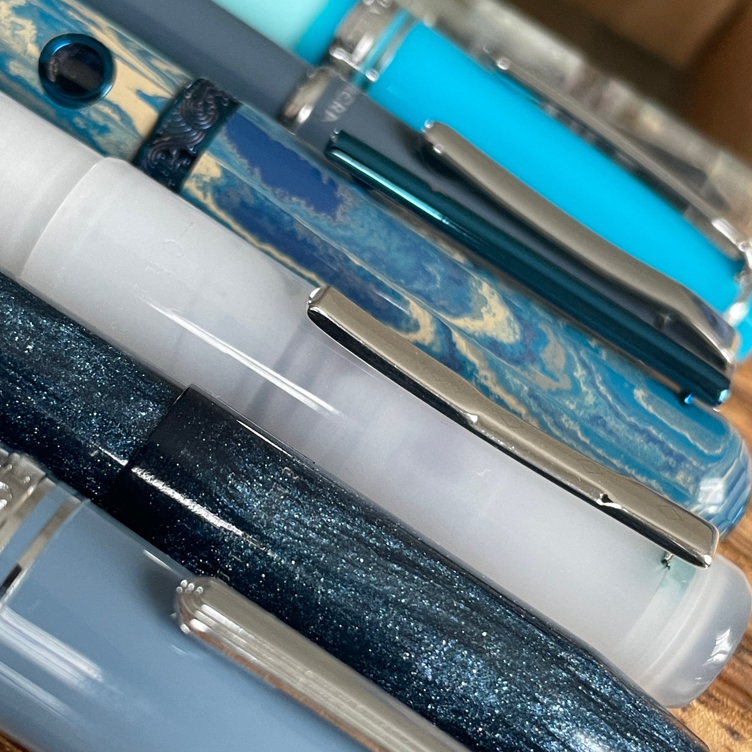
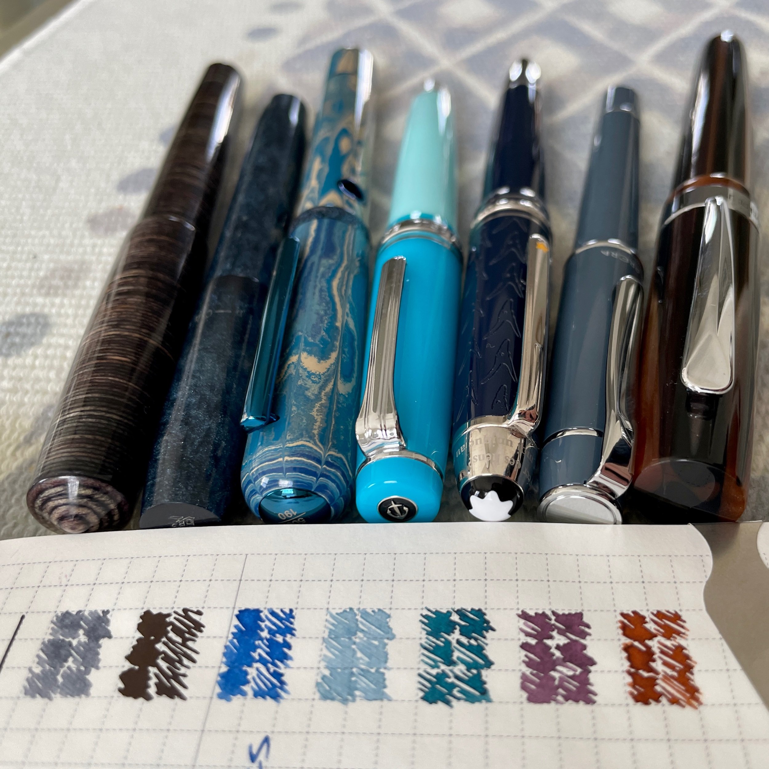
I’m all doubled up: one light grey and one light black ink. The Sailor’s B line widths should render that pair an effective accent against Cypress’ narrow F lines and light purple grey.
The goal is to use black as an accent color. Usuzumi’s sheen is simply too fun not to return from last week. Back in black.