Building a spicier monochrome currently inked


I pulled two pens from last week’s rotation because I was reaching for my other pens far more frequently. The Visconti Homo Sapiens and Pilot Custom 74 now reside temporarily in my “to clean” tray.
Four well-rounded nibs form the core of this week’s currently inked. Two Ms (installed in the Loft Highworth and Platinum 3776), a B in the Esterbrook, and an EF in the Montblanc. A solid, if straightforward, assortment.
The four inks comprise a monochrome palette. A lovely monochrome, but all share similar unsaturated cool tones. Further, three come from 2023’s Inkvent calendar and so also share cool-toned shimmer. A two-dimension palette remains.
I aimed for a spicier monochrome.
Spicy translates into a true blue ink to accompany Blizzard’s teal-forward hue and a yellow-green to stand out against the other five understated ink colors. Shading forward and true to hue.
Waka-uguisu is a new green ink for me. Cool grassy tones with prominent shading. A lot of favorites in that prior sentence. And the TWSBI’s wet feed will ensure I see that strong shading.
Aonibi is a trustworthy aged companion. Deep blue-grey with excellent performance across even absorbent papers. Useful.
I chose two more sharply ground nibs in Lamy’s Cursive and The Nib Tailor’s Selvedge, to pad my writing options. Both grinds are forgiving. Easy to use while quickly jotting notes or brainstorming ideas for a lesson. Line variation without the muss.
Spicy.
Grey/Black

Montblanc 146 Le Petit Prince & Fox (EF). Montblanc Oyster Grey. The ol’ double Montblanc pairs a pen and an ink from the same manufacturer. Oyster Grey is a cool graphite grey in this feed. Shading and haloing are a delight in the true-to-width EF lines. Reliable no-drama writing well-suited to task management, lesson plan outlines, meeting notes, scratch notes, and D&D notes.
Blue/Teal
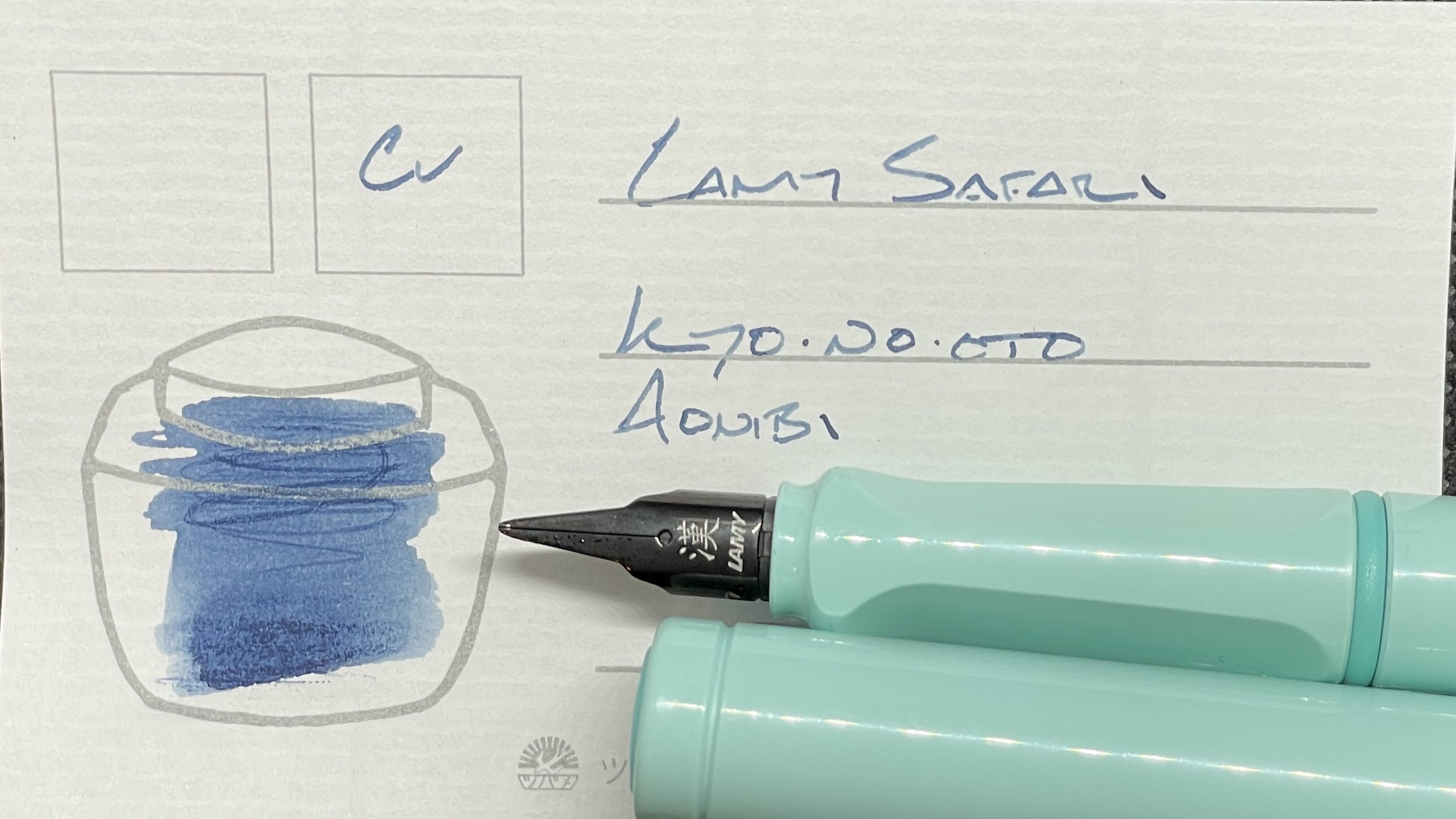
Lamy Safari Blue Macaron (Cv, by Lamy). Kyo-no-oto Aonibi. Aonibi is one of my all-time favorite inks. Loud shading with a muted dark blue hue. And dry enough to ensure clean lines and quick dry times, even on students’ spongy papers. The Cursive nib lends subtle flair to my writing, which extends this pairing from use with lesson plans and reading notes and meeting notes to creative tasks like journaling and creative writing.

Loft Highworth Teal Ocean (M Long Blade, by Hongdian). Diamine Blizzard. The combination of egg-shaped Long Blade grind, long curvy section, and light blue Blizzard ink makes this pairing excellent for long rambling writing sessions. The Loft’s curved section, in particular, encourages me to slide my hand further away from the paper than is typical for my writing form. A loose writer for journaling, D&D notes, teaching reflections, and after-meeting task migrating.
Earth Tones

TWSBI 580-AL Lava (M Selvedge, by Nib Tailor). Sailor Shikiori Waka-uguisu. This combo pairs my longest-owned pen with my newest ink. Bookends. The M stub grind gives me line variation while allowing for small, targeted notetaking. Excellent for lesson plans, targeted journaling, and reading reflections. And the splash of grass-green stands out against this week’s palette, which opens the pairing up to accent work, too. A flexible bookend.
Wild Cards
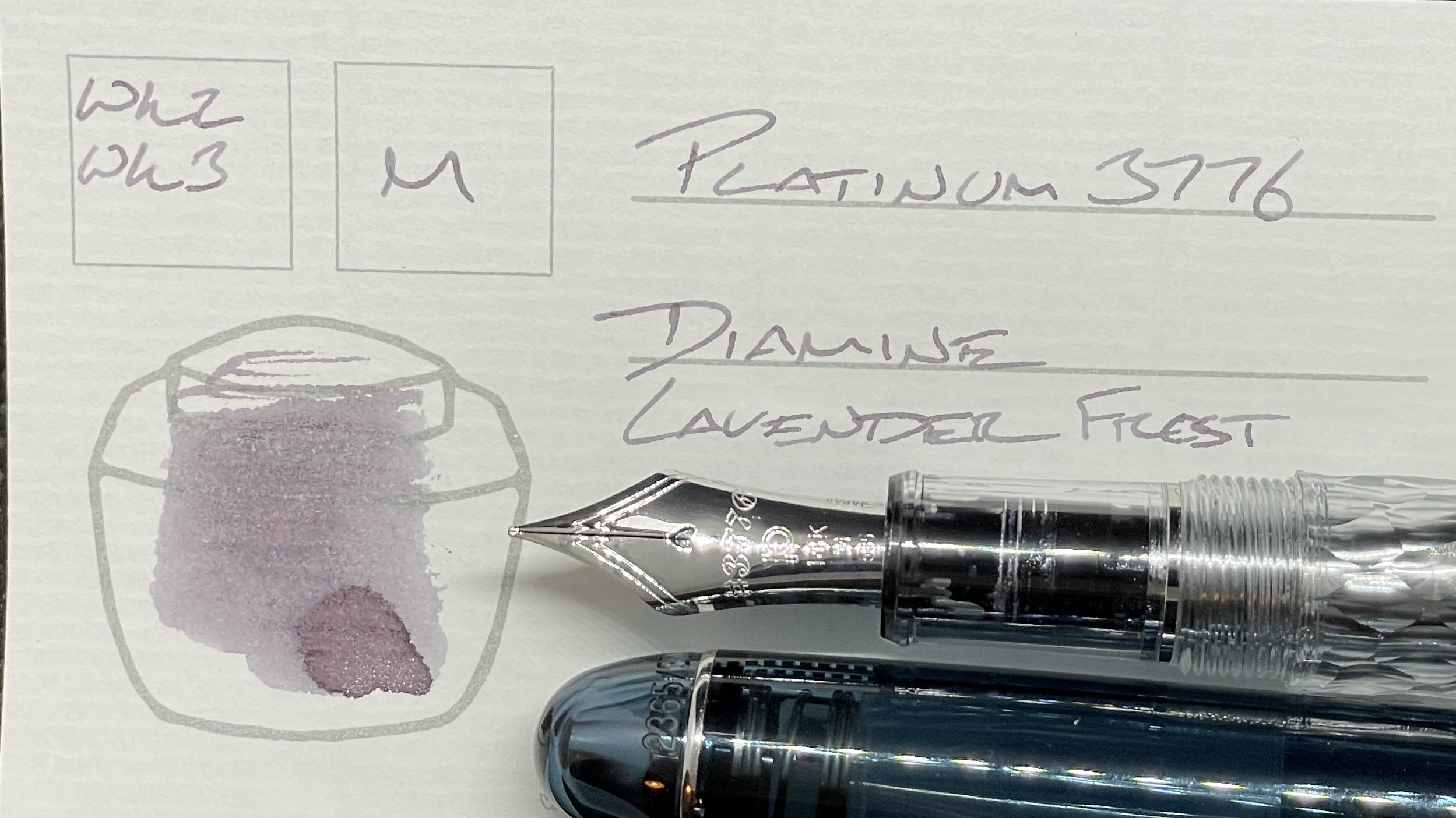
Platinum 3776 Uroko-gumo (M). Diamine Lavender Frost. The new 3776 continues on inked with the new Lavender Frost. The silver-grey purple, paired as it is with a round M nib, is an excellent option for fast-moving detailed notetaking like virtual meetings, brainstorm sessions, student-forward lesson outlines, and short form journaling. And an option for no nonsense pale accenting work.

Esterbrook Estie Raven (B). Diamine Masquerade. Masquerade has grown a dark red-brown over the two weeks it’s resided in the Estie. The B nib writes wide, shading heavy lines which deliver healthy amounts of shimmer to my pages. A brooding professional line at first, until Masqueeade dries and throws off its shimmer. Lecture notes, lesson plan outlines, teaching reflections, journaling, and D&D notes.
