Taking myself out of choosing a currently inked

Taking myself out of the decisionmaking for pairing inks with pens shakes me from my rut of rotating between the same inks and same nibs over and again. The excitement of trying a new pen-nib-ink combination is what starts me writing and working and scribbling. Novelty generates words, for me. So, I invited my good friend (and father-in-law), BF, to serve as my currently-inked-chooser-most-exalted.
My aim in doing so is to maximize novelty. I primed the selection process by opting for seven pens from my collection, each with a newly swapped nib. BF dipped into his own sizable ink stash to build a cohesive palette of seven colors.
Consider me shook. And excited to make all seven combinations work for me. Six new-to-me inks and the ever-reliable Rikyu-cha, which serves as this week’s keystone.
My thought process with each pairing focused on maximizing my nib options. A great example is my trio of EF nibs. Three EF nibs offer a wide, dark EF line (Able Snail), true-to-size moderate EF line (Cypress), and a dry hairline EF (Kaweco). Dry, disciplined EF lines for detailed and quick notations. Moderate lines for meeting and reflective notes. Wide, wet EF lines for reading notes, accent work, and curriculum planning.
A lineup only someone else could summon for me.
Grey/Black
None this week.
That’s right. I am experiencing a slight no-grey-ink panic. Even so, I have made peace with the reality of teaching without my go-to grey ink. Cheers to BF’s dedication to generating novelty for me.
Blue/Teal
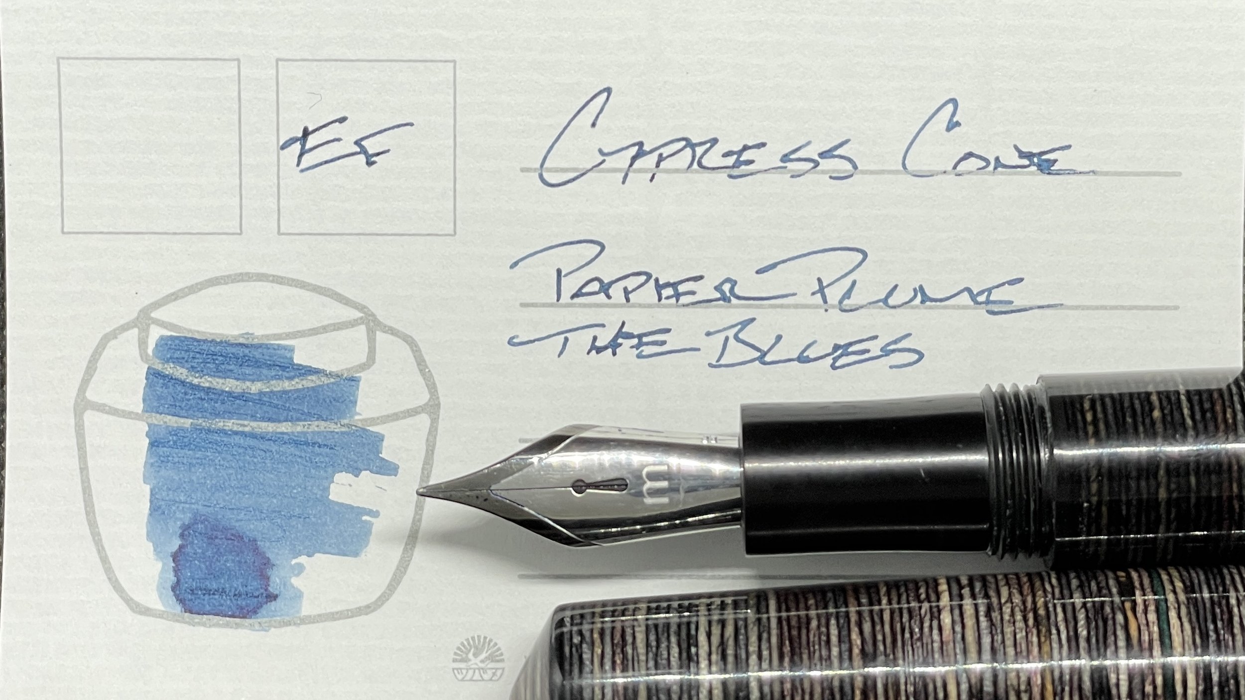
Mr. Cypress Cone Micarta (EF). Papier Plume The Blues. The Blues offers this week’s most muted blue. The cobalt hue is subdued enough to accommodate minimal distractions. My backup meeting notes driver. The Cypress’s earthy, subtle colorway should camouflage through administrative meetings without deflecting attention. Meeting notes, lesson plans, teaching reflections, and possible journaling.
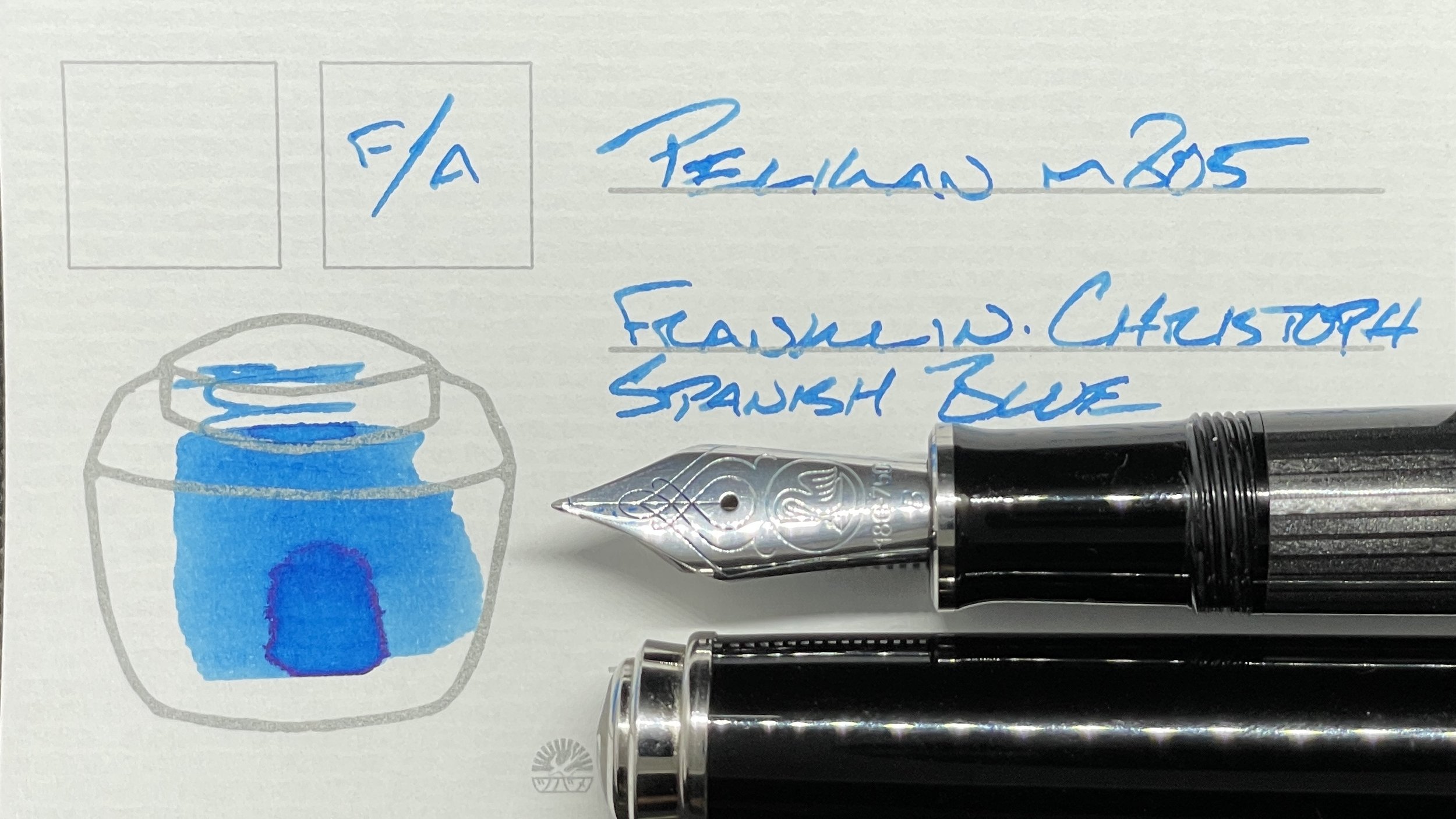
Pelikan m805 Stresemann Anthracite (F Architect, by Custom Nib Studio). Franklin-Christoph Spanish Blue. Spanish Blue is a loud blast of cold blue with subtle red sheen that shows primarily along the edges of my letterforms. The Pelikan’s fun Architect grind lends sass to my writing. Spanish Blue is wet enough to smooth the crisp vertical edge of the architect, which opens this pair up to long form writing as well. Combined, this pair feel tailor-made for accent work, creative writing, journaling, lecture notes, lesson plan outlines, and commonplace notetaking. Utility.

Franklin-Christoph 03 Ghost (B). Papier Plume Lake Michigan Winter. The B nib emphasizes Lake Michigan Winter’s icy whispers of pale blue with fits and gasps of gradient shading. The pale combo of white colorway and ice-blue make for a washed out writer. Wide, whispy lines contrast well against the dark narrow lines of this week’s EF nibs, which serve as functional accent notes. Meeting note tasks, reading notes, lesson plans, and journaling.
Earth Tones

Kaweco Skyline Sport Fox (EF). Sailor Jentle Rikyu-cha. This week’s daily driver. The Kaweco’s dry nib and feed combination keeps lines narrow and quickens Rikyu-cha’s drying time. A promising bet for detailed task management and notetaking. Rikyu-cha is also the most color-neutral of this week’s inks, which limits the potential for distractions of the “pretty colors” variety. Task management, meeting notes, curriculum planning, lesson plans, and reading notes.

Visconti Homo Sapiens Silver Age (F CI, by Nibsmith). Franklin-Christoph Honeycomb. I worried when BF chose Honeycomb. Unfamiliar, I expected a highlighter bright yellow ink which would prove challenging to fit into my writing needs this week. Instead, Honeycomb proved a caramel light-brown. The Visconti nib produces near-constant haloing as I write. And the italic nib keeps lines fun and varied. The wet lines take time to dry, so slowly paced writing tasks for this pair: journaling and letter writing.

Nakaya Neostandard Heki-tamenuri (M Naginata-togi, by Tokyo Station Pens). Diamine Meadow. Meadow is a bright green with generous flow. The Nakaya’s nib floats smoothly along the page leaving infrequent bouts of shading and haloing. The reliable writing suits fast-paced meetings and flighty reflective journaling. The sporadic shading keeps writing fun over multiple lines. And the Nakaya’s girth is comfortable in the hand over long writing sessions. Journaling, meeting notes, curricular planning, and creative writing.

Able Snail Classic Powder Blue (EF). Pennonia Gesztenyebarna. Gesztenyebarna is a powerful shading ink that varyies frequently from a walnut brown to a rusty ochre. The generous EF nib I swapped into the Able Snail is a promising compliment, encouraging strong bouts of shading after even a full A5 page of writing. The dark hue lends itself to serious meetings, detailed reading notes, teaching reflections, lesson plans, creative writing, and journaling.
Wild Cards
No inks in this color family either. Living a blue, teal, brown, and green life for the near future.
