Planning for planning: Day-free and month-focused for 2022
The core organizational needs I have for an analog planner have changed considerably from my early days of analog planning. The way I plan to use my analog planner has followed suit.
My personal life runs increasingly in monthly cycles. I tried to fight the month-to-month rhythm in 2021. I forced myself to fit plans into a weekly layout — without much love.
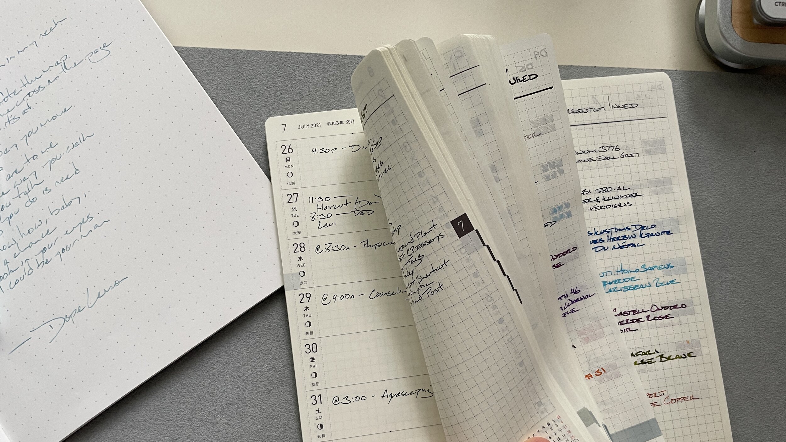
Empty weeks, currently inkeds
My Hobonichi Weeks sat on my desk throughout the first 3/4 of the year. mostly unused. Many weeks lay empty. The book evolved into a currently inked log.
So: I’m leaning in. Most of my social events and obligations are scheduled weeks out. The monthly view has become the default in my calendar app. I’m planning on monthly pages becoming next year’s planner hub.
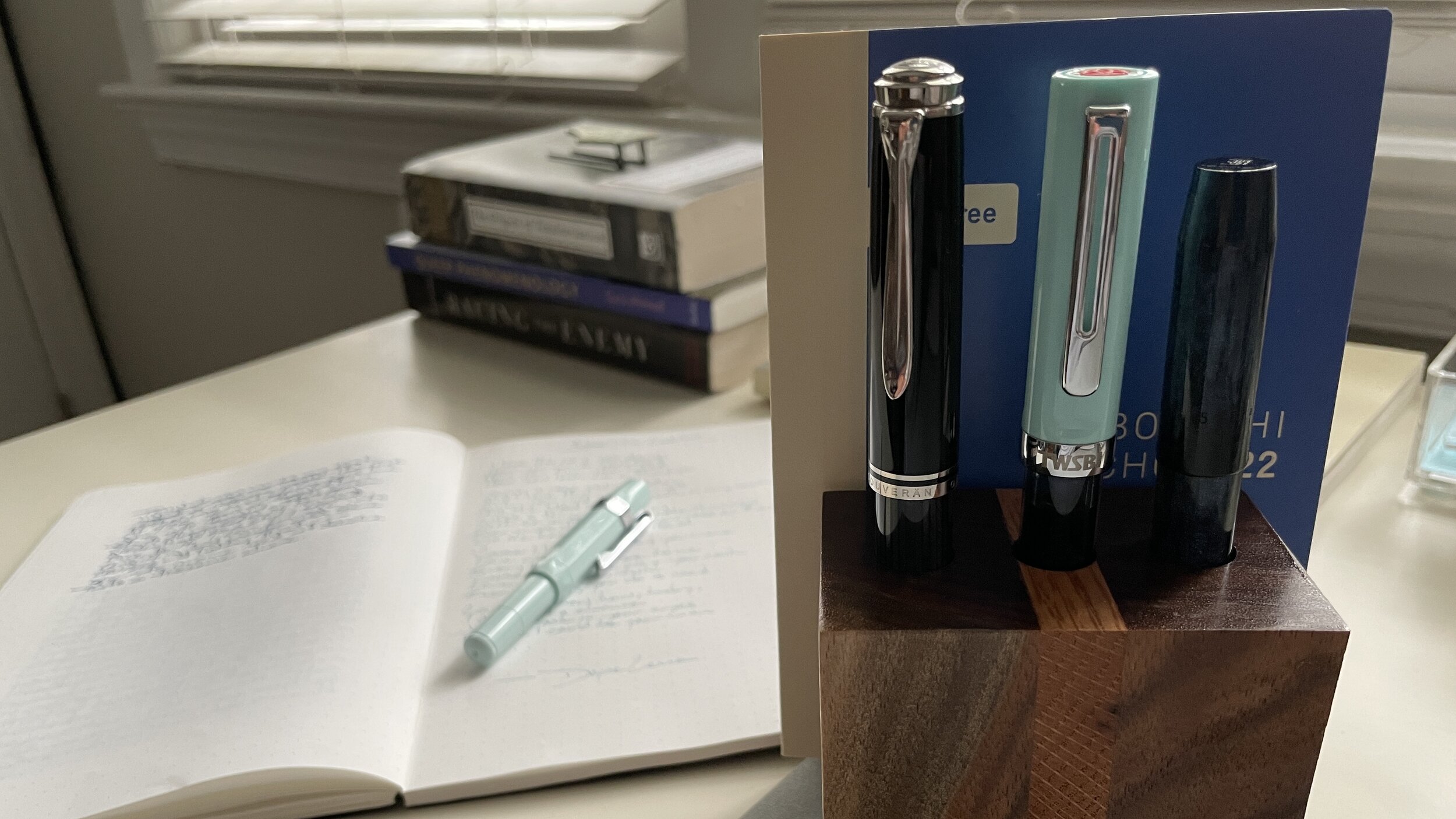
Size. The Weeks was narrow enough to fit inside a back pocket. But it’s too tall to be carried comfortably. I learned this year that I need a planner that travels with me, moving forward.
So I opted for an A6 Hobonichi in 2022. The smaller size means I can substitute this notebook for my pocket notebook. The dimensions will fit cleanly inside the rear pockets of my jeans and chinos.
Empty pages. A quick tally of my pocket notes suggests I’ll have enough empty pages in the back of this Day-Free to easily house a year’s worth of pocket notes. All in one compact notebook.
In 2022, the empty pages will house both my currently inked logs and my scratch notes. The grid will add the structure I’ve learned to enjoy through this year’s pocket notes experiments.
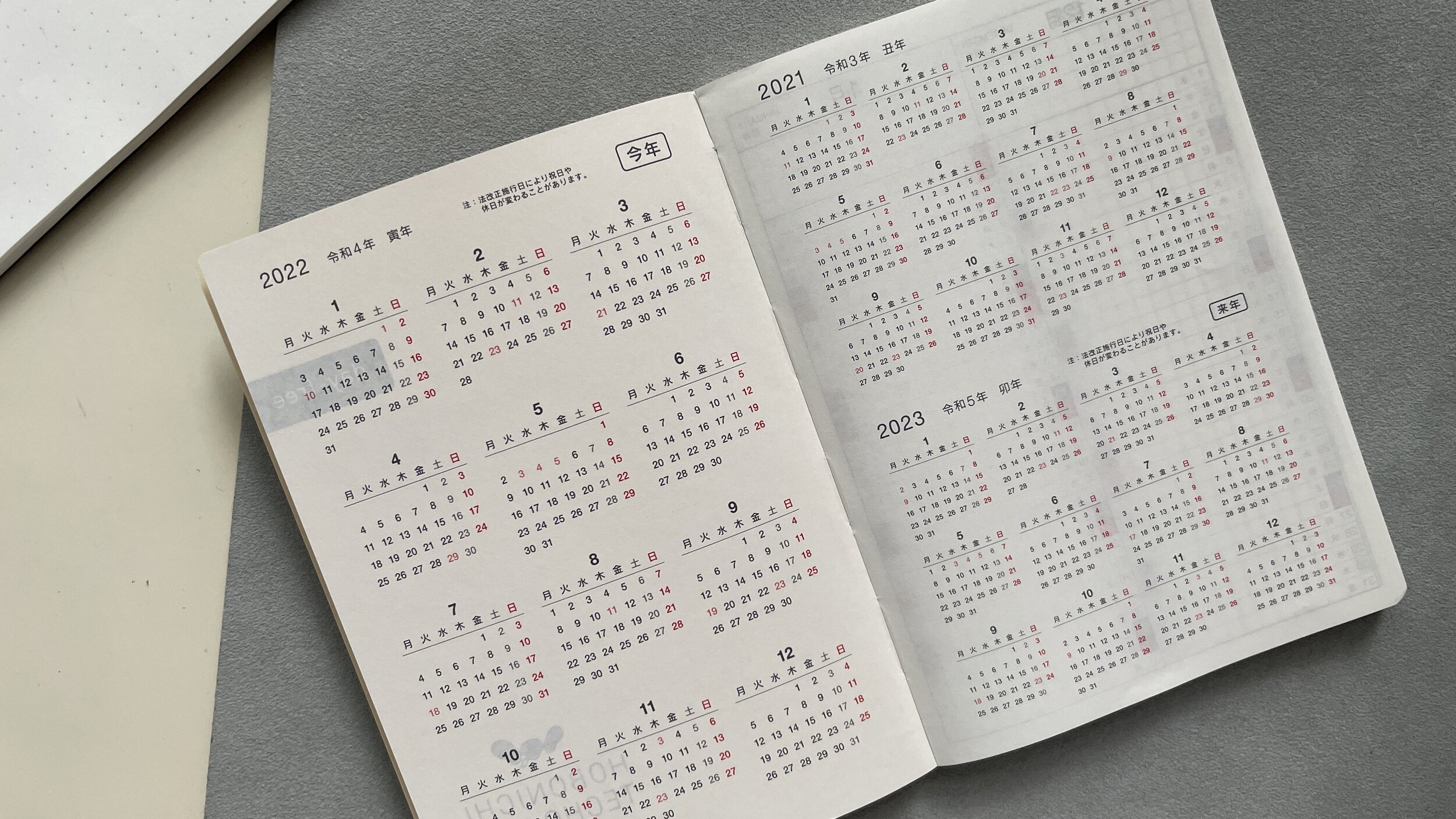
Yearly calendar overview. I struggle to find a meaningful use for yearly overview pages. The ease of use and searching ability of my phone’s calendar app is a strong draw for me in those moments where I do want to see a year at a glance.
This year, I’m leaning into what works so well for the monthly pages in my work journal: highlighting days I have off from work.
Flipping to the first page of my planner will be quicker than opening a calendar app and expanding to the yearly view. Especially when I’m out and away from my desk.
Big picture, small package
Monthly calendar overview. I’m stuck on how best to use these pages. My gut tells me that these could make for decent habit tracking pages; if oriented sideways.

Held horizontally, one habit per column?
How do you use the one-line-a-day monthly overview pages in your planners?
Month pages. The heart of next year’s organization. I dig that the weekend days — Saturday and Sunday — are next to each other. The layout itself helps me to visualize how my more-active weekends look. All my weekend plans sit in one block at the right-hand side of the two-page spread.
Dated tasks within the day cells. Undated tasks along the left-side and bottom-side note areas.
The miniature size is a feature for me. I may have too much planned on a given day if I can’t fit the names of all the events and tasks into a 7-by-6 grid cell. Built in self-reflection. Bonus.

Mighty small, mighty organized
All told, my planning for planning sits on its head for 2022. This year, I worked to adapt my thinking to the planner I wanted in the Hobonichi Weeks. Next year: I think I have a planner built to accommodate how I think right now.
I think I hit the moving target that is my scheduling needs for 2022. 2023 will be a whole new ballgame.
This week’s Inked Tines update includes my most recent currently inked writing tools.
Toolset
Pens. Can’t put my finger on a standout combo this week. Womp-womp.
Monteverde Rodeo Drive (1.1) — Empty. Pen was a gift from my partner. 1.1 mm stub was a fun departure from my normal writing nibs. Broad, ribbony lines made for excellent accent meeting notes and lesson plan notes. Easily readable against 223’s narrow dark-grey. Also, a healthy amount of journaling.
Visconti Homo Sapiens (EF) — Empty. “Extra.” The oversized pen in striking pocked stormtrooper garb. The large and stealthy black nib. The bright blue ink. Grew wetter as it emptied. Excellent in reading notes, teaching notes, discussion notes, lesson plans, and journaling.
Franklin-Christoph 45 (B SIG) — Feed. Split the difference between a dry ink and a wet nib. Great shading encouraged a great mix of dark and dusty denim blues. One of the most fun combos this week. Meeting notes, discussion notes, lesson plans, journaling.
KACO Retro (EF) — 1/5. Firehose of a pairing. Scarlet Letter is a near-black. Smooth writing. Maintains a European EF line width. One of my seminar discussion notes accent pairs. The friction-fit cap made for silent uncapping during meetings. Win.
TWSBI Eco-T (EF) — 1/2. A wet combination. Writing took 20-30 seconds to dry. 223’s chromatic shading makes the prettiest smudges I’ve seen. A good-paper only combo: feathered and bled through copy paper and post-its. Task management, lesson plans, scratch notes until Wednesday, and meeting notes.
Pelikan m805 (F Architect) — 4/5. Mostly unattended after Sunday’s lesson plan prep. Grabbed the pair during Tuesday’s journaling session when the Monteverde kicked. Then it sat.
Notebooks. Work bujo. Musubi Cosmo Air Light 83 (A5). 16 more pages. A monthly page, the two-page weekly spread, eight pages of lesson plans, two pages of meeting notes, and two pages of discussion notes from seminar classes. The work journal stands at page 98.

Peek-a-boo
I started with a monthly page for October. Simple monthlies suit me best. A small calendar highlighting my days off from work. And a shortlist of big-picture projects that need to be started or finished this month.
Plus, it’s a good first week when a big-picture project is already crossed off the monthly list.
The weekly remains a site of experiments. This week, I tried color coding my teaching schedule. Mild Violet Mildliner emphasized student-driven lessons. I’m undecided on whether the highlights helped. I’ll continue for another week and reflect next weekend.

Pretty in purple
I also tracked one-on-one meetings with my research students across Wednesday, Thursday, and Friday. The t-charts I used functioned well, but were less-than-pleasing to look at.

X’s marking spots
Journal. Taroko Breeze (A5). Nine new pages. Three entries. Two poems. Five pen and ink combinations. The personal journal stands at page 96. Just passed halfway through the Taroko. Progress.
The first entry houses scribblings and jottings from my local pen group’s virtual gathering last weekend. Messy and doodle-heavy. Not every page needs to be productive to be constructive.
The remaining pages are shared between two long-form reflections. Tuesday night’s saw the Monteverde run dry. It’s fun to watch an ink color grow shadier, and then fainter, as the feed dries out.

Tag team
Written dry. Two pens gave up the ghost this week. The Monteverde Rodeo Drive kicked early Tuesday evening, while journaling.
The final pages of an ink fill are exciting. Marsala grew lighter and shaded more for about an A5 page. Then it changed to a dusty brown-pink. And then: hello, railroad.
The Visconti ran dry on Friday, after a month in my currently inked. And right in the middle of a one-on-one session with a research student. I make a lot of concept maps and sketches during our “research question” meetings.
I find it helps first-time researchers to see the connections their research questions assume exist on paper. We narrow down to the connections they’re actually interested in from there.
Caribbean Blue added a welcome pop of color to my accent notes and journaling. The bright color also helped keep my teaching scribbles viewable to a student distanced over three feet away from my notebook.
The pair was mostly used accent notes. The combination of tailored use and an EF nib explains how this pair lasted so long without running dry.
A third pen and ink combo is down to only the ink remaining in its feed: the Franklin-Christoph 45. One more journal entry should see the pair retired.
Newly inked. The Kaweco Skyline Sport in Mint. I continued the week’s theme of going with my gut. The Mint Sport stood out when I first scanned my pen tray. So: the universe chose this pen.
My most well-loved Sports. So often-used that the cap’s printing is nearly scrubbed off where the clip and cap meet.

Worn, loved, and still good-lookin’
Chosen to run a new premium Kaweco nib through its paces. More on that below.
The collection
Incoming / new orders. Kaweco released their new premium steel nibs recently. My father-in-law was kind enough to help me get into one. You know: for scientific purposes.
I requested an EF, naturally.
I swapped the EF with my Skyline Sport Mint’s standard steel M nib. It’s a quick process. Gently pull the nib and feed straight out. No twisting or wiggling to avoid damaging the feed’s thin plastic tines.

Statement.
We aimed to test the new premium setup. Both the new nib and new feed are now housed in the Mint Sport.
I prefer a dry ink when testing a new nib. It’s easy to feel every edge on the mob’s tipping or grind. We went with a favorite teal: Kyo-no-oto’s Hisoku.

A smidge of matchy-matchy
The EF writes quite well. It’s a reliable and smooth writer, even with a desert-dry ink. Drags on the page similarly to my titanium EF nib.
No noticeable shading from Hisoku. But that’s to be expected from an EF nib.

Loving the new nib artwork. Sunrise ahoy
Outgoing / trades or sales. Reservation made with Aaron at Pentiques. Parker Vacumatic is on its way to the west coast for repair. A well-earned spa trip for the old reliable writer.

Vintage is definitely still in style
Currently reading and listening
Fiction. Chapter Three of Wells’ Network Effect fell to my exhausted gaze Thursday night. Murderbot continues to struggle with understanding their conscience and growing friendships. 33 pages.
I feel more detached from this storyline than the others. Friday night’s journal reflection unpacked my feelings a bit. I suspect that I need to read earlier in the night to give the story a fair chance of connecting with me. Fair is fair.
Nonfiction. I finished Woodward & Costa’s Peril on Monday. A fly-on-the-wall story of the end of the Trump administration and beginning of the Biden administration. It’s comforting to hear the folks at the centers of governmental power are still just people. Mistakes, hearts, and all.
No real notes to be had. No singular intellectual lesson beyond the reminder that democracy is an ongoing project. Folks have to constantly reaffirm good faith values. Still, I’m thankful for the reminder.
I also reviewed my notes on Roxanne Dunbar-Ortiz’s fabulous An Indigenous People’s History of the United States. Mostly her chapter on “Indian Country.” She highlights the arguments given for and against the Carlisle Boarding School. Thinking it can make a strong “textbook chapter.”
I troved through archives for first-hand student accounts and Pratt’s own accounts of the school. It’s been a while since I did real historical research. Took until Thursday for the rust to shake off.
This event sits at the center of a new unit for my history students. It’s a fitting opportunity to practice thinking through who get’s to be included when talking about “us” in American politics. And who does not. My sneaky way of teaching hegemony to teenagers.
Building lessons is one of the most fun parts of teaching — for me. Good week.
Music. I’m still on a Studio Ghibli kick. I’ve had this compilation of piano and solo guitar covers playing on loop all week.
Quietly in the background while I teach. Louder in the background while marking papers, researching, and reading. Even louder in the evening while my partner and I wind down.
Tea-worthy background soundtracking. But be warned: I fell asleep twice. Adult lullabies.
For the record, I’m absolutely on Inkvent #TeamApril