Thrice minted and extra fine

My week starts with four inked pens. That means there is a some room to customize my currently inked. I get to swap in two new pen and ink combinations. Love it.
The coming week will entail a healthy amount of detailed notes and slow writing tasks. Marking papers, planning lessons and reading notes will rule the work days.
So: narrow nibs are my path forward. Narrow lines are easily legible in-between double spaced typing, and along margins. I’m going with three EF, two F, and a B.
Five are also round nibs. I want the forgiving round tipping available should the week go against plan and invite quickly scrawled meeting notes and pocket notes. Schools are hectic places, and this happens fairly often.
Lastly, I added a pop of orange (Koiame) and heavy sheen (Skull & Roses) to this week’s palette. Life is to be lived.
But also lived well. Orange is excellent for grading. It’s easily seen without dipping into the intimidating red zone. And sheen helps to keep lecture notes readable at a distance and at odd angles.
Grey/Black
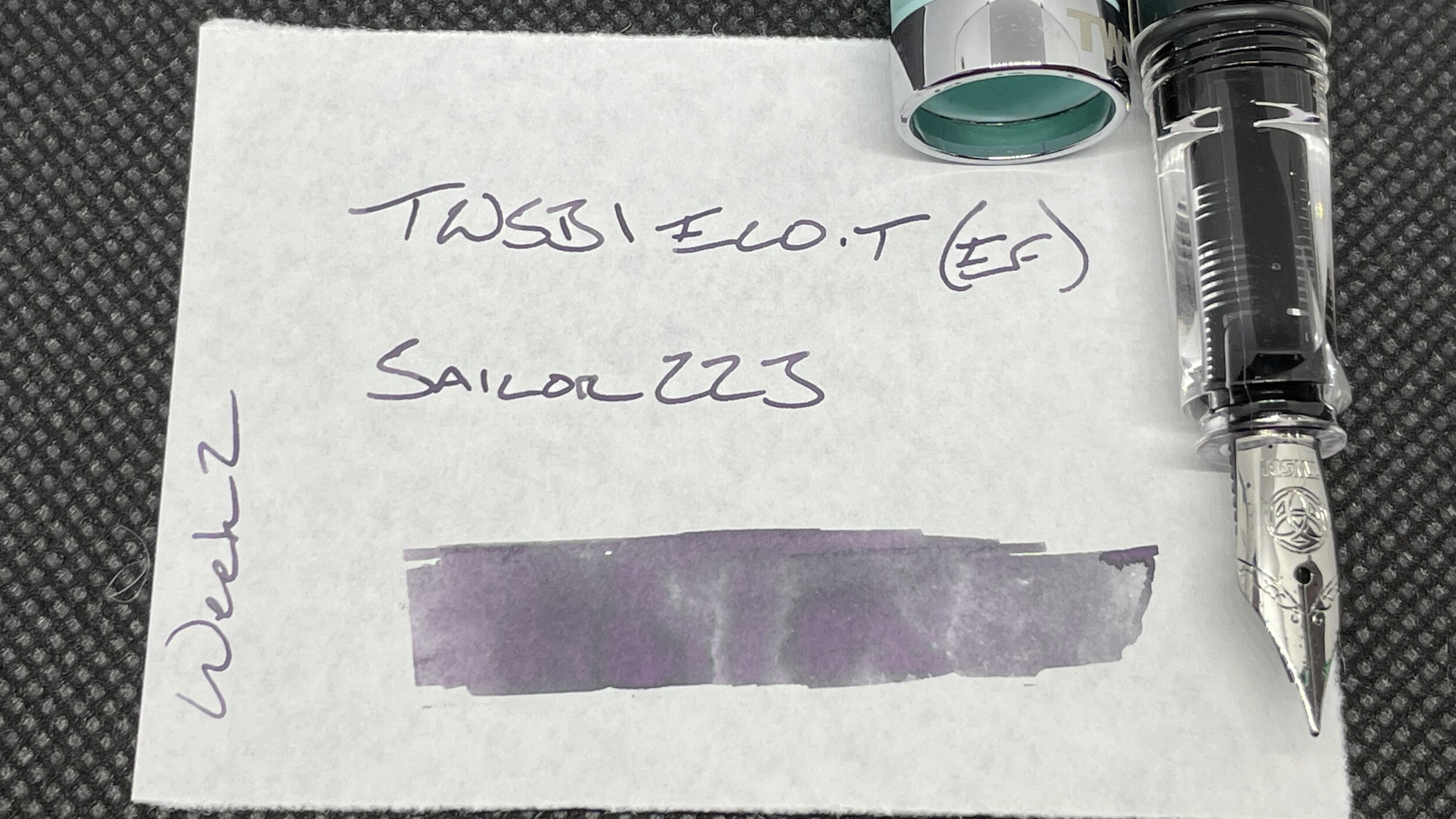
TWSBI Eco-T Mint (EF). Sailor Ink Studio 223. Wet, dark, and capable. A light hand brings out 223’s purple undertones. I need to remember to be patient while keeping my weekly updated. This pair takes 15-20 seconds to dry on CAL paper. Task management, meeting notes, reading notes, lesson plans.
Blue/Teal

Kaweco Skyline Sport Mint (EF). Kyo-no-oto Hisoku. Dry, narrow lines and quick to dry. Taken together, that’s the pocket notes trifecta. Prevents smearing and so keeps quickly jotted notes easily readable — handwriting notwithstanding. Plus, the Sport is easily tailored to pocket living. Pocket carry. Scratch notes, lesson plans, meeting notes, reading notes, journaling.

Platinum 3776 Nice Pur (B). Diamine Skull & Roses. Bold and sheen-forward. A healthy B line width, if generous — bordering on too wet. Coated paper only for this pair for fear of bleeding and feathering. Lesson plans and journaling.
Earth Tones
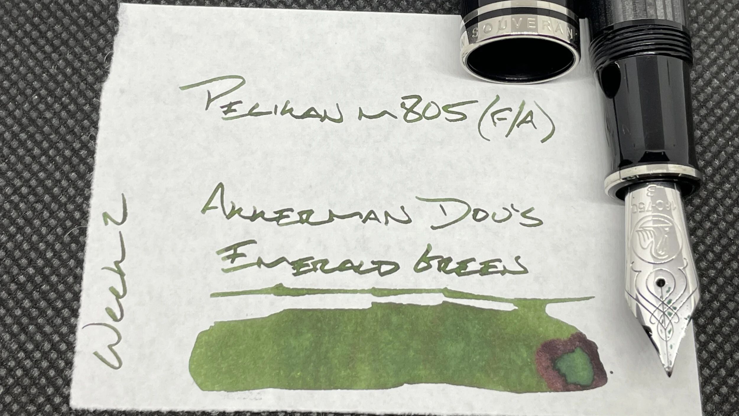
Pelikan m805 Stresemann Anthracite (F Architect, by Custom Nib Studio). Akkerman Dutch Masters Dou’s Emerald Green. Fun murky green with hints of sheen when used at the grind’s wetter angles. My slow writing combo. Headings, letters, and journaling. Because an architect grind makes journaling more fun.

Narwhal Schuylkill Chromis Teal (F). Taccia Ukiyo-e Ink Sharaku-Koiame. The last of my Koiame sample lives inside this gorgeous piston filler. Orange stands out and so is great for marking student papers. The true F line keeps my writing legible, even on absorbent printer papers. And Koiame shades in fun ways on the coated papers I use while journaling and writing lesson plans. Win-win.
Wild Cards

KACO Green Retro Blue (EF). Papier Plume Bootlegger’s Scarlet Letter. Wet, purple-black. This pair enjoy one another. Lines are smooth while keeping to a European EF width. Well-suited for just about any writing task, from reading notes to long form journal entries. And the friction fit cap is a silent partner during meetings.
