Splitting the difference


Splitting the difference between work needs and the coming five days off for playing around with personal scribblings. A little somber and a dash of playful.
Three dark ink colors — Aonibi, Arctic Blast, and Best Wishes — easily sneak into somber curriculum planning meetings and parent meetings. Woodman’s shady graphite can carry the day through administrative meetings, class lessons, and my own drafting sessions. Utility with fun shading.
Psc and Virginia offer pops of color to accentuate somber meeting notes and, more playfully, carry longform creating writing sessions. The dual Diamines’ sheen and shimmer come out well on well-sized papers, lending their own creative sides after they’re well dry.
Grey/Black

Carolina Charlotte Dragon Scales (EF SIG, by Franklin-Christoph). Wearingeul Tin Woodman. Moderate grey toned ink. Moderate ink flow. Quick drying time. Purple undertones. Thank you, Tin Woodman. An excellent grey ink for daily driving: task management, reading notes, lesson plans, scratch notes, and D&D notes.
Blue/Teal

Franklin-Christoph Blue Diamondcast 45 (F). Kyo-no-oto Aonibi. The diminutive 45 provides a narrow section that is well-suited to precise writing and short letterforms. Excellent for detailed notetaking, like reading notes. Aonibi is a dry ink, which builds on the 45’s suiting to accommodate margin notetaking without fears of feathering. A literary companion for the week.

Franklin-Christoph Antique Glass 03 (F CI, by Mike It Work). Diamine Arctic Blast. Time at home affords me a finite window of days wherein I can toy with heavily shimmered inks like Arctic Blast. The sheen and shimmer highlight lecture notes and help the blue undertones stand out in lesson plan outlines and reading notes. Hello, winter.
Earth Tones
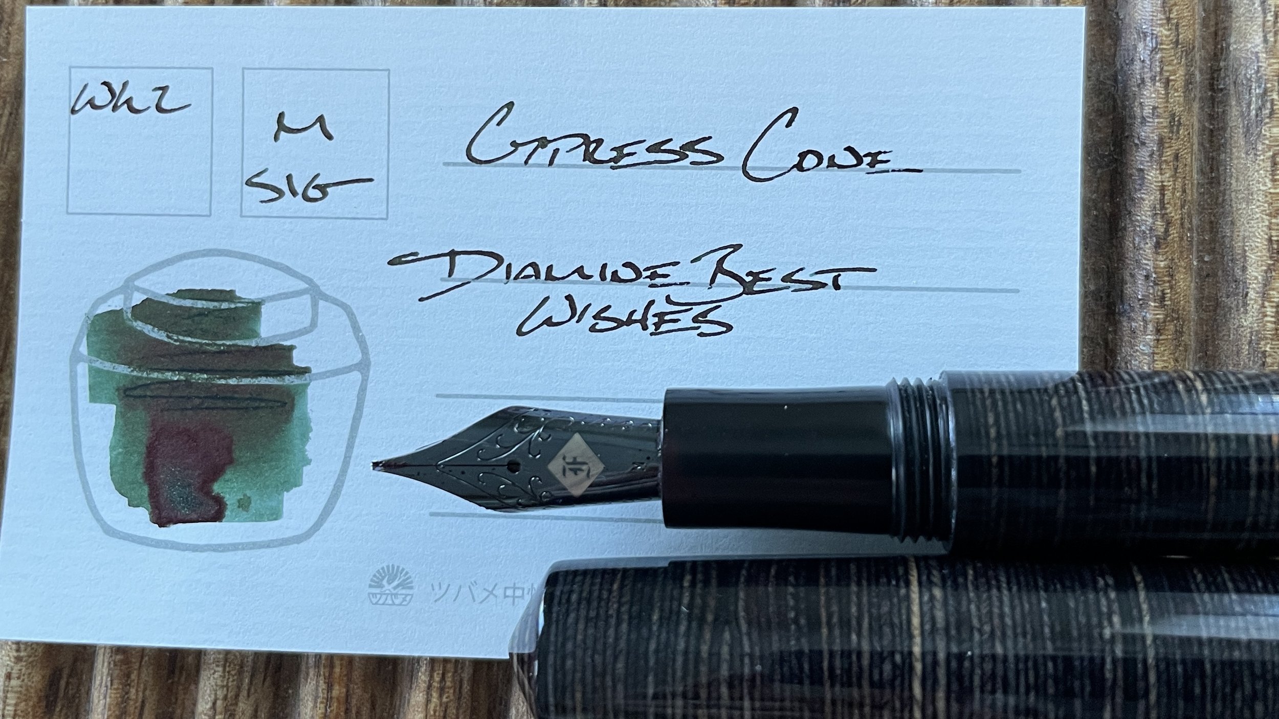
Mr. Cypress Cone Micarta (M SIG, by Franklin-Christoph). Diamine Best Wishes. The M SIG and Best Wishes are a down-to-business black-green while writing and a fun, shimmery dark green in broader swatches. The dark coloring suits teaching reflections and somber meeting notes while lending just a whisper of whimsy. If I need to work, might as well work stealth-fabulously.
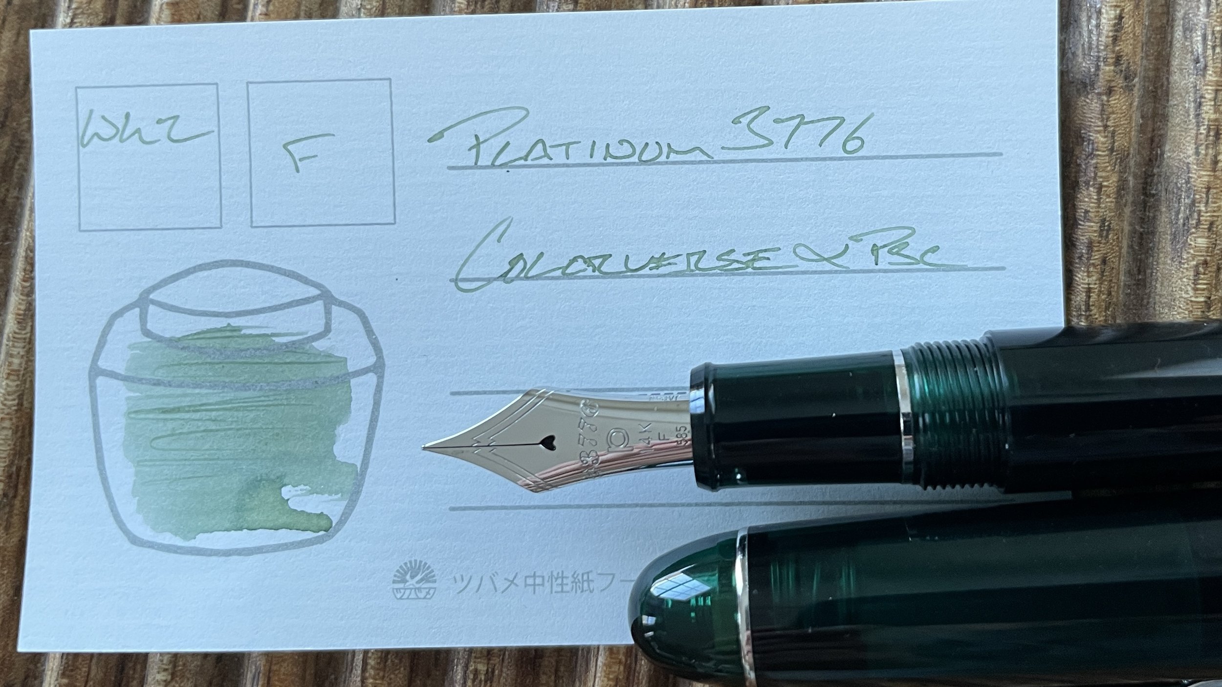
Platinum 3776 Laurel Green (F). Colorverse α Psc. Platinum’s F nibs are the perfect balance of narrow lines and moderate wetness for me. Psc is a dry ink, resulting in pale green writing and strong shading. A wonderful whispy accompaniment to this week’s otherwise moody tones. Excellent for margin notes, paper marking, accent notes, and journaling. Perhaps some lesson planning and reading notes, too.
Wild Cards
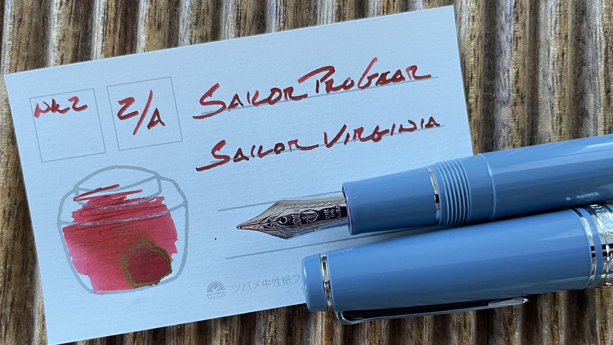
Sailor Pro Gear Slate (Z Architect, by Custom Nib Studio). Sailor USA 50 States Virginia. Virginia’s red shading stands out against the dark shimmer inks and muted blue greys of this week’s palette, too. The wide lines of the Pro Gear’s Architect grind suit longform writing sessions well, as I enjoy how wide letters fill pages up quickly — “accomplishment” in easy mode.
