Summoning all of the grinds. Well, five of them.


80% of this week’s nib options are ground in a customized way. Even my daily driver sports an EF architect-esque grind All in the Nib calls the “Mini Cutlass.” From narrow to broad, from light ink to dark, this week’s currently inked is replete with crisp writing options. And all five grinds offer a functional reverse line width. Variable and multifunctional.
I enter this week with lesson plans sketched out, conferences planned, and meetings prepped. Wowza. All but two meetings will move methodically enough to accommodate intentional attention to my writing angle. This is what policy wonks call a “policy moment” — a nib grind moment.
Both the Relic’s Bu-di and Cypress’ M SIG lead the charge into this week. Both provide wide-lined options that are quite useful while structuring notes pages, for adding emphasis, and for longform reflections.
The Sailor and Nahvalur sport vertically angled grinds while the TWSBI has a horizontally arranged italic. Variety.
And, of course, the outlier proves the rule. I tapped my favorite Platinum F nib to ensure I have a thoughtlessly-easy writing choice in case one of my meetings’ pacing proves too quick intentional writing angles.
Grey/Black

Nahvalur Nautilus Primary Macchiato (Mini Cutlass, by All in the Nib). Diamine Earl Grey. A favorite nib grind with a favorite ink. Quick drying mid-toned grey ink and a moderately wet, sharp nib. Reliable quick writing with an edge, and so with line variation — even in narrow EF lines. Task management, meeting notes, reading notes, lesson plans, and grading trackers.
Blue/Teal
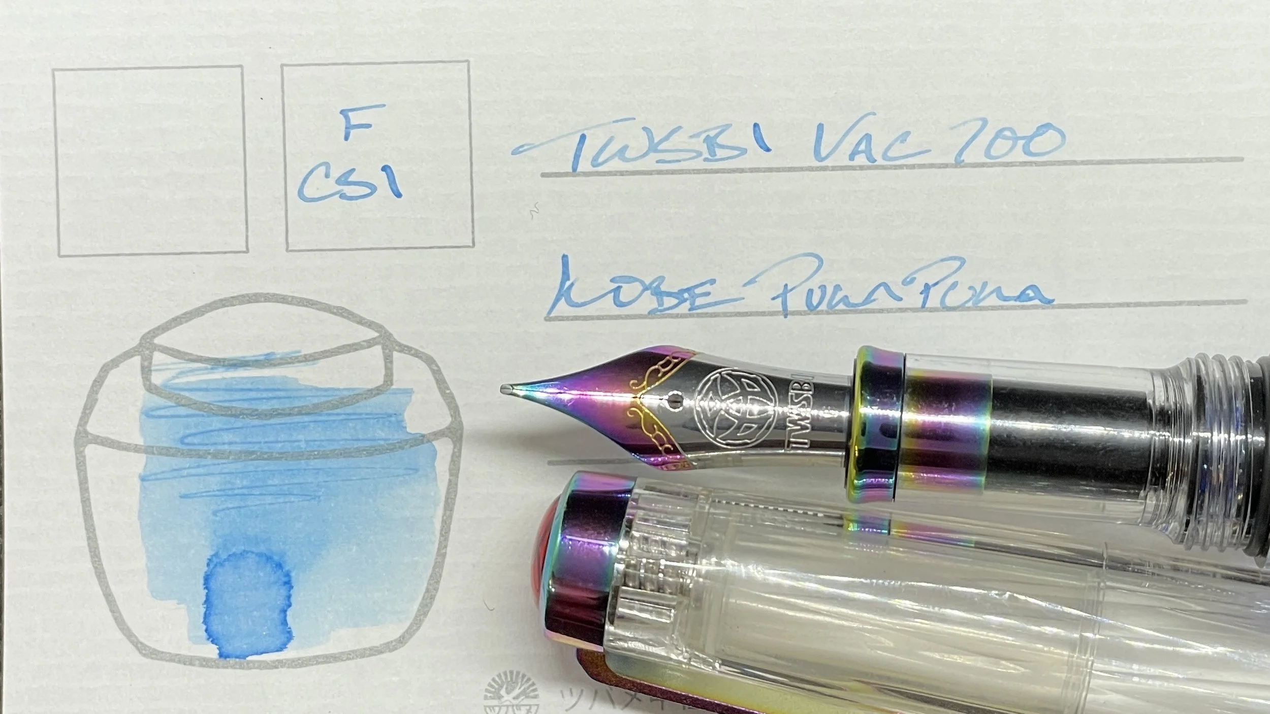
TWSBI Vac700R Iris (F CSI, by Nibgrinder). KOBE Onomatopoeia Puka Puka. Puka Puka is a sprightly bright blue that writes more wetly than its initial whispy hue suggests. The challenge is to maintain light writing pressure, trusting Puka Puka to darken to a readable searing blue as it dries. Solitary accent notetaking is a definite; for instance, accenting meeting notes after a meeting concludes to prevent distractions from the playful Iris colorway. Also: lesson plans, reading notes, and journaling.
Earth Tones

Platinum 3776 Laurel Green (F). Colorverse α Psc. A matchy-matchy pairing of greens for the week. Psc’s whispy, grassy green is well-suited to accenting meeting and reading notes. Psc is also dark enough to be easily legible on students’ papers — for when I need a peaceful color to deliver points in need of improvement. Platinum’s F nib is a favorite for its consistent writing and moderate wetness. Excellent for both quick notations and for longform reflections, like journaling.
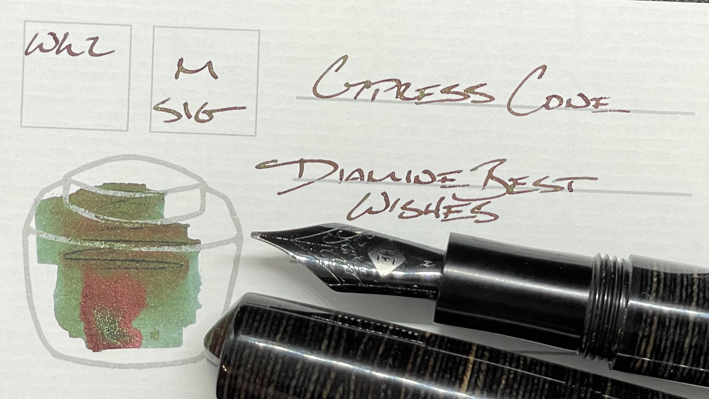
Mr. Cypress Cone Micarta (M SIG, by Franklin-Christoph). Diamine Best Wishes. Deep, dark greens with hints of scaly shimmer. Scales that keep longform writing interesting over the course of extended writing sessions. The M SIG offers healthy line widths that work well for both those longform writing sessions and quick, detailed notetaking within meeting notes, lesson plan outlines, and lecture notes.
Wild Cards

Relic Pens Large “Fire, Earth & Ocean” (M Bu-di, by Nib Tailor). Sailor Shikiori Hara-hara. Murky purples that shade a deep near-black hold a warm space in my heart. The Bu-di grind lends flexibility to my writing with the Relic. Broad structural headings and highlighting for intellectual tasks from the bent side. Tidy narrow EF lines for detailed scribbling. All the tasks, sans somber meetings as the cheery colorway may present unwanted contrast into serious-toned conferences.

Sailor Pro Gear Slate Blue (Z Architect, by Custom Nib Studio). Sailor USA 50 States Virginia. The Architect grind produces a river-flow of true-red writing. This pair is best supported on well-sized papers that can handle generous outpourings of ink. The limitation relegates this pairing to journaling (Graphilo paper) and personal planning (Tomoe River paper).
