A well rested four pens return to the rotation


One of the perks of having a sizable pen collection is rediscovering what I enjoy about pens I already own. A dopamine kick without a new purchase. That feeling of “oh now I recall why I really like this” that follows escaping my rut of choosing the same pens over and again.
My hunt for rediscovery landed four pens that have slept in my pen case for multiple months without use. Both the Platinum 3776 in Nice Pur and the Kaweco Sport in Iridescent Pearl were last inked in 2022, according to my database. I tuned both the 3776’s B and Sport’s BB nibs for an added novel feel and: wowza.
The Nahvalur and Pilot were last attended-to back in Fall 2023 — a full season of breathing space since each was last used. I even swapped a Nemosine (now within Birmingham Pen Co.) stub nib into the Schuylkill to help the pen feel newer.
Ditto with this week’s ink choices. I filtered my ink database for long ignored inks from my samples trays. The result is a quartet of earthy and muted heavy shaders that are overdue for attention.
This is going to be a fun week.
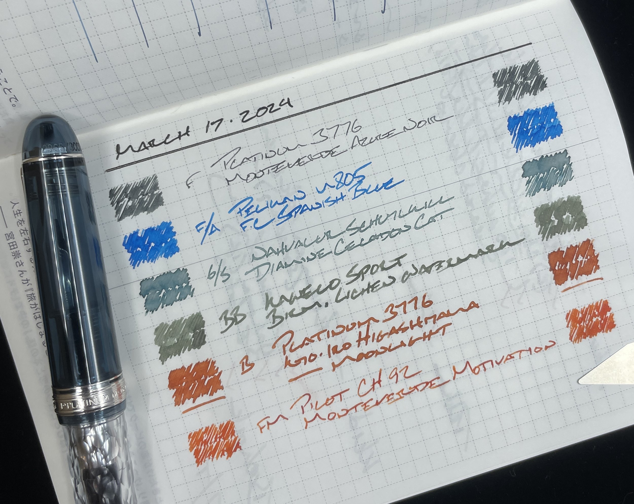
Grey/Black
Platinum 3776 Century Uroko-gumo (F). Monteverde Azure Noir. Platinum’s F nibs write narrow, disciplined lines that keep my small handwriting crisp and clear. Excellent for detailed notes and tracking tasks. Azure Noir’s black-heavy blue-black keeps distractions to a minimum so my detailed notes are business ready. Task management, meeting notes, lesson plans, D&D notes, and reading notes.
Blue/Teal

Pelikan m805 Stresemann Anthracite (F Architect, by Custom Nib Studio). Franklin-Christoph Spanish Blue. I aim to take full advantage of Spanish Blue’s popping blue and infrequent red sheen. Small bouts of sheen keep long writing sessions exciting. And the Pelikan’s architect grind add fun flair to my letters. Journaling, teaching reflections, creative writing and letters fit the bill. The Stresseman colorway also blends into serious administrative meeting rooms without distracting those next to me. Pleasure and business.

Nahvalur Schuylkill Chromis Teal (06 mm Stub, by Nemosine). Diamine Celadon Cat. I swapped a stub nib and wet feed into my Schuylkill with Celadon Cat’s whispy nature and penchant for shading in mind. The result is a mid-toned teal with deeply shaded edges. Perfect for lesson plans, reading notes, accenting meeting notes, and journaling. Manuscript drafting is also on the proverbial table given the Schuylkill’s moderately-sized section.
Earth Tones
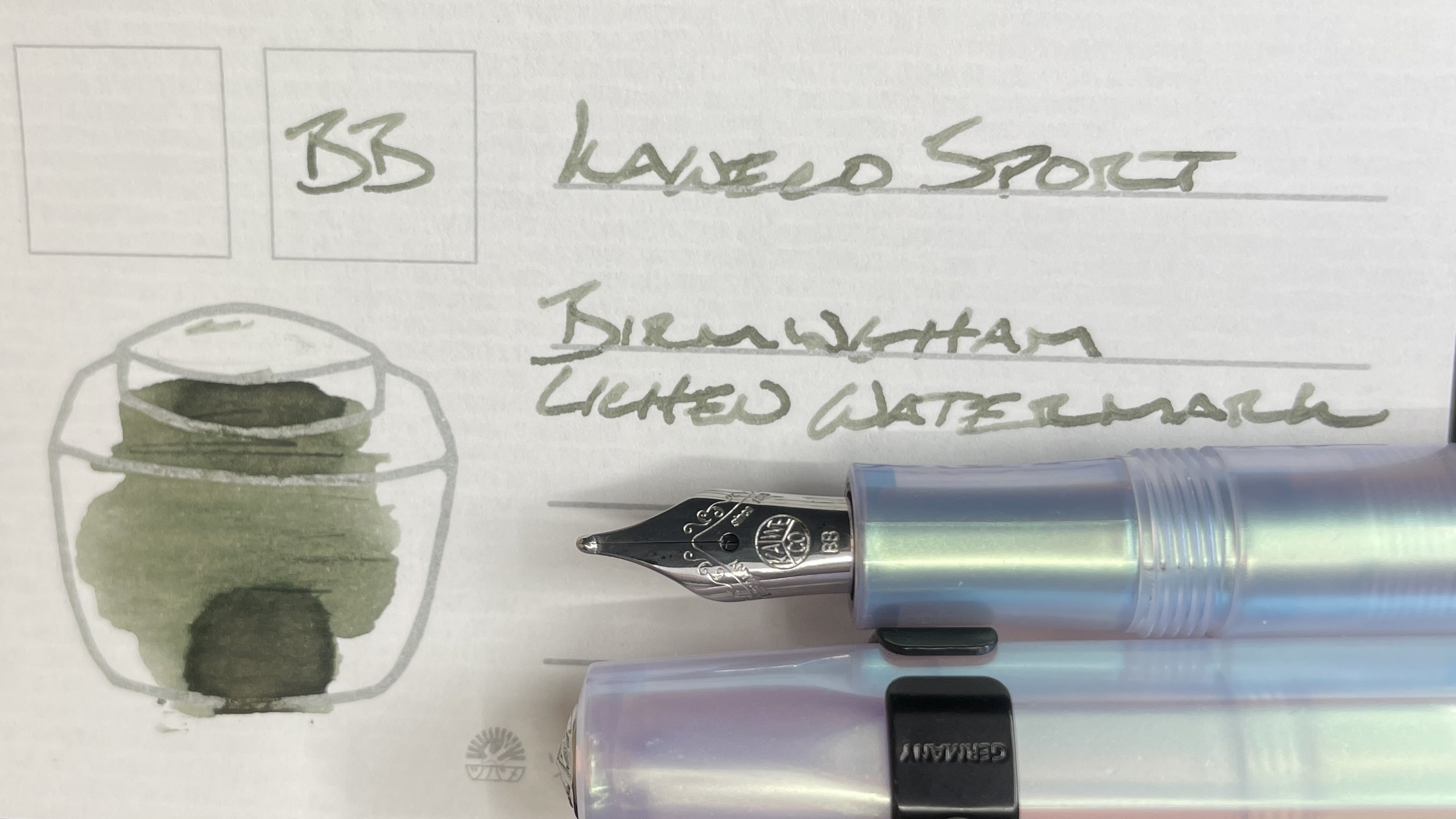
Kaweco Skyline Sport Iridescent Pearl (BB). Birmingham Lichen Watermark. The BB makes this combo a balancing act. The nib size brings out Lichen’s shading and encourages the ink to feather on absorbent papers. So I’m reaching for a Tomoe River filled pocket notebook this week. The wide lines also suit legible lecture notes, teaching notes, and short lesson plans.
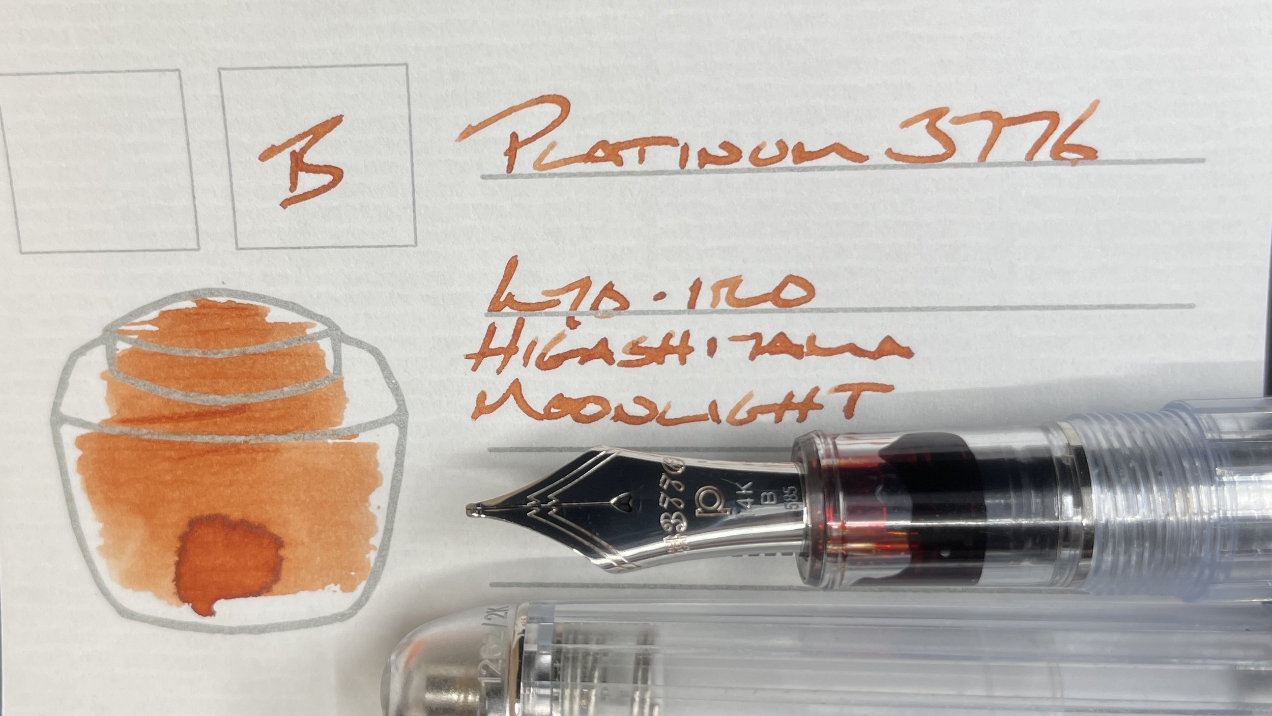
Platinum 3776 Nice Pur (B). Kyo-iro Higashiyama Moonlight. Moonlight lends a terracotta hue to the week’s color palette. Platinum’s B nib forms palindromic shading, dark on the ends of words and pale-peach through the middle letters. The 3776’s mid-sized section and Japanese-width B nib make for excellent longform writing, especially when taking on detail-oriented writing like analytic journaling and teaching reflections.
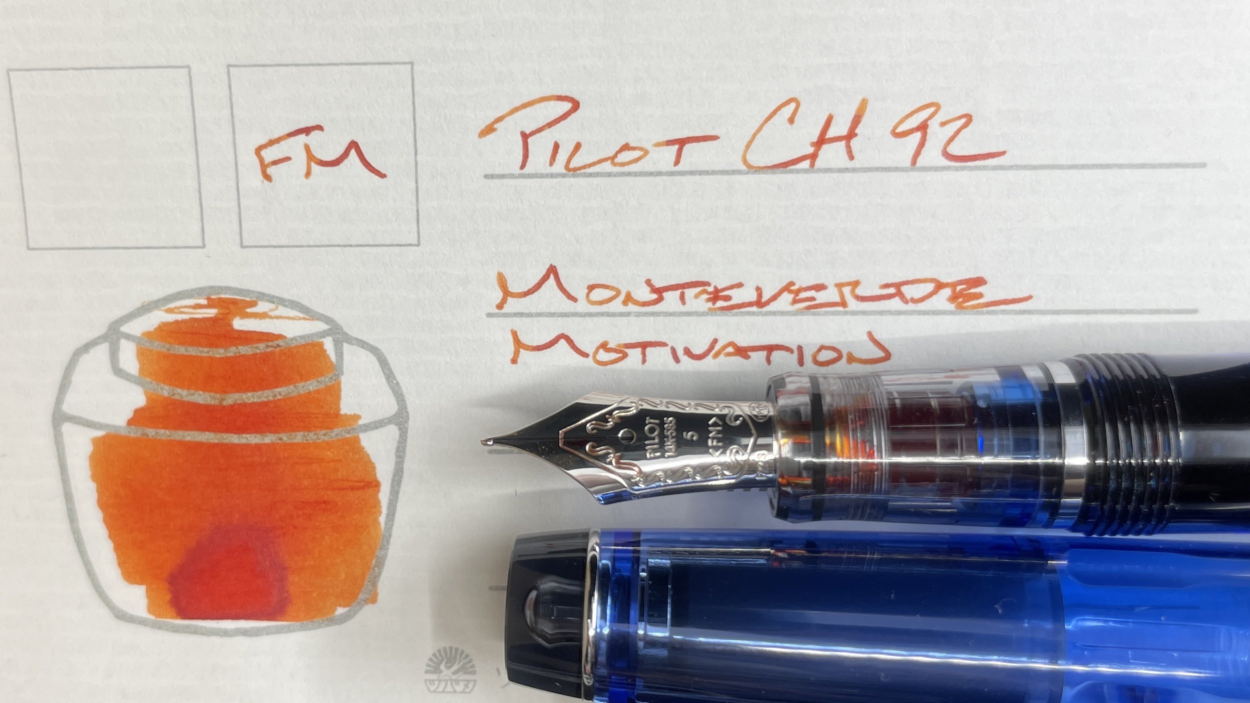
Pilot Custom Heritage 92 Transparent Blue (FM). Monteverde Emotions Motivation. A disciplined FM nib and dry-leaning feed ensure Motivation’s orange shouty personality sees just as much space on the page as its red-orange shading. The pops of orange and red are excellent colors for marking student projects, even in narrow FM lines. Similar marking is in this pair’s future: editing, reading notes, and revisions.
Wild Cards
Still nada. What a trek the last month has been. All orange and green and no plurpinks.