Embracing the wider side of life
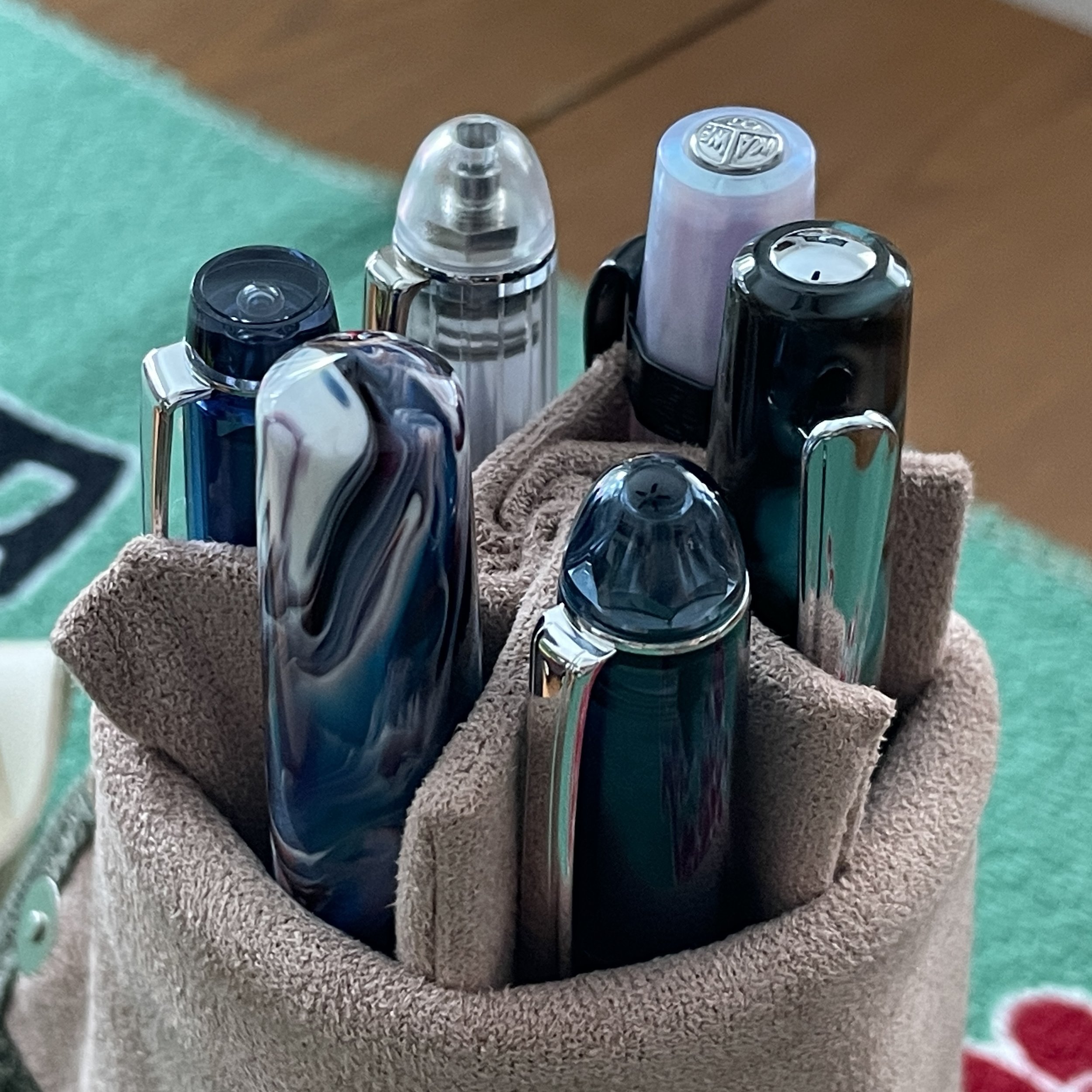

This week invites three B nibs into the mix — a departure from my typical attraction to narrow lines. I expect creative writing, reading notes, and journaling to fill my week off from work. Wide line work benefits all three forms of writing.
Longform creative writing and journaling lend themselves to broader lines in that those broad lines fill up pages quickly. Letterforms stretch the width of each word, extending often short sentences across multiple lines. I feel accomplished as my notebooks’ pages fill — motivation to write further. A gamification of my own personal scribblings.
Egging myself on is a reliable way to ensure I delve deeply into the ideas my intentional self wants to think through. I’m prone to short, targeted bouts of writing otherwise — especially during weeks off from teaching. The perks of embracing the wider side of stationery life.
Grey/Black
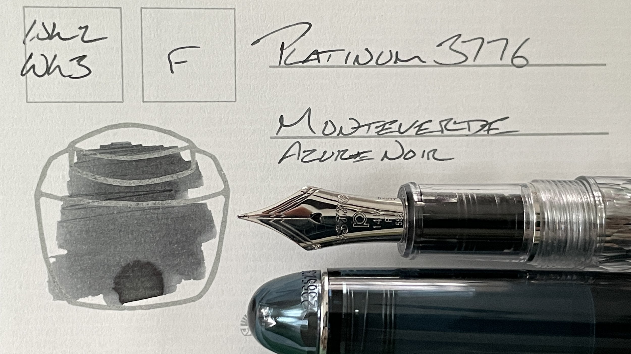
Platinum 3766 Uroko-gumo (F). Monteverde Azure Noir. Azure is a blue-black with a grey-leaning personality. The combination brings light to my most mundane writing tasks: tracking to-dos, plotting tasks in my week off from work, and driving reading notes. Platinum’s F lines are legible even in Hobonichi’s 3.7 mm grid. Legible mundanity ahoy.
Blue/Teal

Carolina Charleston in Cool Tones Primary Manipulation (B). Taccia Ukiyo-e Ainezu. A new addition to my currently inked. Ainezu is a blue-leaning blue-black with loads of shading. Carolina Pen Company’s B nib is a wet writer, which should steer Ainezu into its deepest, grungiest blue-black coloration. With lines wide enough to easily contrast against the Uroko-gumo’s narrow F line work. Journaling, reading notes, manuscript drafting, and creative writing.
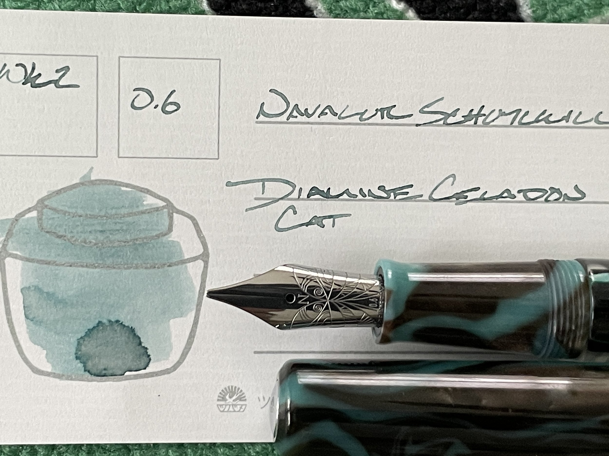
Nahvalur Schuylkill Chromis Teal (M Stub, by Nemosine). Diamine Celadon Cat. A splendid pairing of a wet Medium stub and feed with a light teal ink. Celadon Cat emerges as a medium-toned teal with superb shading and moody haloing. The M size lines fill up my journal’s tiny grid quickly, which suits short and longform journaling. Cat’s coloring contrasts against Azure, which will keep accented reading reflections distinguishable from the summative notes themselves.
Earth Tones

Kaweco Skyline Sport Iridescent Pearl (BB). Birmingham Lichen Watermark. I am traveling to visit family this week. A pocket pen, inked with a dark and subtle writing fluid will be a boon. The Kaweco is my planned pocket carry through security, the plane ride, and airport scribblings. The BB nib also opens this pair up for longform journaling, analytic reflections, and creative writing.
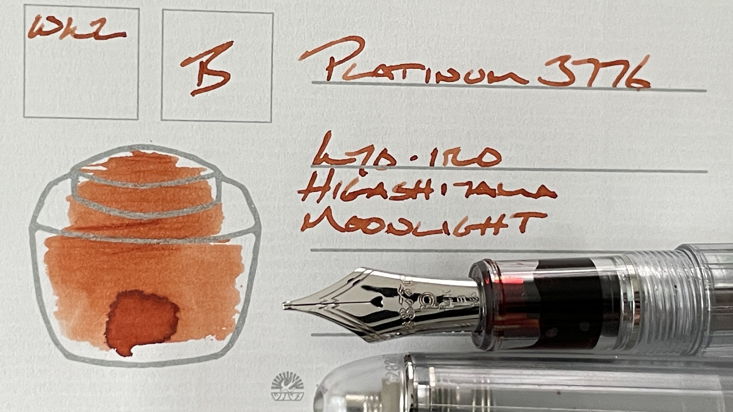
Platinum 3776 Nice Pur (B). Kyo-iro Higashiyama Moonlight. A dry combination that dries quickly on both my Kleid paper and the Tomoe River classic in my commonplace notebook. Moonlight’s peach-orange is bright, leaping off the page when juxtaposed against Azure Noir. A prime pairing for commonplace notes, reading notes, journaling, and creative writing.

Pilot Custom Heritage 92 Transparent Blue (FM). Monteverde Emotions Motivation. A bright red-orange in a disciplined FM line. A combo that is well-suited to detailed accent work like margin notes, reading notes, and editing my manuscript drafts. I also like the 92’s secure clip and modest blue colorway as a backup pocket carry for when the Kaweco’s loud shiny colorway would offer undesired distraction.
Wild Cards
A florid and profound absence of pens and inks in this color family.
